







 Note Wisdom
Elegant Watercolor Whiskers: A Gentle Visual Framework for Sophisticated Feline Storytelling
Design a serene, elegant presentation using watercolor kitten art and soft pastel pink tones. This framework blends structured data cards with poetic, gentle visuals for boutique brands, creative agencies, and sophisticated storytellers seeking a refined
- Download this PPT
- Commercial use (1 project)
- Present publicly
1. Main Design Philosophy
-
Core Idea: "Gentle Sophistication." The design philosophy centers on merging the delicate, ethereal nature of watercolor art with a highly structured, pristine editorial layout. It transforms a standard summary into a serene, poetic visual journey.
-
Conceptual Metaphor: The presentation acts as a "quiet morning tea in an art studio." The watercolor kitten serves as a graceful muse, guiding the audience through information with elegance, calm, and refined beauty.
-
Narrative Direction & Emotional Tone: The narrative is soft, reflective, and graceful. It evokes feelings of tranquility, warmth, and premium quality, avoiding the harsh or overly playful aesthetics often found in pet-themed decks.
-
Audience Insight & Intended Perception: The target audience includes boutique pet brands, creative agencies, art educators, or luxury lifestyle businesses. They should perceive the content as highly curated, empathetic, and aesthetically superior.
-
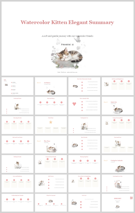
Why This Philosophy Fits: The thumbnail displays a strict, almost clinical grid of content cards and data points, yet it relies on a delicate watercolor illustration and soft pastel typography. This contrast demands a philosophy that respects clear information delivery while prioritizing a soft, artistic, and elegant aesthetic.
-
How It Guides Design: This philosophy dictates the use of muted pastel colors, generous white space (or cream space), delicate line weights, elegant serif typography, and the strategic placement of soft watercolor washes to break up text-heavy slides.
2. Color System
-
Why This System: The muted, desaturated palette was selected to evoke a sense of vintage elegance, calmness, and premium quality, perfectly mirroring the delicate watercolor aesthetic.
-
Color Psychology & Emotional Meaning: Dusty rose and blush pink evoke warmth, compassion, and feminine grace. Cream and soft grey provide a neutral, calming canvas that promotes focus and reduces visual fatigue.
-
Primary Palette:
-
Warm Cream/Off-White (Backgrounds):
#FDFBF7 -
Dusty Rose (Headers, primary highlights):
#D98C8C
-
-
Secondary Palette:
-
Soft Blush Pink (Accents, step indicators, subtle highlights):
#F2D1D1 -
Muted Sage/Soft Grey (Secondary text, dividers):
#B8B8B8
-
-
Accent Palette:
-
Deep Espresso (Primary text, high contrast):
#3A2E2A -
Champagne Gold (Subtle borders, special icons):
#D4C4A8
-
-
Color Pairing Logic & Harmony: The palette uses a harmonious, low-contrast analogous scheme. The dusty rose and blush pink are balanced by the neutral cream and anchored by the deep espresso text, creating a sophisticated and airy feel.
-
Color Proportion & Balance: 65% Cream/White (background and negative space), 25% Dusty Rose/Blush (structural elements, headers, icons), 10% Espresso (text, critical data labels).
-
Background-to-Foreground Layering: The cream background acts as the foundational layer. Soft white or slightly off-white rounded rectangles group related content. Delicate pink lines and dark espresso text create the final, readable layer.
-
Contrast, Readability, & Accessibility: The deep espresso text (
#3A2E2A) on the cream background (#FDFBF7) provides a contrast ratio exceeding WCAG AA standards, ensuring excellent readability for dense summary text. -
Semantic Use of Color: Dusty rose is strictly reserved for page titles, key metrics, and active icons. Blush pink is used for progress dots and secondary callouts. Espresso is strictly used for body copy and list items.
-
How It Supports the Theme: The palette directly mirrors the soft washes of the watercolor illustration, creating perfect visual cohesion and a high-end editorial feel.
3. Visual Elements
-
Why These Elements: To humanize the summary content and maintain visual interest across a multi-slide deck without relying on heavy, distracting photography.
-
Illustration Style & Mascot Direction: Delicate, traditional watercolor paintings of a kitten. The style features soft, bleeding edges, translucent washes, and minimal detail, emphasizing an ethereal, dreamlike quality. The kitten is depicted in various graceful poses (sleeping in a teacup, surrounded by flowers, sitting quietly).
-
Iconography Style: Ultra-thin line icons (1px stroke) with rounded caps. Icons use a single color (Dusty Rose) and are often accompanied by small, elegant geometric accents like tiny dots or stars.
-
Shape Language & Geometric Motifs: Extensive use of rounded rectangles for content cards. Circular step indicators with thin outlines. Soft, organic shapes (like the watercolor blooms) contrast with the strict geometric grid of the cards.
-
Texture, Materiality, & Lighting: The background features a subtle, smooth matte finish, mimicking high-quality watercolor paper. The illustrations have a tactile, "wet-on-wet" texture that adds a layer of artistic depth.
-
Decorative Elements & Framing: Minimalist. Scattered paw prints, tiny stars, and delicate line dividers fill negative space. A thin, elegant border frames the entire presentation, reinforcing the "editorial" feel.
-
Repetition, Rhythm, & Consistency: Every slide uses the same top-left title placement, consistent card padding, and identical illustration proportions. The blush pink circular step indicators are repeated across all process-oriented slides.
-
How Each Element Improves Engagement: The watercolor kitten serves as a memorable, emotive visual anchor. The consistent use of rounded shapes, thin icons, and soft colors reduces cognitive load, making the summary feel effortless and pleasurable to process.
4. Layout & Typography
-
Why This Layout: To ensure the presentation is easily scannable and maintains a predictable, elegant rhythm, allowing the audience to focus on the content rather than navigating the design.
-
Grid System & Alignment Logic: A strict 12-column grid system. Content is organized into clean, multi-column card layouts (3 or 4 columns for features, 2 columns for detailed text and illustrations). Text is always left-aligned within the cards to create a clean vertical axis.
-
White Space Strategy: Generous padding (minimum 50px margins on all sides). White space is treated as an active design element, preventing information overload and providing visual breathing room between dense data sets.
-
Visual Hierarchy & Focal Point Planning: Every slide has a clear focal point: the elegant title, a delicate watercolor illustration, or a row of pink icon badges. The eye is guided from the large title (top left) to the main visual, then to the supporting text within the white cards.
-
Reading Flow & Eye-Path Direction: Standard Z-pattern for title slides and F-pattern for content slides. The numbered sections and progress bars provide a clear left-to-right horizontal flow.
-
Font Pairing & Type Scale:
-
Headings:
Cormorant GaramondorPlayfair Display(Elegant, high-contrast serif font, 28-36pt, Regular or Light). -
Body:
LatoorMontserrat(Clean, highly legible sans-serif, 14-16pt, Light or Regular).
-
-
Weight, Spacing, & Line Height: Headings are Light (300) or Regular (400) to maintain elegance, body is Regular (400). Body text line height is set to 1.6 for optimal readability.
-
Consistency Rules: Titles always appear in the same top-left position. Page numbers appear in the bottom right. The specific dusty rose color (
#D98C8C) is exclusively used for all main titles and primary accents. -
How Layout Improves Clarity: The structured grid and generous spacing prevent clutter, ensuring that even dense summary points remain accessible, elegant, and professional.
5. Design Goal
-
Design Goals: To create a presentation that feels like a curated art gallery experience rather than a standard business summary. To make the content approachable, memorable, and highly sophisticated.
-
Appropriateness for Audience: Ideal for boutique brands, creative agencies, or any organization looking to project an image of elegance, care, and premium quality.
-
Intended Emotional Impact: The audience should feel calm, engaged, and positively inclined toward the presenter and the content.
-
Communication Objectives: To clearly convey summary points, data, and narratives while maintaining a distinct and charming artistic identity.
-
Desired Audience Response: Increased attention retention, positive association with the brand, and a sense of refined connection to the presenter.
-
How Design Balances Aesthetics & Delivery: The strict grid ensures message delivery is never compromised, while the watercolor illustrations and soft pastel palette ensure the aesthetics elevate the message rather than distract from it.
6. Design Principles and Consistency Checklist
-
Key Principles:
-
Softened Rigor: Strip away the harshness of traditional summaries, but keep the structural integrity.
-
Visual Anchoring: Every slide should have a visual resting point (the watercolor cat or a bold pink badge).
-
Structured Calm: Use strict grids but soft pastel colors and delicate shapes.
-
-
Reusable Rules:
-
Never use pure black (
#000000) or pure white (#FFFFFF); use deep espresso and warm cream. -
Maintain a consistent border radius (e.g., 16px) on all content cards.
-
Ensure all icons have the same ultra-thin stroke weight (1px).
-
Always left-align body text and bullet points within the cards.
-
Keep the watercolor illustrations delicate and ethereal; avoid hard lines or heavy saturation.
-
Conclusion
This design concept successfully transforms a standard summary template into an engaging, elegant visual journey. By leveraging a muted pastel color palette, strict card-based grid layouts, and delicate watercolor kitten illustrations, the deck achieves a rare balance between professional credibility and artistic grace. The consistent application of rounded shapes, refined typography, and ample white space ensures that complex information is delivered with clarity, empathy, and a distinct, memorable brand personality.
Article + Bundle Download