







 Note Wisdom
Swashbuckling Feline Recruitment: A Pirate-Themed Visual Strategy for Team Building
Design an adventurous recruitment presentation using dark chocolate browns and a pirate cat mascot. This framework balances structured corporate information with playful, nautical storytelling, ideal for creative teams seeking an engaging and memorable em
- Download this PPT
- Commercial use (1 project)
- Present publicly
1. Main Design Philosophy
-
Core Idea: "Adventurous Professionalism." The design philosophy centers on merging the rugged, storytelling nature of pirate lore with the structured, informational needs of a recruitment or onboarding presentation. It transforms a standard corporate pitch into an exciting narrative voyage.
-
Conceptual Metaphor: The presentation acts as a "Captain's Log" or a "Treasure Map." The pirate cat serves as the charismatic captain, guiding potential recruits through the challenges and rewards of joining the crew.
-
Narrative Direction & Emotional Tone: The narrative is bold, humorous, and confident. It evokes feelings of camaraderie, adventure, and anticipation, avoiding the sterile or overly serious atmosphere of traditional HR presentations.
-
Audience Insight & Intended Perception: The target audience includes creative professionals, game developers, or corporate teams looking for a unique and engaging culture fit. They should perceive the opportunity as exciting, unconventional, and rewarding.
-
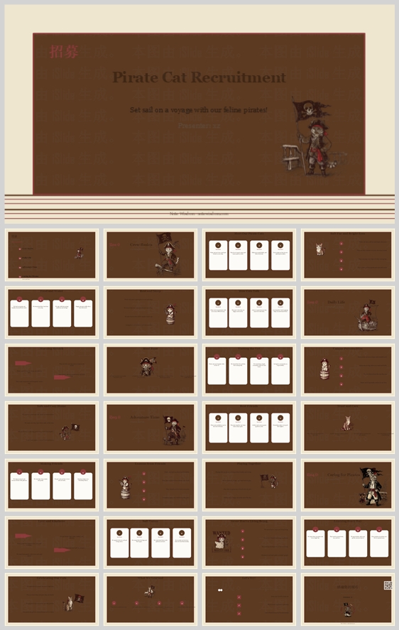
Why This Philosophy Fits: The thumbnail displays a highly structured grid of data cards and text lists, yet relies on a distinct dark brown palette and a whimsical pirate cat illustration. This contrast demands a philosophy that respects clear information delivery while prioritizing a strong, narrative-driven aesthetic.
-
How It Guides Design: This philosophy dictates the use of vintage-inspired colors, serif typography for headings, consistent mascot placement, and a layout that balances dense information with visual storytelling elements like dotted travel routes.
2. Color System
-
Why This System: The rich, dark palette was selected to evoke the vintage, nautical feel of old maps and pirate ships, while the bright pink provides a modern, energetic contrast necessary for a dynamic recruitment pitch.
-
Color Psychology & Emotional Meaning: Deep chocolate brown promotes feelings of stability, earthiness, and premium quality. Cream white provides a clean slate for information. Crimson pink adds a pop of modern energy, excitement, and alerts the eye to key data points.
-
Primary Palette:
-
Deep Chocolate Brown (Backgrounds, main headers):
#4A382D -
Cream White (Content cards, primary text on dark backgrounds):
#F9F6F0
-
-
Secondary Palette:
-
Crimson Pink (Accents, highlights, icon backgrounds):
#D94664 -
Muted Gold/Beige (Subtitles, secondary lines, borders):
#C4B6A6
-
-
Accent Palette:
-
Dark Espresso (Text on cream cards, high contrast):
#2B1F18
-
-
Color Pairing Logic & Harmony: The high contrast between the dark brown background and the bright cream cards ensures excellent readability. The crimson pink is used sparingly as a punctuation mark, preventing the dark theme from feeling too heavy or gloomy.
-
Color Proportion & Balance: 50% Deep Chocolate Brown (background and negative space), 35% Cream White (content cards and text), 10% Muted Gold/Beige (structural lines and subtitles), 5% Crimson Pink (accents and focal points).
-
Background-to-Foreground Layering: The textured brown background acts as the foundational layer. Cream white rounded rectangles float on top to group related content. The pink accents and dark espresso text create the final, readable layer.
-
Contrast, Readability, & Accessibility: The dark espresso text (
#2B1F18) on the cream white cards (#F9F6F0) provides a contrast ratio exceeding WCAG AAA standards, ensuring excellent readability. The cream white text on the dark brown background also offers high contrast. -
Semantic Use of Color: Crimson pink is strictly reserved for active icons, important numbers, and callout badges. Muted gold is used for subtle dividers and secondary information. Dark espresso is strictly used for body copy and list items.
-
How It Supports the Theme: The palette directly mirrors the adventurous, slightly vintage, and premium aesthetic associated with pirate themes and classic nautical exploration.
3. Visual Elements
-
Why These Elements: To humanize the recruitment content and maintain visual interest across a multi-slide deck without relying on heavy stock photography.
-
Illustration Style & Mascot Direction: Detailed, vintage-inspired vector illustrations of a ginger-and-white pirate cat. The cat is depicted in various thematic poses (holding a sword, looking through a spyglass, standing on a barrel) with pirate attire including a hat and peg leg.
-
Iconography Style: Simple white line or solid icons enclosed within circular pink backgrounds on the 4-column cards. This creates a consistent, scannable visual rhythm.
-
Shape Language & Geometric Motifs: Extensive use of rounded rectangles for content cards. Dotted lines are used to represent travel routes, timelines, or connections between ideas. Circular badges are used for step numbers or key highlights.
-
Texture, Materiality, & Lighting: The background features a subtle, woven or crosshatch texture, giving the digital slides a tactile, vintage parchment feel. The illustrations are flat but shaded to give them a slight 3D pop against the dark background.
-
Decorative Elements & Framing: Minimalist. Small nautical elements like the pirate flag (Jolly Roger), scattered dots, and subtle line dividers fill negative space without adding clutter.
-
Repetition, Rhythm, & Consistency: Every slide uses the same top-left title placement, consistent card padding, and identical illustration proportions. The pink circular icon badges are repeated across all data-heavy slides.
-
How Each Element Improves Engagement: The pirate cat mascot serves as a memorable visual anchor, making the deck instantly recognizable. The consistent use of rounded shapes and pink badges reduces cognitive load, making the recruitment data feel effortless to process.
4. Layout & Typography
-
Why This Layout: To ensure the presentation is easily scannable and maintains a predictable rhythm, allowing the audience to focus on the recruitment message rather than navigating the design.
-
Grid System & Alignment Logic: A strict 12-column grid system. Content is organized into clean, multi-column card layouts (4 columns for features, 2 columns for detailed text and images). Text is always left-aligned within the cards to create a clean vertical axis.
-
White Space Strategy: Generous padding (minimum 40px margins on all sides). White space is treated as an active design element, preventing information overload and providing visual breathing room between dense data sets.
-
Visual Hierarchy & Focal Point Planning: Every slide has a clear focal point: the large title, a hero cat illustration, or a row of pink icon badges. The eye is guided from the large title (top left) to the main visual, then to the supporting text within the white cards.
-
Reading Flow & Eye-Path Direction: Standard Z-pattern for title slides and F-pattern for content slides. The dotted lines and numbered sections provide a clear left-to-right horizontal flow.
-
Font Pairing & Type Scale:
-
Headings:
CinzelorPlayfair Display(Classic, serif font evoking vintage documents, 28-36pt, Bold). -
Body:
MontserratorOpen Sans(Clean, highly legible sans-serif, 14-16pt, Regular).
-
-
Weight, Spacing, & Line Height: Headings are Bold (700), body is Regular (400). Body text line height is set to 1.5 for optimal readability.
-
Consistency Rules: Titles always appear in the same top-left position. Page numbers appear in the bottom right. The specific crimson pink color (
#D94664) is exclusively used for all primary accent elements. -
How Layout Improves Clarity: The structured grid and generous spacing prevent clutter, ensuring that even dense recruitment requirements and company benefits remain accessible and professional.
5. Design Goal
-
Design Goals: To create a presentation that feels like an exciting invitation to join a crew rather than a standard corporate job description. To make a "Recruitment Pitch" approachable, memorable, and fun.
-
Appropriateness for Audience: Ideal for creative agencies, gaming companies, or any organization looking to attract talent that values culture, adventure, and a sense of humor.
-
Intended Emotional Impact: The audience should feel excited, engaged, and positively inclined toward the presenter and the company culture.
-
Communication Objectives: To clearly convey recruitment criteria, company culture, and benefits while maintaining a distinct and charming brand identity.
-
Desired Audience Response: Increased application rates, positive association with the employer brand, and a sense of connection to the company's mission.
-
How Design Balances Aesthetics & Delivery: The strict grid ensures message delivery is never compromised, while the pirate cat illustrations and rich brown palette ensure the aesthetics elevate the message rather than distract from it.
6. Design Principles and Consistency Checklist
-
Key Principles:
-
Narrative Structure: Treat recruitment as a story of adventure and discovery.
-
Visual Anchoring: Every slide should have a visual resting point (the cat or a bold pink badge).
-
Structured Adventure: Use strict grids but vintage textures and whimsical shapes.
-
-
Reusable Rules:
-
Never use pure black (
#000000) or pure white (#FFFFFF); use deep chocolate and cream. -
Maintain a consistent border radius (e.g., 16px) on all cream cards.
-
Ensure all pink icon badges are the exact same size and style.
-
Always left-align body text and bullet points within the cream cards.
-
Keep the pirate cat illustration in the same flat, vintage vector style without photo realism.
-
Conclusion
This design concept successfully transforms a standard recruitment template into an engaging, adventurous visual journey. By leveraging a rich chocolate and crimson color palette, strict card-based grid layouts, and charming vintage pirate cat illustrations, the deck achieves a rare balance between corporate credibility and playful storytelling. The consistent application of rounded shapes, careful typography, and ample white space ensures that complex recruitment data is delivered with clarity, excitement, and a distinct, memorable brand personality.
Article + Bundle Download