







 Note Wisdom
Paw & Bean Cat Cafe Concept Presentation
This Paw & Bean presentation pack helps cat cafe founders pitch a warm, cat-friendly coffee concept with a 29-slide deck, speech script, customer Q&A, meeting timeline, onsite checklist, and feedback survey. Its cream palette, black line art, and coffee i
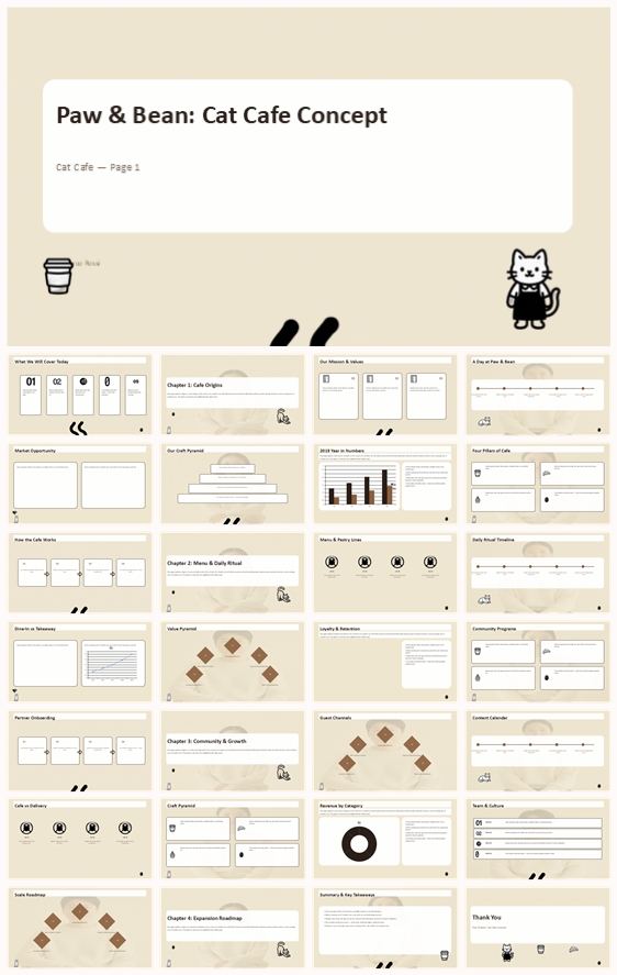
- Download this PPT
- Commercial use (1 project)
- Present publicly
One-Sentence Positioning
For cat cafe founders and cafe teams who need to present a warm, cat-friendly coffee concept.
What's Inside This Pack
-
A 29-slide PowerPoint deck with short speaker notes.
-
A full speech script with 300–400 words per slide.
-
Customer Q&A covering revenue, guests, retention, and expansion.
-
A meeting timeline totaling 72.5 minutes.
-
An onsite materials checklist for print, A/V, and room setup.
-
A feedback survey and a beginner-friendly modification guide.
Problems It Solves
-
Hard to explain a cat cafe concept with warmth and clarity.
-
No ready answers for revenue, guests, and cat welfare questions.
-
Difficult to keep a 29-slide presentation on schedule.
-
Unsure how to set up tasting station and round tables.
-
Want post-meeting feedback on cafe concept and menu.
-
Need help editing PowerPoint without breaking the design.
Who It's For
Cat cafe founders, cafe managers, and creative teams pitching a cat cafe concept.
Outcome
You can present Paw & Bean with a complete story, timed agenda, and ready answers. The pack helps you explain the menu, daily ritual, cat welfare, and growth plan. Your audience leaves with a clear view of the cafe concept and how to support it.
2. Design Concept
1. Main Design Philosophy
-
Core idea: turn a cat cafe concept into a warm neighborhood story. Why: the thumbnail uses soft cream backgrounds, black line art, and coffee icons to keep the business deck friendly and approachable.
-
Concept metaphor: a cafe menu board mixed with a cat's sketchbook. Why: the deck combines menu items, daily rituals, resident cats, and community programs.
-
Narrative direction: from cafe origins and mission to menu, daily ritual, community, and expansion. Why: the pack covers a full cat cafe concept from first impression to growth plan.
-
Emotional tone: calm, cozy, playful, and trustworthy. Why: the cafe promises specialty coffee, fresh pastries, and cat welfare in a quiet space.
-
Audience insight: viewers include cat lovers, coffee drinkers, community partners, and potential investors. Why: the pack includes customer Q&A, feedback survey, and onsite tasting station.
-
Design guidance: warm cream base, black line art, rounded cards, coffee icons, and cat mascots. Why: these choices keep the deck readable while reinforcing the Paw & Bean identity.
2. Color System
-
Why this palette: the thumbnail centers on a very light warm cream background #EFE6D0 with black line art and white fills. Why: it feels like paper, coffee, and a calm cafe interior.
-
Color psychology: cream suggests warmth and coffee; black suggests clarity and illustration; white suggests cleanliness and space.
-
Primary palette: warm cream #EFE6D0 as the dominant background. Why: it creates a soft, inviting surface that separates the deck from standard white slides.
-
Secondary palette: black and white for text, line art, icons, and mascots. Why: black on cream gives strong contrast without visual noise.
-
Accent palette: deep charcoal or coffee brown for headings and key numbers. Why: accents need to guide attention while staying within the cafe's muted mood.
-
Color ratio: about 75% warm cream, 15% black and white, 10% dark accents. Why: this keeps the deck airy and prevents the palette from becoming flat.
-
Background-to-foreground strategy: warm cream sits behind, white cards and black line art sit in the middle, dark accents sit on top. Why: this creates clear depth with flat materials.
-
Contrast and accessibility: black text on warm cream remains highly readable; white cards keep body text clean. Why: long-form content stays comfortable during live presentation.
-
Semantic use: black for headings and icons, cream for backgrounds, white for cards, dark brown for key data. Why: each color has a stable role.
-
Theme support: the palette mirrors a cat cafe that values coffee, cats, and community. Why: it makes the business case feel like an extension of the cafe experience.
3. Visual Elements
-
Why these elements: the thumbnail uses black-and-white line art cats, coffee cups, beans, pots, steam lines, croissants, cupcakes, and menu boards. Why: they make the deck feel like a cafe rather than a generic business report.
-
Illustration style: black and white line art cats with thick outlines and white fills. Why: the cat mascot adds warmth and brand recognition.
-
Mascot direction: cats in sitting, lying, standing, stretching, licking, and barista poses. Why: they connect the cafe's resident cats to the presentation experience.
-
Icon style: simple black outline icons with consistent stroke weight and rounded corners. Why: they keep menu, revenue, and community ideas scannable.
-
Shape language: rounded cards, thin frames, diamond blocks, circles, and numbered dots. Why: these shapes echo cafe menus, table settings, and editorial layout.
-
Texture and material: flat warm cream with no heavy shadow or pattern. Why: the flat surface protects the clean, illustrated cafe feel.
-
Decorative elements: paw prints, paw trails, coffee steam, stars, hearts, and arrows. Why: they mark sections and add rhythm without distracting from content.
-
Repetition and consistency: consistent black labels, white cards, line icons, and cat mascots. Why: repetition builds a coherent visual system across all slides.
-
Brand recognition: the black cat barista, coffee icons, and warm cream palette become memorable signals. Why: viewers remember the cafe more easily when the visual language is distinctive but simple.
4. Layout & Typography
-
Why this layout system: the thumbnail uses framed slide areas, modular cards, and generous margins. Why: this makes menu, data, and community content easy to scan.
-
Grid system: a consistent outer frame with an internal modular grid for titles, labels, charts, and text blocks. Why: it supports different content types without changing the visual rhythm.
-
White space strategy: large empty areas around titles and between modules. Why: white space gives the reader room to breathe and reinforces the calm cafe theme.
-
Visual hierarchy: small dark label first, large black title second, supporting text third, icons and charts last. Why: viewers know where to look immediately.
-
Reading flow: top-left label, central title, left-to-right content blocks, bottom-right mascot or page number. Why: this follows natural reading patterns and keeps the eye moving.
-
Type pairing: a modern sans-serif family for headings and body text. Why: sans-serif type matches the clean, illustrated thumbnail style.
-
Type scale: oversized titles, medium subheadings, compact body text, and small labels. Why: this creates strong contrast between message and detail.
-
Weight and spacing: bold headings, regular body, generous line height, and slightly tracked labels. Why: this improves readability during live presentation.
-
Consistency rules: same title position, same label style, same frame width, and same icon stroke. Why: consistency makes the deck feel professionally designed rather than assembled.
-
Clarity and memory: structured layouts and repeated visual cues help viewers remember the cafe concept, menu, and roadmap.
5. Design Goal
-
Design goal: present Paw & Bean as a warm, credible, cat-friendly cafe concept. Why: the pack combines cafe origins, menu, daily ritual, community, and expansion plans.
-
Audience fit: the design avoids loud gradients and heavy effects. Why: the target audience values calm spaces, cat welfare, and specialty coffee.
-
Emotional impact: viewers should feel cozy, curious, and confident in the cafe. Why: the visual tone mirrors the quiet warmth of a cat napping on a windowsill.
-
Communication goal: make menu lines, daily ritual, retention, and expansion easy to follow. Why: the deck must answer practical questions from guests, partners, and investors.
-
Expected reaction: viewers should ask about reservations, cat welfare, loyalty programs, or new locations. Why: the pack includes customer Q&A, feedback survey, and onsite materials.
-
Balance: aesthetics support readability, and readability supports the cafe story. Why: the deck needs both emotional warmth and business clarity.
6. Design Principles and Consistency Checklist
-
Keep the warm cream background as the base for every slide. Why: it unifies the deck and reinforces the cafe's calm identity.
-
Use black line art for text, icons, mascots, and frames. Why: it maintains the monochrome illustrated style.
-
Reserve dark accents for labels, key numbers, and small emphasis. Why: it protects the minimal palette from becoming busy.
-
Reuse the cat mascot in sitting, lying, barista, or reading poses. Why: it creates warmth and brand memory.
-
Maintain one outer frame width and one modular grid. Why: it keeps all slides visually related.
-
Keep icon stroke, corner radius, and line weight consistent. Why: it prevents visual fragmentation.
-
Use large titles, short labels, and compact body text. Why: it supports fast comprehension during presentation.
-
Leave generous margins and white space. Why: it preserves the calm, cozy cafe tone.
-
Repeat the same hierarchy: dark label, black title, supporting detail. Why: it trains the viewer's eye across the deck.
-
Check every slide against the palette, grid, icon style, and typography rules. Why: consistency builds trust and professionalism.
Conclusion
The design concept turns Paw & Bean into a warm, illustrated, and credible cat cafe presentation. Warm cream backgrounds, black line art, cat mascots, coffee icons, rounded cards, and clear layouts keep the deck readable, memorable, and aligned with a friendly neighborhood cafe.
Article + Bundle Download