







 Note Wisdom
Paper Paws Stationery and Gift Collection Brand Deck
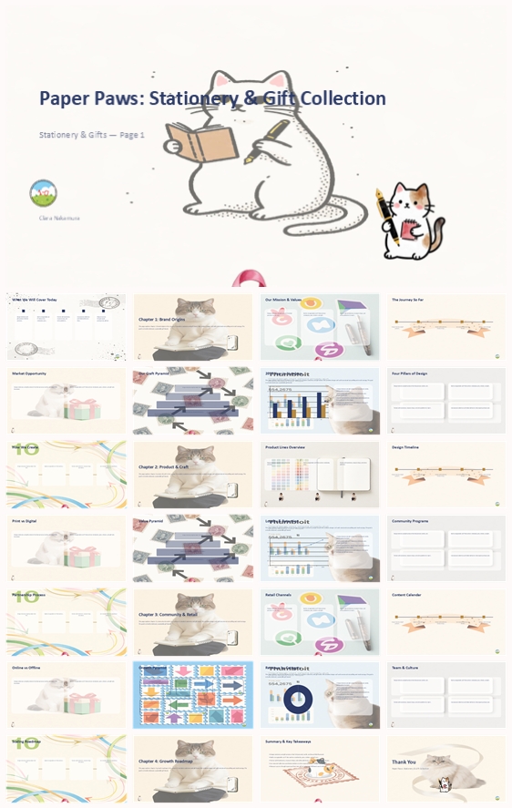
This Paper Paws presentation pack helps stationery and gift brands present a cat-themed collection with customer Q&A, feedback survey, meeting timeline, and onsite display list. Soft pastel visuals, watercolor cats, and modular layouts keep product desig
- Download this PPT
- Commercial use (1 project)
- Present publicly
One-Sentence Positioning
For stationery and gift brands that need to present a cat-themed collection to retail buyers and partners.
What's Inside This Pack
-
Customer Q&A covering revenue, customers, retention, and expansion.
-
A 12-question feedback survey for post-presentation evaluation.
-
A 29-slide meeting timeline totaling 72.5 minutes.
-
An onsite materials list for catalog, lookbook, and price list.
-
A/V and room setup checklist for projector, mic, and seating.
-
Product display guidance with texture samples and gift-set lookbook.
Problems It Solves
-
Hard to answer revenue, customer, and retention questions during a pitch.
-
No ready feedback form to measure brand story and product design.
-
Difficult to keep a 29-slide presentation on a tight schedule.
-
Unsure how to prepare print materials and product display table.
-
Need clear room and A/V setup for a stationery presentation.
-
Want to explain sales channels, repeat purchases, and expansion plans.
Who It's For
Stationery founders, brand managers, and retail teams presenting a cat-themed gift collection.
Outcome
You can present Paper Paws with a complete narrative and ready answers. The pack helps you explain product design, material quality, sales channels, and growth plans. Your audience leaves with a clear view of the collection and its retail potential.
2. Design Concept
1. Main Design Philosophy
-
Core idea: present a cat-themed stationery and gift collection as a warm, retail-ready brand. Why: the thumbnail uses watercolor cats, soft paper textures, and pastel chapter markers to keep the business story friendly.
-
Concept metaphor: a cat curator arranging notebooks, cards, and gift sets on a studio table. Why: the collection is built around stationery, gifts, and everyday desk moments.
-
Narrative direction: brand origins, product craft, community and retail, then growth roadmap. Why: the deck must move from emotional brand story to practical retail proof.
-
Emotional tone: playful, calm, handmade, and quietly confident. Why: the visual style suggests a small studio brand rather than a mass-market supplier.
-
Audience insight: viewers include bookstore buyers, museum shop managers, retail partners, and gift shoppers. Why: the pack includes wholesale terms, retail channels, and feedback questions.
-
Design guidance: pastel color blocks, rounded cards, watercolor mascots, hand-drawn icons, and clean sans-serif type. Why: these choices keep the deck warm while making product and data sections easy to scan.
2. Color System
-
Why this palette: the thumbnail combines cream, mint, powder blue, blush pink, and pale yellow. Why: these tones mirror paper goods, gift packaging, and gentle cat illustrations.
-
Color psychology: cream suggests paper and warmth; mint suggests freshness; blue suggests trust; pink suggests affection; yellow suggests small delights.
-
Primary palette: warm cream and soft beige as the base. Why: they create a paper-like surface that makes stationery products feel tangible.
-
Secondary palette: mint, powder blue, blush pink, and pale yellow. Why: they separate chapters, product lines, and data blocks without harsh contrast.
-
Accent palette: muted teal, soft coral, and gentle charcoal for headings and key numbers. Why: accents need enough strength to guide the eye while staying within the pastel mood.
-
Color ratio: about 70% cream and beige, 20% pastel blocks, 10% deeper accents. Why: this keeps the deck airy and prevents the soft palette from feeling washed out.
-
Background-to-foreground strategy: textured cream backgrounds sit behind pastel cards and darker text. Why: this creates gentle depth without heavy shadows.
-
Contrast and accessibility: dark brown or charcoal text on cream remains readable; pastel blocks carry short labels and icons. Why: long-form content stays comfortable during live presentation.
-
Semantic use: mint for craft, blue for retail, pink for community, yellow for growth. Why: color becomes a quiet wayfinding system.
-
Theme support: the palette supports a cat-themed gift collection that values illustration, paper quality, and emotional storytelling. Why: it makes the visual system feel like part of the product experience.
3. Visual Elements
-
Why these elements: the thumbnail uses watercolor cats, hand-drawn stationery icons, soft geometric shapes, and small decorative dots. Why: they make a business deck feel like a gift collection rather than a corporate report.
-
Illustration style: watercolor cat mascots in reading, writing, wrapping, and desk poses. Why: the cat adds warmth and gives the brand a memorable face.
-
Mascot direction: a cat can appear as a quiet companion near product stories, retail sections, and closing moments. Why: it softens data-heavy slides without distracting from the message.
-
Icon style: hand-drawn notebooks, pens, envelopes, stars, hearts, paw prints, and gift boxes. Why: these icons match the stationery and gift catalogue.
-
Shape language: rounded cards, soft circles, dotted lines, ribbons, and gentle arrows. Why: these shapes echo paper goods, gift wrapping, and hand-cut studio materials.
-
Texture and material: watercolor wash, paper grain, light shadows, and soft cream backgrounds. Why: texture suggests paper quality, which is central to the brand's promise.
-
Decorative elements: confetti dots, small stars, paw trails, and pastel chapter dividers. Why: they create rhythm across sections without becoming ornamental noise.
-
Repetition and consistency: one pastel chapter color per section, one cat style, one icon stroke, and one card radius. Why: repetition builds a coherent system across 29 slides.
-
Brand recognition: the watercolor cat, pastel palette, and stationery icons become recognizable signals. Why: viewers remember the collection more easily when the visual language is distinct but restrained.
4. Layout & Typography
-
Why this layout system: the thumbnail uses modular cards, clear section dividers, and generous margins. Why: this makes product lines, retail channels, and growth data easy to scan.
-
Grid system: a consistent outer margin with two-, three-, and four-column card grids. Why: the deck needs flexibility for timelines, comparisons, KPIs, quotes, and team profiles.
-
White space strategy: wide breathing room around titles and between cards. Why: white space protects the calm, premium gift feel and improves readability.
-
Visual hierarchy: small pastel chapter label first, large title second, supporting text third, chart or icon last. Why: viewers immediately understand where they are in the story.
-
Reading flow: top-left chapter marker, central title, left-to-right content blocks, bottom-right page number or mascot. Why: this follows natural reading patterns and keeps navigation predictable.
-
Type pairing: a modern sans-serif for headings and body text, with a softer serif optional for quotes. Why: sans-serif keeps data clear, while a serif touch can echo gift-card typography.
-
Type scale: oversized section titles, medium subheadings, compact body text, and small labels. Why: this creates strong contrast between chapter messages and supporting detail.
-
Weight and spacing: bold headings, regular body, generous line height, and lightly tracked labels. Why: this improves readability during projection and keeps the deck approachable.
-
Consistency rules: same title position, same card radius, same icon stroke, same footer placement. Why: consistency makes the deck feel professionally designed rather than assembled.
-
Clarity and memory: repeated pastel chapters and modular layouts help viewers remember brand origins, product craft, retail channels, and growth plans.
5. Design Goal
-
Design goal: present Paper Paws as a warm, credible, retail-ready stationery and gift collection. Why: the pack combines brand story, product design, material quality, retail channels, and expansion plans.
-
Audience fit: the design avoids hard gradients, neon colors, and heavy corporate effects. Why: the target audience values hand-drawn illustration, premium paper, and emotional storytelling.
-
Emotional impact: viewers should feel calm, curious, and delighted. Why: the collection is about small everyday objects that bring warmth.
-
Communication goal: make product lines, material choices, sales channels, and roadmap easy to follow. Why: the deck must answer practical questions from buyers and partners.
-
Expected reaction: viewers should request the wholesale price list, visit the product display table, or recommend the collection. Why: the pack includes onsite display materials and a feedback survey.
-
Balance: aesthetics support readability, and readability supports the gift collection story. Why: the deck needs both emotional charm and business clarity.
6. Design Principles and Consistency Checklist
-
Keep cream and warm beige as the base across all slides. Why: it unifies the deck and echoes paper and gift materials.
-
Use one pastel chapter color per section. Why: it helps viewers track brand origins, product craft, community and retail, and growth roadmap.
-
Reuse the watercolor cat in quiet, relevant poses. Why: it creates warmth and brand memory without overpowering content.
-
Maintain one icon stroke, one card radius, and one shadow style. Why: it prevents visual fragmentation across 29 slides.
-
Keep charts soft, rounded, and pastel with clear labels. Why: data should feel approachable and match the gift collection tone.
-
Use large titles, short labels, and compact body text. Why: it supports fast comprehension during presentation.
-
Leave generous margins and breathing room. Why: it preserves the calm, premium stationery feel.
-
Repeat the same hierarchy: chapter label, title, supporting detail, visual. Why: it trains the viewer's eye across the deck.
-
Check every slide against palette, icon style, typography, and spacing rules. Why: consistency builds trust and professionalism.
-
Let cat-themed details stay subtle. Why: the brand is playful, but the deck still needs retail clarity.
Conclusion
This design concept turns Paper Paws into a soft, playful, and retail-ready brand presentation. Cream paper tones, pastel chapter colors, watercolor cats, hand-drawn stationery icons, rounded cards, and clear data frames keep the deck warm, readable, and memorable for buyers, partners, and gift shoppers.
Article + Bundle Download