







 Note Wisdom
The Nurturing Classroom: A Pastel-Themed Teaching Plan
Discover a comprehensive visual design system for educational presentations. This guide explores a pastel, nature-inspired aesthetic using sage green and soft serif typography to create a calm, structured, and highly engaging teaching plan.
- Download this PPT
- Commercial use (1 project)
- Present publicly
Core design philosophy
The core philosophy is "Organic Structure." The design merges the need for rigorous, organized educational planning with the warmth and playfulness of early childhood or primary education. It positions the lesson plan not as a dry administrative document, but as a vibrant, inviting ecosystem where ideas grow.
Emotional tone and narrative direction
The emotional tone is calm, encouraging, safe, and highly approachable. The narrative direction guides the viewer on a journey of gentle discovery, where the teacher acts as a nurturing guide in a beautifully organized natural environment. It suggests that learning is a joyful, structured, and organic process.
1. Main Design Philosophy
-
Core idea and creative approach: The creative approach uses a "Digital Storybook" aesthetic. It blends modern UI/UX card-based layout principles with soft, illustrative elements to create a dashboard that feels like a children's book.
-
Main design concept and conceptual metaphor: The conceptual metaphor is "The Classroom as a Garden." Just as a garden requires careful planning, nurturing, and the right environment to thrive, so does a lesson plan. This metaphor justifies the botanical elements, the soft green palette, and the animal mascots acting as "guides" through the content.
-
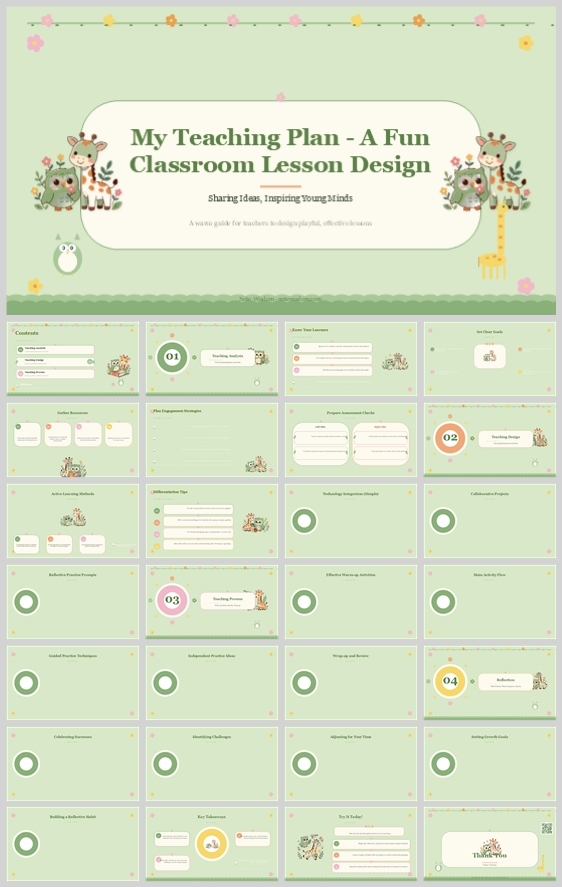
Narrative direction and emotional tone: The deck moves from a welcoming introduction (the cover) through structured stages (the numbered circular badges) to a warm conclusion. The tone is supportive and inspiring, designed to reduce the anxiety often associated with lesson planning.
-
Audience insight and intended perception: The audience includes educators, curriculum designers, and school administrators. They perceive the deck as highly professional yet deeply empathetic. They see a creator who understands both pedagogical structure and the emotional needs of a classroom.
-
Why this philosophy fits the thumbnail style, topic, and audience: The thumbnail is inherently soft, featuring pastel greens, rounded corners, and cute animal illustrations. This philosophy perfectly aligns with the "Fun Classroom Lesson Design" topic. For educators, an overly corporate or harsh design feels disconnected from the actual classroom experience. This philosophy bridges the gap between administrative reporting and classroom reality.
-
How the design idea guides color, elements, layout, and typography: It dictates a low-contrast, high-readability palette (soft greens, creams) to reduce cognitive load. It mandates the use of rounded, organic shapes (circles, rounded rectangles) over sharp angles. It drives the layout to use generous white space, mimicking a physical breathing space, and chooses friendly, approachable typography.
2. Color System
-
Why this color system was chosen: The color system was selected to evoke a sense of calm, growth, and safety. Green is universally associated with education, growth, and nature, making it the perfect anchor for a teaching plan.
-
Color psychology and emotional meaning: Sage green represents harmony and balance, reducing eye strain during long planning sessions. Soft yellow and peach add warmth and optimism without being aggressive.
-
Primary palette: Sage Green (#D1E2C8) for backgrounds, Forest Green (#2E4A35) for primary text and headers.
-
Secondary palette: Cream/Off-White (#F9F9F4) for content cards and text blocks, Soft Charcoal (#3A3A3A) for secondary body text.
-
Accent palette: Muted Yellow (#F9E076) for primary focal points (like the large "01" badge), Soft Peach/Pink (#F8D1D1) for decorative floral elements.
-
Color pairing logic and harmony: The palette uses an analogous scheme (greens, yellows, creams) with a complementary pop of peach. The harmony relies on low saturation and high brightness, creating a pastel, non-threatening aesthetic.
-
Color proportion and balance: 60% Sage Green background, 30% Cream/White content cards, 10% Accents (Yellow, Peach, Dark Green text).
-
Background-to-foreground layering strategy: The solid sage green background creates a soft canvas. White/cream rounded rectangles float on top, creating a clear focal plane for content. Subtle, soft drop shadows on these cards create depth without harshness.
-
Contrast, readability, and accessibility: Dark Forest Green text on Cream backgrounds ensures a high contrast ratio (exceeding 7:1), making it highly accessible. The yellow accents are used sparingly for large numbers or icons, never for small body text.
-
Semantic use of color across titles, body text, icons, and highlights: Forest Green is used for all titles to establish hierarchy. Soft Charcoal is used for body text. Muted Yellow is used exclusively for primary stage indicators (01, 02, 03, 04) to draw the eye. Peach is used for decorative elements to add visual interest without distracting from the content.
-
How the palette supports the theme, audience, and visual hierarchy: The green palette directly reinforces the "growth" theme of education. The soft, natural tones appeal to the empathetic nature of educators. The clear contrast ensures that the information hierarchy is immediately understood.
3. Visual Elements
-
Why these visual elements were chosen: These elements were chosen to humanize the subject matter. Education is fundamentally about people and connection; the visual elements mirror this.
-
Illustration style and mascot direction: The illustrations are flat, vector-based, with soft outlines and a storybook quality. The mascots (a deer, a giraffe, an owl) are stylized to be non-threatening, cute, and diverse, acting as friendly guides through the curriculum.
-
Iconography style, stroke consistency, and corner treatment: Icons feature a consistent 2px stroke weight, rounded line caps, and minimal detail. They are enclosed in soft, circular backgrounds to maintain the organic feel.
-
Shape language and geometric motifs: The shape language is heavily rounded. Rectangles have significant corner radii (e.g., 20px). Circles are used for numbered stages, reinforcing a continuous, cyclical learning process.
-
Texture, materiality, and lighting atmosphere: The texture is flat, digital, and clean. There is no artificial grain or noise. Lighting is represented through subtle, soft drop shadows on the white cards, creating a gentle "floating" effect over the green background.
-
Decorative elements and framing devices: Vine borders, floral clusters, and soft wavy lines at the top and bottom of the cover serve as framing devices. These elements act as visual anchors, preventing the design from feeling too sterile.
-
Repetition, rhythm, and visual consistency rules: The same card style, corner radius, and shadow effect are applied across all slides. The numbered badges (01-04) create a rhythmic progression. The animal mascots reappear subtly in the corners of content slides.
-
How each element improves comprehension, engagement, and brand recognition: The consistent card layout drastically improves comprehension by chunking information. The mascots increase engagement by making the deck feel friendly. The distinct visual style ensures high brand recognition for the educator or institution.
4. Layout & Typography
-
Why this layout and typography system was chosen: The layout is designed to manage complex information (a full lesson plan) without overwhelming the viewer. The typography pairs a classic serif with a modern sans-serif to balance authority with readability.
-
Grid system and alignment logic: A strict 12-column modular grid system is used. Content is organized into distinct cards that align perfectly with the grid. Everything is left-aligned within cards to create a clean, scannable edge.
-
White space strategy and visual breathing room: Generous internal padding (24px) within cards and consistent gutters (16px) between cards are mandated. This white space is crucial for preventing cognitive overload.
-
Visual hierarchy and focal point planning: Each slide has a clear focal point, usually a large title or a prominent numbered badge. The eye is drawn to the largest text, then to the cards, and finally to the supporting icons.
-
Reading flow and eye-path direction: The eye path follows a standard Z-pattern. The viewer reads the title at the top, scans the cards from left to right, and finishes at the bottom right with the call to action or conclusion.
-
Font pairing and type scale:
-
Headings: Merriweather or Playfair Display (Bold, Serif) – adds a touch of traditional pedagogy and elegance.
-
Body: Lato or Open Sans (Regular, Sans-serif) – highly legible on screens, modern, and clean.
-
-
Title, subtitle, body, caption, and label hierarchy:
-
Main Title: 44pt, Bold Serif.
-
Section Subtitle: 24pt, Semi-Bold Sans-serif.
-
Body Text: 14pt, Regular Sans-serif, 1.5 line height.
-
Captions/Labels: 10pt, Regular Sans-serif, all caps for emphasis.
-
-
Weight, spacing, line height, and readability standards: Body text uses a line height of 1.5 to 1.6. Letter spacing is set to 0 for body text and slightly increased (0.05em) for all-caps labels.
-
Consistency rules across all pages: Font sizes must not deviate. Card corner radii must remain identical. The color palette must be strictly adhered to.
-
How the layout improves clarity, rhythm, and information retention: The modular layout creates a predictable rhythm. By isolating information into distinct cards, the viewer's brain can process one concept at a time, significantly improving information retention.
5. Design Goal
-
State the design goals clearly: The primary goal is to transform a standard lesson plan into a visually engaging, highly scannable, and emotionally resonant digital asset. The secondary goal is to establish a calming, organized atmosphere that inspires confidence in the teaching strategy.
-
Explain why these goals are appropriate for the audience and context: Educators are often overwhelmed by administrative tasks. A design that feels calm, organized, and visually pleasant reduces this stress. It makes the planning process feel less like a chore and more like a creative endeavor.
-
Intended emotional impact: The audience should feel a sense of relief, inspiration, and confidence. The design should evoke a warm, "ready to teach" mindset.
-
Communication objectives: To clearly communicate the structure, methodology, and creative approach of the lesson plan without sacrificing visual appeal.
-
Desired audience behavior or response: The audience should be able to quickly navigate the plan, understand the pedagogical stages, and feel excited to implement the ideas in a real classroom.
-
How the design balances aesthetics, readability, and message delivery: The use of pastel colors and cute illustrations provides the aesthetic appeal. The strict grid and high-contrast typography ensure readability. The clear card-based structure ensures the message is delivered efficiently.
6. Design Principles and Consistency Checklist
-
Key principles to keep the deck visually coherent:
-
Softness: Always use rounded corners over sharp edges.
-
Breathability: Never overcrowd a slide; maintain at least 30% white space.
-
Natural Harmony: Stick strictly to the sage green, cream, and muted yellow/peach palette.
-
Friendly Authority: Use serif fonts for authority and sans-serif for clarity.
-
-
Reusable rules for color, elements, typography, and layout:
-
Color Rule: Backgrounds are always Sage Green; content boxes are always Cream. Text is always Dark Forest Green or Soft Charcoal.
-
Element Rule: Every slide must feature at least one rounded card. Mascots should appear on at least 50% of slides to maintain the narrative.
-
Typography Rule: Never use more than two font families. Keep body text at 14pt or larger.
-
Layout Rule: Maintain a consistent 16px gutter between all content cards. Align all text to the left within cards.
-
Conclusion
This design concept successfully translates the whimsical, pastel, and structured visual style of the thumbnail into a comprehensive, ready-to-use educational framework. By anchoring the design in the "Classroom as a Garden" metaphor and utilizing a strict, soft-toned modular grid, the presentation achieves a perfect balance of professional organization and playful warmth. The precise color psychology, typography rules, and layout principles ensure that the lesson plan is not only beautiful but also highly functional and accessible for educators.
Article + Bundle Download