







 Note Wisdom
London Classroom: Teacher’s Lesson Presentation
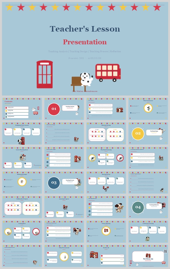
This design concept transforms a teacher’s lesson plan into a playful London-themed journey. Using red, yellow, and blue with iconic British illustrations, it balances pedagogical structure and visual charm, keeping educators organized while making lesson
- Download this PPT
- Commercial use (1 project)
- Present publicly
1. PPT Title
London Classroom: Teacher’s Lesson Presentation
2. Design Concept
Core Design Philosophy
Structured Playfulness. The deck uses a cheerful, London-inspired visual identity to turn a standard lesson plan into an engaging classroom journey. It balances pedagogical rigor with child-friendly charm, making the planning process feel organized, creative, and culturally rich.
Emotional Tone and Narrative Direction
The emotional tone is upbeat, trustworthy, and whimsical. The narrative direction follows a “classroom field trip” arc: the teacher and students board a red double-decker bus, guided by a friendly dog mascot, and travel through four lesson stages—analysis, design, process, and reflection. Every slide feels like a stop on a bright, well-organized London tour.
1. Main Design Philosophy
Core idea and creative approach:
Combine British cultural icons with a modular, card-based lesson-planning system. The design treats the lesson plan as a visual itinerary, not a static document.
Main design concept and conceptual metaphor:
“The Lesson as a London Bus Tour.” The red bus, telephone booth, signpost, and star bunting are not mere decoration—they are wayfinding devices. Section numbers become tour stops. The dog mascot acts as the friendly guide.
Narrative direction and emotional tone:
The deck moves from welcome and overview to structured teaching stages, ending with reflection and thanks. The tone stays energetic but never chaotic, using clean white cards to contain information.
Audience insight and intended perception:
The audience includes primary school teachers, teacher trainers, and curriculum designers. They want materials that are ready to use, visually engaging, and culturally relevant. They should perceive the deck as professional enough for planning, yet playful enough for a young classroom.
Why this philosophy fits the thumbnail style, topic, and audience:
The thumbnail already signals a UK/London theme through the red bus, phone booth, dog mascot, and star banner. The topic is a teacher’s lesson presentation. The audience needs clarity and inspiration. A “structured playfulness” approach respects both the administrative need for organization and the emotional need for joy in teaching.
How the design idea guides color, elements, layout, and typography:
It drives a red-yellow-blue palette, rounded white content cards, star motifs, serif headings for authority, and sans-serif body text for readability. Every visual choice reinforces the London classroom narrative without distracting from lesson content.
2. Color System
Why this color system was chosen:
The palette mirrors the Union Jack’s red, white, and blue, with warm yellow for energy. It is instantly recognizable, culturally anchored, and visually cheerful—ideal for an educational setting.
Color psychology and emotional meaning:
-
Red: energy, confidence, attention, British iconography.
-
Blue: trust, calm, focus, reliability.
-
Yellow: optimism, creativity, childhood joy.
-
White: clarity, space, readability.
Primary palette:
-
Sky Blue (#A8C9E1): background across all slides.
-
Classic Red (#D9382B): main titles, section numbers, bus/phone booth illustrations.
-
Warm Yellow (#F5C542): stars, highlights, accent icons.
Secondary palette:
-
Crisp White (#FFFFFF): content cards, text blocks, diagram backgrounds.
-
Deep Navy (#1F3A5F): body text, subtitles, readable contrast.
-
Soft Gray (#E8EDF2): dividers, subtle borders.
Accent palette:
-
Brick Red (#C0392B): darker red for emphasis and icon details.
-
Golden Yellow (#F1C40F): star banner and small decorative accents.
-
Muted Blue (#7BA7C7): secondary illustration fills.
Color pairing logic and harmony:
Red and blue form a classic complementary pair, softened by sky blue and white. Yellow acts as a warm bridge. The result is high-energy but not aggressive.
Color proportion and balance:
-
60% Sky Blue background
-
25% White content cards
-
10% Red accents
-
5% Yellow highlights
Background-to-foreground layering strategy:
Sky blue is the base canvas. White rounded cards float above it with soft shadows. Red and yellow sit on top of the white cards for titles, numbers, and stars. This creates clear depth without visual noise.
Contrast, readability, and accessibility:
Navy text on white cards provides excellent contrast. Red is used for large titles and numbers, not small body text. Yellow is decorative and never carries critical information alone. The deck remains readable for viewers with color-vision differences.
Semantic use of color across titles, body text, icons, and highlights:
-
Red: slide titles, section numbers, primary CTAs.
-
Navy: body text, descriptions.
-
Yellow: stars, progress indicators, positive reinforcement.
-
Sky Blue: background, thematic wrapping.
-
White: content containers, readability zones.
How the palette supports the theme, audience, and visual hierarchy:
The red/blue/yellow scheme immediately evokes a British classroom without using literal flags. It keeps the deck lively for educators and young learners while maintaining enough contrast for professional planning.
3. Visual Elements
Why these visual elements were chosen:
They create instant thematic recognition and emotional warmth. A lesson plan can feel dry; London icons and a dog mascot make it feel like an adventure.
Illustration style and mascot direction:
Flat vector illustrations with simple geometry, no gradients, and rounded edges. The mascot is a friendly spotted dog—curious, non-threatening, and consistently placed as a guide. The red double-decker bus and telephone booth are stylized, simplified, and child-friendly.
Iconography style, stroke consistency, and corner treatment:
Icons use a 2px stroke, rounded caps, and minimal detail. They are enclosed in soft circular or rounded-square backgrounds. Stars, signposts, and buses repeat as motifs.
Shape language and geometric motifs:
Rounded rectangles for cards and content blocks. Circles for section numbers, stars, and icon backgrounds. Straight horizontal lines for the star banner. The shape language is soft but structured.
Texture, materiality, and lighting atmosphere:
Flat digital surfaces with subtle drop shadows on white cards. No paper texture or grain. The atmosphere is bright, clean, and optimistic.
Decorative elements and framing devices:
-
Top star banner with alternating red and yellow stars.
-
Red double-decker bus, telephone booth, and signpost.
-
Dog mascot in corners or beside content.
-
Small star clusters and dotted lines.
Repetition, rhythm, and visual consistency rules:
The star banner appears on every slide. Section numbers 01–04 use the same red circle badge. White cards use identical corner radii. The dog mascot appears on at least 60% of slides.
How each element improves comprehension, engagement, and brand recognition:
The repeating banner and card system make the deck easy to scan. The mascot humanizes the content. The London icons make the presentation memorable and shareable among teachers.
4. Layout & Typography
Why this layout and typography system was chosen:
The layout prioritizes information hierarchy and scannability. Serif headings add academic credibility; sans-serif body text ensures readability on screens and projectors.
Grid system and alignment logic:
A 12-column modular grid with consistent margins. Content is organized into white cards that align to the grid. Text is left-aligned inside cards for a clean reading edge.
White space strategy and visual breathing room:
Each card uses 24px internal padding. Gutters between cards are 16px. Slides avoid overcrowding; at least 30% of each slide remains open background.
Visual hierarchy and focal point planning:
The eye first lands on the slide title or section number, then moves to the white content cards, then to supporting icons. The dog mascot is secondary and never competes with text.
Reading flow and eye-path direction:
Standard Z-pattern: top-left title → top-right section marker → middle cards left-to-right → bottom conclusion or reflection prompt.
Font pairing and type scale:
-
Headings: Playfair Display or Merriweather (Bold, Serif).
-
Body: Open Sans or Lato (Regular, Sans-serif).
-
Title: 40–44pt, bold serif.
-
Section number: 36pt, bold serif or sans-serif.
-
Subtitle: 20pt, semibold sans-serif.
-
Body: 14pt, regular sans-serif, 1.5 line height.
-
Caption/label: 10pt, regular sans-serif, all caps with 0.05em tracking.
Weight, spacing, line height, and readability standards:
Headings use bold weights. Body text uses regular weight with generous line height. No paragraph exceeds 4 lines inside a card. Letter spacing remains default for body text.
Consistency rules across all pages:
Same card style, same star banner, same section badge system, same mascot placement logic. Font sizes do not deviate. Red is reserved for titles and numbers; yellow for stars and highlights.
How the layout improves clarity, rhythm, and information retention:
The modular card system chunks information into digestible pieces. The repeating banner and section numbers create rhythm. Teachers can quickly find and retain key lesson stages.
5. Design Goal
State the design goals clearly:
To transform a teacher’s lesson presentation into a visually engaging, culturally themed, and highly scannable tool that supports planning, delivery, and reflection.
Explain why these goals are appropriate for the audience and context:
Teachers need materials that are both practical and inspiring. A London-themed deck makes lesson planning feel creative rather than administrative, especially for primary education or English-culture lessons.
Intended emotional impact:
Joy, curiosity, confidence, and a sense of organized adventure.
Communication objectives:
Clearly communicate the four stages—teaching analysis, teaching design, teaching process, and reflection—while keeping the tone warm and accessible.
Desired audience behavior or response:
Teachers should feel eager to use the deck, adapt it to their own lessons, and share it with colleagues.
How the design balances aesthetics, readability, and message delivery:
The red/yellow/blue palette and London icons provide aesthetic appeal. White cards and navy text ensure readability. The modular grid ensures the message is delivered without clutter.
6. Design Principles and Consistency Checklist
Key principles to keep the deck visually coherent:
-
Thematic consistency: London icons, stars, and the dog mascot appear throughout.
-
Color discipline: Use only the defined red, blue, yellow, white, and navy palette.
-
Card-based structure: Every content slide uses white rounded cards on sky blue.
-
Friendly authority: Serif headings for credibility, sans-serif body for clarity.
-
Breathing room: Never overcrowd; maintain generous padding and gutters.
Reusable rules for color, elements, typography, and layout:
-
Color rule: Background is always Sky Blue #A8C9E1. Cards are always White #FFFFFF. Titles are always Classic Red #D9382B. Body text is always Deep Navy #1F3A5F.
-
Element rule: Top star banner on every slide. Section numbers in red circles. Dog mascot on at least 60% of slides.
-
Typography rule: No more than two font families. Headings serif, body sans-serif. Body text never smaller than 14pt.
-
Layout rule: 12-column grid. 24px card padding. 16px gutters. Left-align text inside cards.
-
Consistency rule: Every slide must pass the “squint test”—the hierarchy should be obvious even when blurred.
Conclusion
This design concept turns a standard teacher’s lesson presentation into a London-themed classroom adventure. By combining British cultural icons, a red-yellow-blue palette, modular white cards, and a friendly dog mascot, the deck achieves structured playfulness. It remains professional enough for curriculum planning, yet joyful enough for young learners. Every design choice—from the star banner to the serif typography—supports clarity, engagement, and thematic coherence.
Article + Bundle Download