







 Note Wisdom
Pawsitive Business: A Warm and Engaging Cat-Themed Presentation Design
This design concept transforms a traditional business presentation into a warm, approachable experience using a cat mascot and soft minimalist aesthetics. By utilizing a cream background and terracotta accents, the deck balances professional credibility w
- Download this PPT
- Commercial use (1 project)
- Present publicly
1. Main Design Philosophy
Core Idea: "Warm Minimalism with Narrative Character."
Conceptual Metaphor: The presentation acts as a guided tour, where the two flat-vector cats serve as friendly co-pilots leading the audience through business concepts.
Narrative Direction & Emotional Tone: The tone is approachable, encouraging, and softly professional. Instead of a harsh, aggressive corporate pitch, this design fosters a sense of comfort, reliability, and warmth.
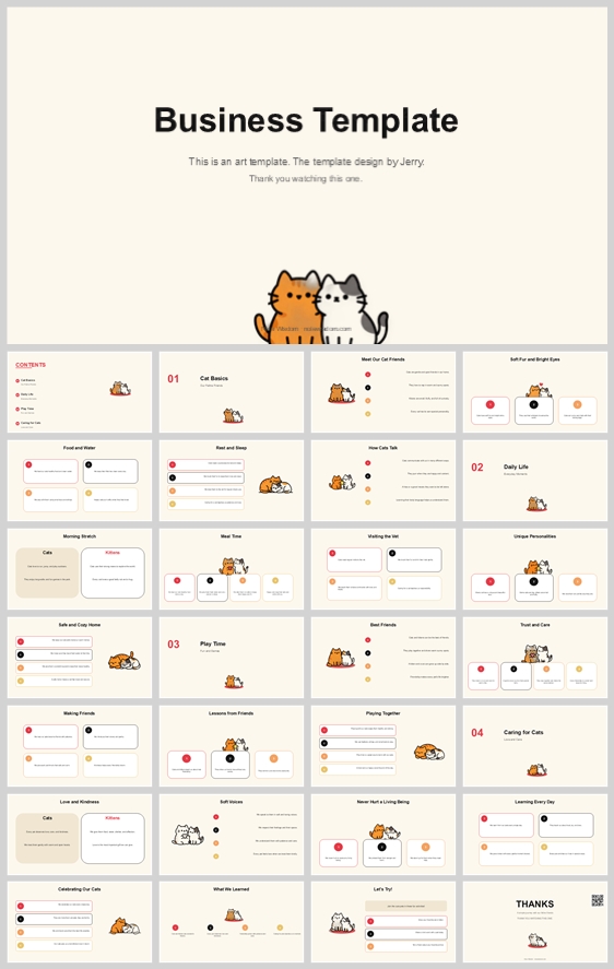
Audience Insight: This design is targeted toward startups, creative agencies, or small business owners who want to humanize their brand and make complex business strategies (e.g., "Daily Life," "Play Time," "Caring for Cats" sections indicated in the thumbnail) feel digestible and less intimidating.
Why This Fits: Traditional business templates often rely on cold blues and rigid grids. This design subverts that expectation by using a soft cream background and adorable mascots, instantly lowering the audience's psychological defenses and increasing engagement.
How It Guides Decisions: This philosophy dictates a modular card-based layout (for easy digestion), a warm, low-contrast color palette, and consistent inclusion of the mascot to maintain a continuous narrative thread.
2. Color System
-
Primary Palette: Warm Cream/Off-White (#F9F6F0) for backgrounds. This reduces eye strain compared to stark white and provides a cozy, paper-like texture that feels premium yet accessible.
-
Secondary Palette: Deep Charcoal (#2C3E50) for primary typography and structural elements. It offers high contrast for readability without the harshness of pure black.
-
Accent Palette: Terracotta Orange (#E67E22) and Soft Grey (#BDC3C7). Orange is used for key highlights, active states, and the dominant mascot; grey is used for secondary text, subtle dividers, and the secondary mascot.
-
Color Pairing & Harmony: The warm cream base neutralizes the vibrant terracotta, creating a balanced, earthy, and inviting aesthetic.
-
Color Proportion: 60% Cream (Background), 25% Charcoal (Text/Structure), 10% Terracotta (Highlights/Mascot), 5% Grey (Secondary elements).
-
Accessibility & Semantic Use: Orange is reserved exclusively for actionable items, key metrics, or drawing attention to specific data points. Charcoal handles all reading tasks to ensure maximum contrast.
3. Visual Elements
-
Mascot Direction: Two flat-vector cats (one orange, one grey/white). They are depicted in various poses (sitting, sleeping, playing). They act as visual anchors, breaking up text-heavy sections and providing an emotional connection point.
-
Iconography & Shape Language: Icons are line-based with rounded caps and corners. Shapes are predominantly rounded rectangles and circles.
-
Why These Elements: Rounded shapes and cute animals eliminate visual aggression. They make the business content feel "soft" and approachable. The repetition of the cats creates a strong brand identity that is instantly memorable.
-
Texture & Atmosphere: The design relies on flat colors with very subtle drop shadows on the white cards to create depth. This mimics a clean, modern, digital paper-cutout style.
4. Layout & Typography
-
Grid System: A strict 12-column modular grid. Content is organized into distinct "cards" or blocks (often 2, 3, or 4 columns) with consistent padding.
-
White Space Strategy: Generous margins around text blocks and illustrations. This breathing room prevents cognitive overload and emphasizes the high-quality, minimalist aesthetic.
-
Visual Hierarchy & Reading Flow: Clear top-down reading flow. Large, bold headings are followed by smaller subheadings and bulleted lists. The eye is naturally drawn to the orange accents (like the numbers 01, 02, 03) first, then the headings, then the body text.
-
Font Pairing & Type Scale:
-
Headings: A modern, geometric sans-serif (e.g., Poppins, Montserrat, or Inter) in Bold/ExtraBold.
-
Body: The same sans-serif family in Regular or Light weight for maximum readability.
-
Type Scale: Title (36-44pt), Section Number (48pt, orange), Subhead (20-24pt), Body (14-16pt).
-
-
Consistency Rules: Every page must feature a heading block at the top, a consistent margin, and at least one visual element (mascot or icon) to maintain rhythm across the deck.
5. Design Goal
-
State the Goals: To transform dry business topics into an engaging, easily digestible visual story that feels like a friendly conversation rather than a lecture.
-
Intended Emotional Impact: The audience should feel welcomed, relaxed, and confident in the presenter's ability to communicate clearly.
-
Communication Objectives: Ensure key business takeaways (the "Cats Basics," "Daily Life," etc.) are remembered through the use of strong visual cues and structured layout.
-
Balancing Aesthetics and Delivery: The design achieves this by using a professional grid system (for credibility) paired with playful illustrations (for engagement), ensuring the message is neither too boring nor too unprofessional.
6. Design Principles and Consistency Checklist
-
Color Rule: Never use pure black (#000000) or pure white (#FFFFFF) for backgrounds or text. Always use the defined cream and charcoal.
-
Mascot Rule: Every slide must feature at least one instance of the cat mascots to maintain narrative continuity.
-
Shape Rule: All containers, images, and buttons must have rounded corners (8px to 16px radius). No sharp angles.
-
Layout Rule: Maintain a minimum 5% margin on all sides of the slide. Align all elements strictly to the 12-column grid.
-
Typography Rule: Never use more than two font weights per slide. Keep body text left-aligned for maximum readability.
Conclusion
This design concept successfully bridges the gap between professional business communication and engaging visual storytelling. By leveraging a warm color palette, a modular card-based layout, and a charming cat mascot, the presentation avoids the pitfalls of standard corporate templates. The result is a highly readable, visually cohesive, and emotionally resonant deck that guides the audience through complex information with ease and a smile.
Article + Bundle Download