







 Note Wisdom
Whisker Wisdom: A Minimalist Cat Education Presentation Template
This cat education illustration template uses a monochrome palette, modular card layouts, and a line-art feline mascot to create a calm, professional learning experience. It balances academic clarity with emotional warmth, making dense educational content
- Download this PPT
- Commercial use (1 project)
- Present publicly
1. Main Design Philosophy
Core Idea: “Feline-Guided Learning.”
Conceptual Metaphor: The cat mascot acts as a calm, knowledgeable tutor guiding the learner through each educational module. The deck feels like a quiet classroom with a friendly feline instructor.
Narrative Direction & Emotional Tone: Calm, curious, and academically warm. The tone avoids hyperactive edtech aesthetics and instead leans into a focused, almost literary illustration style.
Audience Insight: Educators, trainers, cat behaviorists, and students who need a professional but approachable educational deck. They value clarity, memorability, and a non-intimidating visual pace.
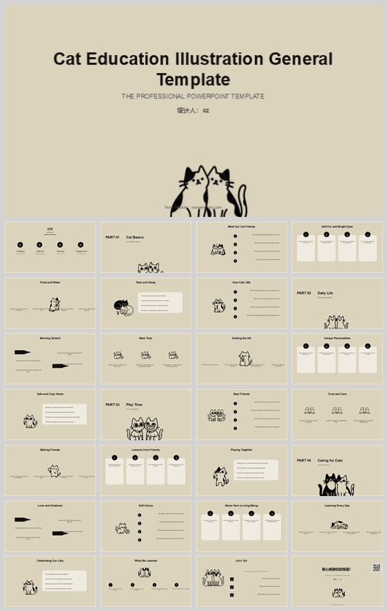
Why This Fits: The thumbnail uses monochrome line-art cats, beige backgrounds, and modular card layouts. This signals a serious yet gentle educational tool. The design philosophy directly supports that by prioritizing structure, repetition, and visual quietness.
How It Guides Decisions: Color stays low-contrast and paper-like. The cat appears on every section to create continuity. Layout uses a strict grid so the playful illustrations never compromise readability.
2. Color System
Why This Color System: Monochrome plus warm beige reduces cognitive load, mimicking printed educational handbooks and vintage textbooks.
Color Psychology: Beige evokes paper, calm, and tradition. Black ink conveys authority and clarity. Warm gray softens secondary information without introducing distraction.
Primary Palette: Soft Sand (#E8E0D5) for full-bleed backgrounds. It replaces stark white and prevents screen glare.
Secondary Palette: Ink Black (#1A1A1A) for headings, body text, line art, and key icons. It provides maximum readability.
Accent Palette: Warm Gray (#B8B2A8) for secondary labels, captions, and inactive states. Pure White (#FFFFFF) for content cards to lift information off the sand background.
Color Pairing Logic: Sand and white create gentle layering. Black provides decisive contrast. Gray bridges them without adding a new hue.
Proportion & Balance: 60% Sand background, 25% Black text and illustrations, 10% White cards, 5% Gray accents.
Background-to-Foreground Strategy: Sand is the canvas. White cards are the reading surfaces. Black is the message. Gray is the whisper.
Contrast & Accessibility: Black on sand and black on white exceed WCAG AA. Gray on sand is reserved for large or non-essential text only.
Semantic Use: Black for titles, section numbers, and mascot strokes. White for cards and content blocks. Gray for metadata, page numbers, and secondary descriptions.
How It Supports Theme: The palette feels educational, timeless, and cat-friendly without relying on stereotypes like bright orange or playful rainbow colors.
3. Visual Elements
Why These Elements: Line-art cats and minimal icons match the thumbnail’s hand-drawn but professional illustration style.
Illustration Style & Mascot Direction: A single black line-art cat family. Poses vary: sitting, sleeping, peeking, walking, and group huddles. Stroke weight stays consistent at 2–3 px. No fill except occasional black patches. The cat is never decorative only; it anchors the section topic.
Iconography Style: Thin-line icons with rounded caps and rounded joins. Circles, dots, and simple geometric bullets. No filled icon backgrounds unless used as section markers.
Shape Language: Predominantly rounded rectangles for cards (8–12 px radius) and perfect circles for bullets and section numbers. This softens the academic grid.
Texture & Materiality: Flat matte surfaces. No gradients, no drop shadows, no glossy effects. The design should feel like ink on textured paper.
Decorative Elements: Minimal. Occasional horizontal rules, dotted separators, and small paw-print motifs used sparingly.
Repetition & Rhythm: Every content slide includes at least one cat illustration. Section dividers use a larger cat group. This creates predictable rhythm and brand recognition.
How Each Element Improves Comprehension: The cat provides emotional anchor and memory hook. Line icons reduce visual noise. Rounded cards make dense educational content feel digestible.
4. Layout & Typography
Why This Layout & Typography: The thumbnail uses a modular card system with strong alignment. This supports scanning, comparison, and retention.
Grid System: 12-column grid with 24 px gutters. Content cards span 3, 4, or 6 columns. Margins are generous: 48 px top/bottom, 64 px left/right.
White Space Strategy: Minimum 32 px padding inside cards. Empty space is treated as an active design element, not wasted area.
Visual Hierarchy & Focal Point: Each slide has one primary focal point: the section title or the cat illustration. Secondary content sits in cards below or beside.
Reading Flow: Top-left to bottom-right. Section numbers (01, 02, 03, 04) act as wayfinding anchors.
Font Pairing: Montserrat for headings (Bold / ExtraBold) and Inter for body (Regular / Medium). Both are geometric sans-serifs with excellent screen readability.
Type Scale: Main title 40 pt, section number 48 pt, section title 28 pt, card heading 18 pt, body 12–14 pt, captions 10 pt.
Weight & Spacing: Headings use 700–800 weight. Body uses 400. Line height 1.5 for body, 1.2 for headings. Letter spacing 0 for body, -1% for large headings.
Consistency Rules: All cards use identical corner radius, padding, and stroke weight. All section numbers appear in the same position. All cat illustrations sit in the same relative zone per layout type.
How Layout Improves Retention: The card system chunks information. The cat creates visual breaks. The monochrome palette prevents distraction. Together they increase focus and recall.
5. Design Goal
Design Goals: To create an educational presentation that feels professional, calm, and memorable. To use a cat mascot as a mnemonic device. To make dense educational content scannable and friendly.
Why Appropriate: Educators need materials that reduce anxiety and increase engagement. Cat lovers respond to the mascot. Professional audiences respect the restrained palette and rigorous grid.
Intended Emotional Impact: Comfort, trust, curiosity, and quiet delight.
Communication Objectives: Clearly communicate educational modules. Make each section visually distinct yet unified. Ensure the audience remembers the cat and the lesson.
Desired Audience Response: Lean in, smile, read carefully, and retain the information.
Balancing Aesthetics, Readability, and Message: The monochrome palette and modular grid carry the message. The cat carries the emotion. Neither overwhelms the other.
6. Design Principles and Consistency Checklist
Key Principles:
-
Monochrome discipline: no color except sand, black, white, and warm gray.
-
Cat as anchor: every section must include the mascot.
-
Grid fidelity: align everything to the 12-column grid.
-
Rounded softness: all cards and icons use rounded corners.
-
Quiet contrast: never use pure black on pure white; always use ink on sand or ink on white.
Reusable Rules: -
Color: #E8E0D5 background, #1A1A1A text, #FFFFFF cards, #B8B2A8 secondary.
-
Typography: Montserrat headings, Inter body. Never more than two weights per slide.
-
Layout: 64 px side margins, 48 px top margin, 32 px card padding.
-
Illustration: 2–3 px stroke, no fill except black patches, consistent cat proportions.
-
Icons: rounded caps, 1.5–2 px stroke, no filled backgrounds.
Conclusion
This design concept transforms a standard educational template into a calm, cat-guided learning experience. By combining a strict monochrome palette, modular card layouts, and a consistent line-art mascot, the deck achieves professional clarity without sacrificing warmth. The result is a presentation that feels like a well-designed textbook: authoritative, approachable, and memorable.
Article + Bundle Download