







 Note Wisdom
Ink & Paw: Monochrome Design Studio — A Complete Brand System Presentation
A complete monochrome brand system presentation kit for design studios. Includes a 29-slide deck, speech script, client Q&A, feedback survey, onsite checklist, and modification guide. Built to show discipline, portfolio quality, and growth through Swiss g
- Download this PPT
- Commercial use (1 project)
- Present publicly
Ink & Paw Monochrome Design Studio — Brand System Presentation
A complete presentation kit for design studios to present their brand systems, process, and growth with discipline and clarity.
What's Inside This Pack
-
29-slide monochrome deck covering studio origins, craft, clients, and roadmap
-
Full speech script for every slide, 300–400 words each
-
8-answer client Q&A on revenue, retention, pricing, and services
-
12-question feedback survey for post-meeting evaluation
-
Onsite checklist: portfolio summary, type specimen, projector, mic, seating
-
PPT modification guide for first-time PowerPoint users
Problems It Solves
-
You need to present your studio’s work and process but lack a structured deck.
-
Your brand system feels scattered across one-off deliverables.
-
You struggle to explain pricing, scope, and value to clients.
-
You want to show growth and retention without sounding generic.
-
You need prepared answers for client or partner questions.
-
You want a smooth onsite meeting with the right materials and A/V.
Who It's For
Design studio founders, creative directors, brand consultants, and independent designers.
Outcome
You walk into the room with a disciplined, monochrome presentation that reflects your studio’s visual grammar. You explain your craft, portfolio, and roadmap with confidence. You answer client questions without scrambling.
1. PPT Title
Ink & Paw: Monochrome Design Studio
PPT Title: Ink & Paw: Monochrome Design Studio — A Complete Brand System Presentation
2. Design Concept
1. Main Design Philosophy
The core idea is discipline as a visual language. A monochrome studio does not rely on color to create hierarchy; it relies on grid, type, and restraint. The concept metaphor is the Swiss grid as a studio’s backbone. The narrative moves from studio origins through craft and clients to roadmap. The emotional tone is calm, authoritative, and quietly confident.
Audience insight: design clients and partners judge a studio by its own presentation. A monochrome deck signals that the studio practices what it preaches. The off-white background, black type, and single red accent create focus without decoration.
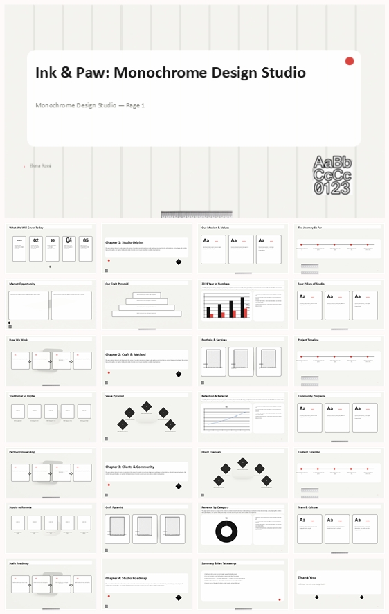
Why this philosophy fits the thumbnail: the thumbnail uses an off-white surface, bold black typography, thin grid lines, a type specimen card, and a single red dot. The design concept extends that language into a full system. The philosophy guides color, elements, layout, and typography toward clarity and rigor.
2. Color System
Why this color system: monochrome plus one accent is a classic design-studio signal. It says the work is about structure and typography, not decoration.
Color psychology: off-white suggests paper and honesty; black signals authority and precision; grey adds calm; red brings a single point of decision and energy.
Primary palette: off-white #F4F4F0, black #111111, light grey #D9D9D9.
Secondary palette: mid-grey #8A8A8A, pale grey #EFEFEF.
Accent palette: red #D32F2F.
Color pairing logic: high contrast between black and off-white, with grey for secondary information. Red appears only on the most important accent.
Proportion: 80% off-white and black, 15% grey, 5% red.
Background-to-foreground layering: backgrounds stay flat off-white. Content sits on white or off-white rounded cards with thin black outlines. Red is used sparingly for dots, arrows, or key numbers.
Contrast and accessibility: black on off-white meets WCAG AA. Body text uses dark grey on off-white.
Semantic use: titles in black; body text in dark grey; red for emphasis, page numbers, or call-to-action dots.
How the palette supports the theme: it keeps the deck visually quiet so typography and data stand out. The single red accent creates a memorable signature.
3. Visual Elements
Why these elements: the thumbnail uses type specimen cards, grid frames, ruler lines, geometric blocks, and a red dot. These are the tools of a monochrome studio.
Illustration style: none. Typography is the hero. Icons are minimal black line drawings.
Mascot direction: no mascot. The cat in the name is suggested through a small paw or type detail, but the visual system stays typographic.
Iconography: consistent 2px black stroke. Icons include letter T, fountain pen, color swatch, drafting compass, star, grid matrix.
Shape language: rectangles, circles, diamonds, plus marks. Rounded corners only on content cards.
Texture and materiality: flat, clean, paper-like. No gradients, no shadows.
Decorative elements: red dot, plus marks, ruler ticks, thin grid lines.
Repetition and rhythm: every slide uses the same grid, the same margins, the same type scale. Section dividers use large numbers and a single red accent.
How elements improve comprehension: the grid makes information predictable. The monochrome palette reduces noise. The red accent directs attention.
4. Layout & Typography
Why this layout and typography: a Swiss grid is the clearest way to organize a design studio’s story. It is rigorous, flexible, and timeless.
Grid system: 12 columns, thin visible grid lines, 24px gutters, 60px side margins.
White space strategy: at least 35% of each slide is empty. Cards have generous internal padding.
Visual hierarchy: headline at 44pt, subhead at 28pt, body at 16pt, caption at 11pt. Page numbers at 10pt in grey.
Reading flow: top-left to bottom-right. Key numbers and red accents placed on the left or center.
Font pairing: headings in a bold grotesque sans (Helvetica Now, Inter, or Neue Haas). Body in a regular grotesque sans.
Type scale: H1 44pt / 1.1 line height; H2 32pt / 1.2; H3 24pt / 1.3; Body 16pt / 1.6; Caption 11pt / 1.4.
Weight and spacing: headings 700 weight; body 400. Letter spacing tight for headlines, normal for body.
Consistency rules: all text left-aligned. All cards same corner radius (8px). All lines same weight.
How layout improves retention: the grid creates a predictable rhythm. The typographic hierarchy ensures the viewer always knows what matters most.
5. Design Goal
Design goals: present the studio as disciplined, systematic, and client-ready. Show portfolio quality, process, and growth without visual noise.
Why these goals fit: design clients want proof of system thinking. A monochrome deck demonstrates that the studio can build and follow a visual grammar.
Intended emotional impact: trust, calm, sophistication.
Communication objectives: highlight $5.9M revenue, 96 active clients, 84% retention, and the studio’s service lines.
Desired audience response: clients feel confident hiring the studio; partners see a reliable collaborator; peers respect the craft.
How design balances aesthetics and message: the monochrome system is beautiful because it is restrained. The red accent prevents monotony. The grid keeps data readable.
6. Design Principles and Consistency Checklist
Key principles: monochrome base, one red accent, Swiss grid, typographic hierarchy, no decoration without purpose, consistent margins, same corner radius, same line weight.
Reusable rules: color — off-white, black, grey, one red. Elements — type specimen, grid frame, ruler line, diamond block, red dot, plus mark. Typography — bold grotesque headlines, regular grotesque body. Layout — 12-column grid, left-aligned, generous white space.
Conclusion: This design system turns a studio presentation into a demonstration of the studio’s own craft. It uses monochrome discipline and one red accent to create clarity, confidence, and memorability. The grid is not just a layout; it is the message.
Article + Bundle Download