







 Note Wisdom
Winter Camp Fun: A Cozy Snowy Adventure
This design concept transforms a winter camp presentation into a cozy snow-globe storybook. Using frosty blues, warm rose accents, snowmen, and child mascots, it balances clear camp information with magical winter charm. The card-based layout keeps parent
- Download this PPT
- Commercial use (1 project)
- Present publicly
1. PPT Title
Winter Camp Fun: A Cozy Snowy Adventure
2. Design Concept
Core Design Philosophy
“Warm Winter Wonderland.” The deck transforms a winter camp presentation into a cozy, magical storybook adventure. It balances the cool calm of a snowy landscape with the warm energy of friendship, play, and learning. Every slide feels like a safe, cheerful stop inside a snow globe—organized enough for parents and staff, playful enough for children.
Emotional Tone and Narrative Direction
The emotional tone is cheerful, cozy, magical, and inclusive. The narrative direction moves from a warm welcome into camp activities, safety, daily rhythms, and celebration. The deck should feel like sitting by a campfire while snow falls outside: structured, comforting, and full of wonder.
1. Main Design Philosophy
Core idea, thought, and creative approach:
Use a “snow globe storybook” approach. The presentation is a contained, magical world where every card is a new discovery. The design combines soft winter pastels, rounded shapes, cute mascots, and clear card-based organization to make camp information feel inviting rather than administrative.
Main design concept and conceptual metaphor:
“The Campfire Snow Globe.” The snow globe represents a safe, self-contained winter camp experience. Inside, children play, learn, and make friends. The glass exterior is the calm blue background; the warm interior is the pink, red, and yellow accents. Each slide shakes the globe to reveal a new camp moment.
Narrative direction and emotional tone:
Welcome → camp overview → activities → safety → reflection → celebration. The tone stays warm, encouraging, and gently energetic. It never feels cold or institutional.
Audience insight and intended perception:
The audience includes parents, camp counselors, and young campers. Parents need clear logistics and safety information; children need excitement and emotional connection; staff need a polished, reusable template. They should perceive the deck as trustworthy, imaginative, and child-centered.
Why this philosophy fits the thumbnail style, topic, and audience:
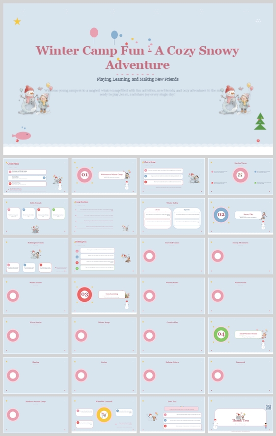
The thumbnail uses light blue winter skies, snowmen, children in winter clothes, pink/red badges, balloons, and soft rounded cards. These are storybook and snow-globe motifs. The topic is a winter camp—playful, seasonal, and emotional. The audience needs warmth and clarity. This philosophy directly explains the thumbnail’s visual DNA.
How the design idea guides color, elements, layout, and typography:
It drives a frosty blue background, white content cards, rose-pink and coral-red accents, golden highlights, and navy text. Elements include snowmen, children, snowflakes, pine trees, balloons, and winter icons. Layout stays modular and airy. Typography pairs a cozy serif for headings with a rounded sans-serif for body text.
2. Color System
Why this color system was chosen:
Winter themes can feel cold or sterile. This palette uses frosty blue as a calm base, then adds warm rose, coral, and golden yellow to create emotional warmth. It mirrors the thumbnail’s balance of snowy atmosphere and child-friendly energy.
Color psychology and emotional meaning:
-
Frosty Blue: calm, trust, winter freshness, safety.
-
Crisp White: snow, clarity, simplicity, breathing room.
-
Rose Pink: warmth, friendship, kindness, childhood joy.
-
Coral Red: energy, celebration, attention, camp spirit.
-
Golden Yellow: optimism, campfire glow, highlights.
-
Soft Navy: authority, readability, structure.
Primary palette:
-
Frosty Blue #D6E6F5 – background
-
Crisp White #FFFFFF – cards, snow, text blocks
-
Rose Pink #F4A6B8 – section badges, accents, headings
Secondary palette:
-
Coral Red #F28B82 – CTAs, numbers, emphasis
-
Soft Navy #2C3E50 – body text, subtitles
-
Golden Yellow #F9D976 – highlights, stars, warm accents
Accent palette:
-
Balloon Blue #A2D2FF – decorative balloons
-
Mint #B8E0D2 – winter icon fills
-
Snow White #F8FBFF – snowflake details
-
Pine Green #7CB342 – trees, nature accents
Color pairing logic and harmony:
Cool blues and white create a calm winter base. Rose pink and coral red provide warm complementary contrast. Golden yellow bridges the two temperature zones. The palette remains pastel, low-saturation, and high-brightness.
Color proportion and balance:
-
60% Frosty Blue background
-
20% Crisp White cards
-
10% Rose Pink / Coral Red accents
-
5% Golden Yellow highlights
-
5% Soft Navy text and icons
Background-to-foreground layering strategy:
Frosty blue is the base canvas. White rounded cards float above with soft shadows. Pink and coral circle badges sit on top of cards. Snowmen, children, and snowflakes appear as decorative foreground elements. Golden yellow is reserved for small highlights.
Contrast, readability, and accessibility:
Soft Navy on White gives excellent contrast for body text. Rose Pink and Coral Red are used for large headings, numbers, and badges—not for small body copy. Golden Yellow is decorative and never carries critical information alone. The deck remains readable for color-vision differences.
Semantic use of color across titles, body text, icons, and highlights:
-
Rose Pink / Coral Red: slide titles, section numbers, primary CTAs.
-
Soft Navy: body text, descriptions, captions.
-
Golden Yellow: stars, highlights, positive reinforcement.
-
Frosty Blue: background, winter atmosphere.
-
White: content containers, readability zones.
-
Pine Green: nature, trees, outdoor motifs.
How the palette supports the theme, audience, and visual hierarchy:
It keeps the deck wintery but not cold, child-friendly but not chaotic. The hierarchy is immediately clear: pink/red title → white card → navy body → yellow highlight.
3. Visual Elements
Why these visual elements were chosen:
They create instant emotional recognition and seasonal charm. A winter camp deck can feel generic; snowmen, children, and snowflakes make it feel like a specific, magical adventure.
Illustration style and mascot direction:
Flat vector illustrations with rounded edges, soft cheeks, and simple geometry. Mascots include a friendly snowman, a young girl in a winter coat, a young boy with a scarf, and small winter animals. They are consistently placed as guides. The illustration style is childlike but not babyish—polished enough for parents and staff.
Iconography style, stroke consistency, and corner treatment:
Icons use a 2px stroke, rounded caps, and minimal detail. They are enclosed in soft circular backgrounds. Common icons include snowflakes, scarves, mugs, skis, snowshoes, campfires, gifts, and pine trees.
Shape language and geometric motifs:
Circles for badges and snowflakes. Rounded rectangles for cards. Soft hills and wavy snow lines. No sharp angles. The shape language is organic, safe, and playful.
Texture, materiality, and lighting atmosphere:
Flat digital surfaces with subtle drop shadows on white cards. No heavy gradients or paper texture. The atmosphere is bright, clean, and gently magical—like a fresh snowfall.
Decorative elements and framing devices:
-
Snowflake clusters and falling snow dots.
-
Balloons in pink, blue, and yellow.
-
Pine trees and snowy hills.
-
Pink and red circular badges with numbers 01–04.
-
Snowmen and child mascots in corners or beside content.
-
Dotted lines and soft connector shapes.
Repetition, rhythm, and visual consistency rules:
Snowflake motifs appear on every slide. White cards use the same corner radius. Badges use the same size and shadow. Mascots appear on at least 60% of slides. The pink/red/yellow accent rhythm repeats without overwhelming.
How each element improves comprehension, engagement, and brand recognition:
Snowflakes and cards create a calm, scannable frame. Badges organize the camp into clear stages. Mascots increase emotional engagement. The repeating winter motifs make the deck instantly recognizable and shareable.
4. Layout & Typography
Why this layout and typography system was chosen:
Parents and staff need to follow camp information without visual stress. The layout uses modular cards and generous white space. Typography pairs a cozy serif for storybook warmth with a rounded sans-serif for screen readability.
Grid system and alignment logic:
A 12-column modular grid with consistent margins. Content sits inside white cards that align to the grid. Text is left-aligned inside cards for a clean reading edge.
White space strategy and visual breathing room:
Each card uses 24px internal padding. Gutters between cards are 16px. At least 30% of each slide remains open frosty-blue background. This prevents cognitive overload and preserves the snowy atmosphere.
Visual hierarchy and focal point planning:
The eye first lands on the slide title or section badge, then moves to the white card content, then to supporting icons and mascots. The snowman or child mascot acts as a secondary focal point.
Reading flow and eye-path direction:
Standard Z-pattern: top-left title → top-right badge → middle cards left-to-right → bottom conclusion or reflection prompt.
Font pairing and type scale:
-
Headings: Lora or Playfair Display (Bold, Serif) – adds storybook warmth.
-
Body: Nunito Sans or Quicksand (Regular, Rounded Sans-serif) – highly readable on screens.
-
Title: 44pt, bold serif, rose pink or coral red.
-
Section number: 36pt, bold serif, white on pink/red circle.
-
Subtitle: 24pt, semibold sans-serif, soft navy.
-
Card heading: 20pt, semibold sans-serif, soft navy.
-
Body: 16pt, regular sans-serif, soft navy, 1.5 line height.
-
Caption/label: 12pt, regular sans-serif, all caps with 0.05em tracking.
Weight, spacing, line height, and readability standards:
Headings use bold. Body uses regular. No paragraph exceeds 4 lines inside a card. Line height is 1.5. Letter spacing remains default for body text.
Consistency rules across all pages:
Same card radius (20px), same shadow, same badge style, same mascot placement logic. Font sizes do not deviate. Pink/red is reserved for titles and numbers; navy for body text.
How the layout improves clarity, rhythm, and information retention:
The card system chunks information into digestible pieces. Repeating badges create rhythm. Parents can quickly find and remember key camp details.
5. Design Goal
State the design goals clearly:
Create a magical, organized, and emotionally warm winter camp presentation that informs parents, excites children, and gives staff a polished, reusable template.
Explain why these goals are appropriate for the audience and context:
Parents need clear logistics, safety, and schedule information. Children need anticipation and joy. Staff need a professional but approachable design. A winter camp is emotional and seasonal, so the deck must balance information delivery with storybook charm.
Intended emotional impact:
Joy, trust, coziness, anticipation, and belonging.
Communication objectives:
Share camp activities, daily schedule, safety guidelines, learning objectives, packing lists, and celebration plans.
Desired audience behavior or response:
Parents should feel confident enrolling their children. Children should feel excited to attend. Staff should feel proud to present.
How the design balances aesthetics, readability, and message delivery:
Soft winter colors and cute illustrations provide aesthetic appeal. White cards and navy text ensure readability. The modular grid and badge system deliver the message clearly.
6. Design Principles and Consistency Checklist
Key principles to keep the deck visually coherent:
-
Cozy winter wonderland: soft blues, warm pink/red, snow motifs.
-
Storybook structure: white cards, rounded shapes, friendly mascots.
-
Consistent rhythm: repeating badges, snowflakes, and card layouts.
-
Accessible warmth: navy text on white; pink/red for large headings only.
Reusable rules for color, elements, typography, and layout:
-
Color rule: Background always Frosty Blue #D6E6F5. Cards always White #FFFFFF. Body text always Soft Navy #2C3E50. Titles always Rose Pink #F4A6B8 or Coral Red #F28B82.
-
Element rule: Snowflake motif on every slide. White rounded cards with 20px radius. Pink/red circle badges with numbers. Snowman or child mascot on at least 60% of slides.
-
Typography rule: No more than two font families. Serif headings, rounded sans body. Body text never smaller than 16pt.
-
Layout rule: 12-column grid. 24px card padding. 16px gutters. Left-align text inside cards.
-
Consistency rule: Every slide must pass the “squint test”—the hierarchy should be obvious even when blurred.
Conclusion
This design concept turns a winter camp presentation into a cozy, magical snow-globe adventure. Using frosty blue backgrounds, white cards, rose-pink accents, snowmen, children, and winter icons, it creates a safe and joyful atmosphere. The card-based layout and accessible typography keep parents informed while preserving the wonder of a snowy camp experience. The result is a deck that celebrates playing, learning, and making new friends.
Winter_Camp_Fun_-_A_Cozy_Snowy_Adventure
Article + Bundle Download