







 Note Wisdom
Little Fresh Classroom: Sweet Learning
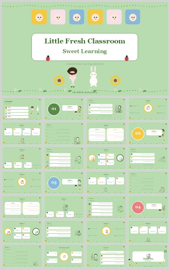
A gentle garden-themed design concept for early childhood classrooms. It uses soft green, white rounded cards, a girl and rabbit mascot, and cheerful accents to create an organized, sweet, and highly readable learning experience for teachers, parents, and
- Download this PPT
- Commercial use (1 project)
- Present publicly
Design Concept (Expanded, Fine-Grained, and Rationale-Driven)
1. Main Design Philosophy
Core Idea and Creative Approach: “Cultivated Sweetness.” The deck treats early learning as a gentle garden where every child grows at their own pace. It combines the emotional warmth of a storybook with the practical structure of a teacher’s planning tool.
Main Design Concept and Conceptual Metaphor: The visual metaphor is “A Sweet Garden of Learning.” The soft green background becomes a calm meadow; white rounded cards become clean planting beds for ideas; the girl in the pink dress and the white rabbit become friendly guides; sunflowers, ladybugs, and dotted lines become signs of growth and discovery.
Narrative Direction and Emotional Tone: The narrative moves from a warm welcome into four structured learning chapters, then closes with reflection and gratitude. The emotional tone is calm, cheerful, tender, and organized. It should feel sweet enough for children and clear enough for adults.
Audience Insight and Intended Perception: The audience includes preschool teachers, kindergarten educators, and parents. They need to perceive the deck as trustworthy, easy to present, and visually engaging for young learners. They should feel that the content is gentle, organized, and ready to use.
Why This Philosophy Fits the Thumbnail Style, Topic, and Audience: The thumbnail uses pastel green, rounded white title boxes, cute characters, small flower icons, dotted borders, and soft colored accents. That combination says “sweet” and “structured” at the same time. This philosophy turns that visual duality into a communication strategy: delight the child, reassure the adult.
How the Design Idea Guides Color, Elements, Layout, and Typography: The garden metaphor dictates a soft green and white palette, friendly mascots, rounded shapes, a strict card grid, and readable typography. Every decorative choice supports growth and warmth; every structural choice supports clarity and reuse.
2. Color System
Why This Color System Was Chosen: Early childhood content needs visual warmth without chaos. This palette keeps the background calm and natural while using soft accent colors for joy, wayfinding, and section identity.
Color Psychology and Emotional Meaning:
Soft Sage Green (#D9EAD3): Growth, calm, freshness, and safety. It creates a gentle meadow-like backdrop that reduces visual stress.
Pure White (#FFFFFF): Clarity, cleanliness, and focus. White rounded cards make text highly legible and separate information into calm zones.
Deep Forest Green (#2E4A3A): Stability, nature, and authority. Used for primary headings and important text.
Warm Charcoal (#3A3A3A): Readability and softness. Used for body text so it is easier on the eyes than pure black.
Blush Pink (#F8BBD0): Sweetness, affection, and section 01 or 03 wayfinding.
Baby Blue (#AEC6CF): Trust, lightness, and calm section markers.
Lemon Yellow (#FFF59D): Happiness, energy, and small highlights.
Sunflower Gold (#F4C542): Warmth and attention. Used for flowers and cheerful accents.
Soft Red (#E57373): Tiny ladybug accents and playful decorative details only.
Primary Palette: Soft Sage Green for backgrounds; Pure White for content cards and focal containers.
Secondary Palette: Deep Forest Green for headings; Warm Charcoal for body text.
Accent Palette: Blush Pink, Baby Blue, Lemon Yellow, Sunflower Gold, and Soft Red for numbered badges, icons, flowers, and small decorations.
Color Pairing Logic and Harmony: Deep Forest Green on white and white on sage green both provide strong readability. Soft accents are used sparingly so they guide the eye without overwhelming the calm garden mood.
Color Proportion and Balance: 60% Soft Sage Green background, 30% Pure White cards, 10% Deep Forest Green, Warm Charcoal, and accent colors combined.
Background-to-Foreground Layering Strategy: The sage green background sits at the back. White rounded cards float above it with subtle shadows. Mascots, flowers, ladybugs, and dotted lines sit on the top layer to frame content.
Contrast, Readability, and Accessibility: Deep Forest Green and Warm Charcoal on white exceed WCAG AA contrast standards. Accent colors are never used for long body text. White text on sage green is limited to large headings or short labels.
Semantic Use of Color Across Titles, Body Text, Icons, and Highlights: Sage green = theme and calm; white = actionable content; deep green = headings; charcoal = reading text; pink, blue, and yellow = section markers and playful highlights; red = tiny decorative details only.
How the Palette Supports the Theme, Audience, and Visual Hierarchy: It feels like a fresh classroom garden. It keeps children visually engaged while helping adults scan information quickly.
3. Visual Elements
Why These Visual Elements Were Chosen: They create instant recognition of “sweet learning” while preserving a professional, template-ready structure.
Illustration Style and Mascot Direction: The mascots are a cute girl in a pink dress and a soft white rabbit. The style is flat vector, rounded, gentle, and minimal. They appear in different poses to act as friendly learning companions.
Iconography Style, Stroke Consistency, and Corner Treatment: Icons use a thin-line, rounded-cap style with consistent stroke weight. Corners are rounded. Icons represent classroom themes such as books, stars, flowers, checklists, and growth.
Shape Language and Geometric Motifs: Rounded rectangles form all content cards. Circles form numbered section badges and icon backgrounds. Small squares with cute faces appear as learning blocks or student avatars. Sharp corners are avoided.
Texture, Materiality, and Lighting Atmosphere: The design is flat and matte. There are no glossy gradients. Soft drop shadows on white cards create gentle depth, like paper cutouts in a storybook.
Decorative Elements and Framing Devices: Dotted lines, small flowers, sunflowers, ladybugs, tiny stars, and simple garden shapes frame the content. These elements add rhythm and reinforce the “garden of learning” metaphor.
Repetition, Rhythm, and Visual Consistency Rules: The girl and rabbit mascots appear on every slide. White rounded cards repeat across all content pages. Numbered badges repeat in the same position. Decorative flowers and dotted lines maintain a steady visual rhythm.
How Each Element Improves Comprehension, Engagement, and Brand Recognition: The mascots build emotional connection. Icons speed up scanning. Repeated card layouts reduce cognitive load. The garden details make the deck feel cohesive and memorable.
4. Layout & Typography
Why This Layout and Typography System Was Chosen: Early childhood content must be easy to present and easy to follow. A strict grid with large white cards keeps information digestible, while gentle typography keeps the mood sweet.
Grid System and Alignment Logic: A 12-column grid underlies every slide. Content sits inside centered white rounded cards. Text is left-aligned for readability; headings are centered on the cover and section dividers. Margins remain generous at about 5–8% of slide width.
White Space Strategy and Visual Breathing Room: White space is high. The sage green background acts as visual rest between white cards. Internal card padding stays at least 24 px so decorations never overwhelm the learning content.
Visual Hierarchy and Focal Point Planning: Each slide has one primary focal point: a large white card, a numbered section badge, or a mascot illustration. Supporting text sits below or beside it.
Reading Flow and Eye-Path Direction: The eye moves from the top-left title to the central card, then left-to-right through bullet points. Section badges act as page anchors.
Font Pairing and Type Scale:
Headings: A warm serif font such as Playfair Display or Georgia in Deep Forest Green.
Body Text: A rounded geometric sans-serif such as Nunito or Quicksand in Warm Charcoal or Deep Forest Green.
Type Scale: Main title 44 pt bold; section headers 28 pt medium; body text 16 pt regular; captions and labels 12 pt regular.
Title, Subtitle, Body, Caption, and Label Hierarchy: The title is largest and centered on the cover. Subtitles are smaller and softer in color. Section headers are serif and dark green. Body text is sans-serif and highly readable. Captions and labels are small and used for details only.
Weight, Spacing, Line Height, and Readability Standards: Headings use bold or medium weight. Body text uses regular weight with 1.5 line height and slight letter spacing. Text blocks stay under 50 words per card.
Consistency Rules Across All Pages: Mascot positions vary but stay within a consistent zone. Cards are always rounded. Colors follow the four-section system. Icons keep the same stroke width. No sharp corners.
How the Layout Improves Clarity, Rhythm, and Information Retention: The rigid grid makes the deck predictable. White cards separate ideas. Repeating mascots and garden details create rhythm. Adults can present without reading dense paragraphs, while children enjoy the gentle visuals.
5. Design Goal
Design Goals: To create a sweet, organized, and immediately usable classroom presentation. It should help teachers and parents present lessons, routines, and learning goals without missing key steps.
Why These Goals Are Appropriate for the Audience and Context: Preschool teachers and parents often plan under time pressure. A cute but structured template reduces stress and makes preparation feel like part of the learning adventure.
Intended Emotional Impact: Calm, confidence, warmth, and joy. The audience should feel that the classroom is a safe and happy place to grow.
Communication Objectives: Clearly convey learning activities, daily routines, developmental goals, and classroom values. Keep information scannable and visually supportive.
Desired Audience Behavior or Response: Users should feel motivated to customize the deck, follow the learning sequence, and share it with co-teachers or families. Children should feel welcomed when they see the slides.
How the Design Balances Aesthetics, Readability, and Message Delivery: Decorative elements create delight, but they never cover text. White cards protect readability. Color is used for navigation and emphasis, not random decoration. The result is a sweet classroom deck that still works as a practical teaching tool.
6. Design Principles and Consistency Checklist
Key Principles to Keep the Deck Visually Coherent:
Keep the garden metaphor gentle and consistent.
Use the girl and rabbit mascots as friendly guides, not distractions.
Place every content block inside a rounded white card.
Use color to segment sections, not to decorate randomly.
Reusable Rules for Color, Elements, Typography, and Layout:
Color: Limit each slide to sage green, white, deep green, charcoal, plus one or two soft accents.
Elements: Mascots appear on every slide. Flowers, ladybugs, and dotted lines support the theme. Icons must use the same stroke width and rounded caps.
Typography: Serif for headings, sans-serif for body. Never use more than three font sizes per slide. Body text stays at 16 pt or larger.
Layout: Maintain a 1-inch safe margin. Align all cards to the grid. Use consistent corner radius and shadow depth. No text outside cards except titles and short labels.
Consistency Check: Before finalizing, verify that all color hex codes match, all icons use the same stroke width, all corners are rounded, and all shadows have the same soft depth.
Conclusion
This design concept transforms the sweet, garden-like thumbnail into a complete, reusable presentation system. By pairing a soft sage green background with clean white cards, a gentle girl-and-rabbit mascot duo, and cheerful garden details, the deck feels like a fresh classroom adventure yet remains highly organized. It serves preschool teachers, kindergarten educators, and parents who need both emotional warmth and practical structure. Every visual choice supports the “Sweet Learning” theme while keeping information readable, scannable, and ready to use.
Article + Bundle Download