







 Note Wisdom
Playful Pastel Education & Learning Presentation Deck
A comprehensive design concept for a pastel cartoon teaching template, focusing on engaging visual systems, color psychology, and layout strategies to create an approachable educational experience. This guide details how to balance playful aesthetics with
- Download this PPT
- Commercial use (1 project)
- Present publicly
1. Main Design Philosophy
-
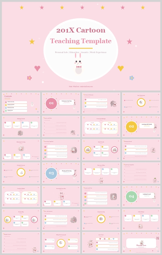
Core Idea & Creative Approach: The design is built on the concept of "Gentle Pedagogy." It treats education as a nurturing, safe, and joyful experience rather than a rigid, corporate task. The creative approach uses a "card-based UI" metaphor, translating digital app interfaces into a physical presentation format to make information feel modular, digestible, and interactive.
-
Conceptual Metaphor & Narrative Direction: The visual narrative mimics a welcoming kindergarten classroom. The mascot (a small white rabbit) acts as a friendly guide, leading the audience through the lesson. The narrative is warm, encouraging, and celebrates small milestones (indicated by the prominent "01, 02, 03" circular badges).
-
Audience Insight & Intended Perception: Designed for educators, students, and parents in early childhood or primary education. The audience should perceive the content as approachable, trustworthy, and easy to understand. It removes the intimidation of complex subjects by wrapping them in a soft, friendly aesthetic.
-
Why This Philosophy Fits: The thumbnail's use of pastel colors, excessive white space, and cute illustrations clearly signals a non-threatening, educational context. The philosophy dictates the use of soft containers, consistent alignment, and a blend of serif elegance with sans-serif friendliness, ensuring the design feels both professional and heartwarming.
2. Color System
-
Why This Color System Was Chosen: To evoke feelings of safety, warmth, and creativity. Pastel colors are proven to reduce anxiety and promote cognitive openness, making them ideal for learning environments.
-
Color Psychology & Emotional Meaning:
-
Primary Palette: Pastel Pink (#FADADD) and Soft White (#FFFFFF). Pink represents care, affection, and nurturing. White provides a clean canvas, ensuring the content breathes.
-
Secondary Palette: Muted Teal (#7DB0B0) and Warm Grey (#7A7A7A). Teal acts as a calming agent and a complementary contrast to the pink, while warm grey ensures text readability without the harshness of pure black.
-
Accent Palette: Lemon Yellow (#F9E076) and Coral Orange (#F5A69D). Yellow represents energy, optimism, and attention (used for stars and highlights). Coral adds a pop of playful vitality (used for subheadings or interactive cues).
-
-
Color Pairing Logic & Harmony: The palette relies on an analogous harmony (pink and coral) balanced by a split-complementary neutral (teal). This creates visual interest without causing eye strain.
-
Color Proportion & Balance: 60% Soft White/Pastel Pink backgrounds (dominant), 30% Muted Teal/Warm Grey for text and structural elements (secondary), 10% Yellow/Coral for accents and focal points (accent).
-
Background-to-Foreground Layering: The background uses a flat pastel pink. The foreground uses pure white rounded rectangles (cards) with soft drop shadows. This creates a distinct "layered paper" effect, giving the presentation a tactile, 3D feel without clutter.
-
Contrast, Readability & Accessibility: Text uses Warm Grey on White or Dark Teal on White, ensuring WCAG AA contrast ratios. Pastel Pink is never used for body text to avoid low contrast.
-
Semantic Use of Color: Titles use Dark Teal for authority. Body text uses Warm Grey for comfort. Accent colors (Coral/Yellow) are reserved exclusively for actionable items, highlights, and decorative stars to guide the eye.
3. Visual Elements
-
Why These Elements Were Chosen: To maintain a cohesive "storybook" aesthetic that keeps the audience engaged and visually rewarded.
-
Illustration Style & Mascot Direction: The mascot is a minimalist, flat-vector white rabbit with simple dot eyes and a soft pink bow tie. It is designed to be neutral and non-threatening, appearing in corners or within badges to add personality without distracting from the core message.
-
Iconography Style: Icons feature a consistent 2px stroke width with fully rounded caps and corners. They are filled with soft pastel colors (light yellow, pale blue) to match the overall softness. This consistency reduces visual friction.
-
Shape Language & Geometric Motifs: Dominant shapes are circles (badges, profile pictures) and rounded rectangles with a generous corner radius (16px-24px). There are no sharp angles, reinforcing the soft, safe environment.
-
Texture, Materiality & Lighting: The design is completely flat vector style. The "materiality" comes from subtle, diffused drop shadows on the cards, simulating a slight elevation above the pink background.
-
Decorative Elements & Framing Devices: Elements like five-pointed stars, small hearts, and tiny flowers are scattered rhythmically around titles and margins. These act as visual "confetti," celebrating the learning process.
-
How Each Element Improves Engagement: The rabbit creates an emotional bond. The rounded cards make information feel like approachable "chunks." The scattered stars provide a sense of playfulness, encouraging the audience to view the presentation as an enjoyable activity.
4. Layout & Typography
-
Why This Layout & Typography System Was Chosen: To create a highly organized, easily scannable structure that supports both visual storytelling and dense educational content.
-
Grid System & Alignment Logic: A strict 12-column grid system is used. Content is placed within modular cards that align perfectly to the grid. Margins are generous (at least 5% of the slide width) to ensure a clean edge and prevent clutter.
-
White Space Strategy: White space is treated as a functional element, not empty space. It surrounds the cards, separates sections, and provides "visual breathing room," allowing the audience's eyes to rest between information points.
-
Visual Hierarchy & Focal Point Planning: The eye is led by scale and color. The largest element is the title, followed by the section number (01, 02), then the card headers. Accent colors and the mascot act as secondary focal points.
-
Reading Flow & Eye-Path Direction: The layout follows a standard "Z-pattern" or "F-pattern" reading flow, depending on the slide type. Cover slides use a central focal point. Content slides use a top-left to bottom-right flow, guided by the numbering system.
-
Font Pairing & Type Scale:
-
Titles: Playfair Display (or similar serif) – adds elegance and a classic educational feel.
-
Body & UI: Poppins or Nunito (rounded sans-serif) – maximizes readability and matches the friendly tone.
-
-
Title, Subtitle, Body, Caption Hierarchy: Title (36-44pt, Bold, Dark Teal), Subtitle (24-28pt, Medium, Coral), Body (16-18pt, Regular, Warm Grey), Caption (12-14pt, Light, Muted Teal).
-
Weight, Spacing, Line Height & Readability: Headings use bold weights and tight line heights (1.2). Body text uses regular/light weights with generous line heights (1.5) and letter spacing (0.5px) for maximum legibility on screens.
5. Design Goal
-
State the Design Goals Clearly: To create a visually stunning, highly functional, and emotionally resonant educational presentation template.
-
Why These Goals Are Appropriate: The target audience (educators and young learners) responds best to environments that feel safe, organized, and visually stimulating but not overstimulating. The soft pastels and modular layout achieve this balance.
-
Intended Emotional Impact: The audience should feel calm, curious, and encouraged. The design aims to lower the "affective filter" (anxiety) associated with learning new concepts.
-
Communication Objectives: To deliver educational content clearly and systematically, ensuring that complex information is broken down into digestible, visually distinct modules.
-
Desired Audience Behavior/Response: The audience should feel engaged, follow the numbered steps easily, and retain the information due to the clear visual hierarchy.
-
Balancing Aesthetics, Readability, and Message Delivery: By using a soft color palette and playful elements, the design captures attention. By using high-contrast text and a strict grid, it ensures the message is never compromised by the aesthetics. The design serves the content, not the other way around.
6. Design Principles and Consistency Checklist
-
Key Principles:
-
Softness Over Sharpness: Always use rounded corners and soft shadows.
-
Rhythmic Playfulness: Use decorative elements consistently but sparingly.
-
Clarity First: Ensure text contrast is always prioritized.
-
-
Reusable Rules for Color: Never introduce colors outside the defined palette. Use accent colors (Yellow/Coral) only for 10% of the visual area.
-
Reusable Rules for Elements: All icons must have the same stroke width and corner radius. The mascot should appear on at least 50% of the slides to maintain narrative continuity.
-
Reusable Rules for Typography: Never use more than two font families. Always maintain a minimum of 1.5 line spacing for body text.
-
Reusable Rules for Layout: Never break the grid. Maintain consistent margins and card padding (e.g., 24px internal padding for all cards).
Conclusion
This design concept transforms a standard educational presentation into a delightful, story-driven experience. By leveraging a meticulously crafted pastel color system, a friendly mascot, and a modular card-based layout, the template achieves a rare balance of professional structure and playful warmth. It respects the audience's need for clarity while nurturing their curiosity, making it an exceptional tool for modern educators.
Article + Bundle Download