







 Note Wisdom
202X Cartoon Teaching Template: Personal Info, Education, Awards, Work Experience
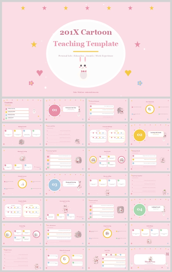
This pastel pink cartoon teaching template uses a cute rabbit mascot and soft rounded cards to create a nurturing educational environment. It offers a structured, visually precise design system that balances playful aesthetics with high readability, makin
- Download this PPT
- Commercial use (1 project)
- Present publicly
1. PPT Title
201X Cartoon Teaching Template: Personal Info, Education, Awards, Work Experience
2. Design Concept (Expanded, Fine-Grained, and Rationale-Driven)
Core design philosophy: "Soft-Touch Pedagogy & Whimsical Structure" – Creating a visually soothing, highly organized, and inherently joyful educational template that lowers cognitive load for young learners while maintaining professional credibility for educators.
Emotional tone and narrative direction: Warm, nurturing, playful, and approachable. The narrative frames the educational journey as a series of gentle, delightful milestones guided by a friendly companion.
1. Main Design Philosophy / 主要设计理念
-
Core idea, thought, and creative approach: The design revolves around "softness as a communication tool." Instead of harsh lines and rigid corporate layouts, it uses rounded shapes, pastel tones, and a friendly mascot to convey safety, warmth, and creativity.
-
Main design concept and conceptual metaphor: "The Classroom as a Cozy Playground." The layout mimics physical flashcards or building blocks, suggesting that learning is tangible, playful, and structurally simple.
-
Narrative direction and emotional tone: The deck tells a story of growth. The recurring rabbit mascot acts as a silent guide, leading the viewer from one topic to another with a consistent, gentle smile.
-
Audience insight and intended perception: Designed for early childhood educators, student teachers, or parent-teacher presentations. The audience perceives the content as accessible, non-intimidating, and thoroughly organized.
-
Why this philosophy fits the thumbnail style, topic, and audience: The pastel pink and white color scheme combined with cartoon elements directly aligns with early childhood education. It signals to the viewer that the information will be easy to digest and visually appealing, reducing anxiety for both presenters and their audience.
-
How the design idea guides color, elements, layout, and typography: The philosophy dictates a soft color palette (low contrast, warm hues), rounded visual elements (no sharp corners), an airy layout (breathing room), and rounded typography to maintain the friendly, approachable narrative.
2. Color System / 色彩系统
-
Why this color system was chosen: Pastel pink and white are statistically proven to lower heart rates and induce feelings of calm and safety. This is crucial for an educational setting where young minds need a secure environment.
-
Color psychology and emotional meaning: Pink represents nurturing, love, and innocence. White provides clarity, focus, and cleanliness. Soft yellow and mint green accents inject optimism and freshness without overwhelming the senses.
-
Primary palette: Soft Bubblegum Pink (#FADADD) and Blush Pink (#F7C6D9) used for the main background.
-
Secondary palette: Pure White (#FFFFFF) used for content cards, text boxes, and the large title circle.
-
Accent palette: Butter Yellow (#FDE29A), Mint Green (#B5EAD7), and Soft Sky Blue (#C7CEEA) used for stars, icons, dots, and small decorative elements.
-
Color pairing logic and harmony: The combination is analogic with split-complementary accents. The consistent pink background anchors the theme, while the white cards pop out to organize information.
-
Color proportion and balance: 60% Pink (Background/Emotion), 30% White (Content/Clarity), 10% Yellow/Green/Blue (Accents/Attention).
-
Background-to-foreground layering strategy: A solid pink background sits furthest back. White rounded rectangles sit on top to create a clear "paper" layer for content. The mascot and decorative elements sit on a middle layer to create depth without cluttering.
-
Contrast, readability, and accessibility: High contrast is achieved through dark brown/charcoal text (#4A3B3B) on white cards, rather than on the pink background. This ensures text is easily readable while maintaining the soft aesthetic.
-
Semantic use of color across titles, body text, icons, and highlights: White is used to highlight the most important structural elements (title circle, main content boxes). Yellow is used specifically for attention-grabbing icons (stars, dots), creating a visual cue for the eye.
-
How the palette supports the theme, audience, and visual hierarchy: It elevates the "child-friendly" theme instantly without being overly childish, allowing the template to be used for professional teaching portfolios as well.
3. Visual Elements / 视觉元素
-
Why these visual elements were chosen: Cartoon animals and geometric shapes act as emotional anchors. They make abstract concepts (like "learning" or "awards") feel concrete and friendly.
-
Illustration style and mascot direction: A cute, watercolor-style white rabbit wearing a red bow. The mascot is placed strategically to guide the eye, acting as a friendly observer in the corner of slides.
-
Iconography style, stroke consistency, and corner treatment: Icons feature a filled, solid style with extremely rounded corners, perfectly matching the "no sharp edges" philosophy. They are enclosed in soft circular or rounded square backgrounds.
-
Shape language and geometric motifs: Dominant shapes are circles and soft rounded rectangles. Circles represent unity and safety (used for titles and icons). Rounded rectangles represent structure and stability (used for content cards).
-
Texture, materiality, and lighting atmosphere: Flat design with a subtle watercolor/matte finish. There are no harsh gradients or drop shadows; instead, depth is created through soft layering and pastel colors.
-
Decorative elements and framing devices: Scattered five-pointed stars, hearts, and simple flower shapes. These act as "visual confetti" to fill empty space and maintain the playful atmosphere.
-
Repetition, rhythm, and visual consistency rules: The same rabbit mascot, star clusters, and circular badges are repeated across every slide. This creates a strong visual rhythm and ensures that no matter which slide is viewed, the viewer instantly recognizes the template's brand identity.
-
How each element improves comprehension, engagement, and brand recognition: The repetitive use of cute elements keeps engagement high for younger audiences. The clear, consistent iconography allows for instant recognition of topics (e.g., a book icon for learning, a star for awards) without needing to read the text first.
4. Layout & Typography
-
Why this layout and typography system was chosen: To manage information overload. The layout breaks down complex information into bite-sized, visually separated blocks. The typography ensures that the text is legible and friendly.
-
Grid system and alignment logic: A strict underlying 12-column grid (or 4x3 grid for content areas) ensures all cards are perfectly aligned. Center alignment is used for titles and hero elements, while left alignment is used for text-heavy content to ensure a natural reading flow.
-
White space strategy and visual breathing room: Generous padding (at least 20-30% margin on all sides) prevents the slides from feeling cramped. White space is treated as an active design element that highlights the content cards.
-
Visual hierarchy and focal point planning: The eye is first drawn to the large circular title area at the top. Secondary focal points are the white content cards. Tertiary focal points are the colorful icons and the mascot in the corners.
-
Reading flow and eye-path direction: The layout directs the eye in a "Z" pattern: Top (Title) -> Left (Image/Icon) -> Right (Text) -> Down to the next row.
-
Font pairing and type scale: A classic Serif font (e.g., Playfair Display or Merriweather) for main titles to add a touch of elegant professionalism. A rounded Sans-Serif font (e.g., Quicksand, Nunito) for body text and UI labels to maintain the friendly, approachable vibe.
-
Title, subtitle, body, caption, and label hierarchy: Titles are bold, large, and dark maroon/charcoal. Subtitles are medium-sized and soft pink. Body text is standard size, dark gray. Captions are small, italicized, and light gray.
-
Weight, spacing, line height, and readability standards: Line height is set to 1.5 for body text to prevent eye fatigue. Letter spacing is slightly increased for headlines to give them room to breathe.
-
Consistency rules across all pages: Headings always sit in the same top-center position. Content cards always have the same corner radius (approx. 20px). Icons always appear in the top-left corner of their respective cards.
-
How the layout improves clarity, rhythm, and information retention: The consistent rhythm of "Title -> Card -> Card" creates a predictable cadence. Viewers can focus on the content rather than trying to figure out where to look next, which dramatically improves information retention.
5. Design Goal
-
State the design goals clearly: To create a teaching template that is visually delightful, structurally flawless, and incredibly easy to customize.
-
Explain why these goals are appropriate for the audience and context: Educators need tools that save them time and make them look good, while young students need visuals that make them feel safe and engaged. This template bridges both needs.
-
Intended emotional impact: Relaxation, joy, curiosity, and confidence.
-
Communication objectives: To clearly communicate educational milestones, personal achievements, and classroom routines without overwhelming the viewer with dense text.
-
Desired audience behavior or response: The audience should feel engaged, smile at the cute mascot, and easily absorb the information presented.
-
How the design balances aesthetics, readability, and message delivery: By confining complex text to white, high-contrast cards and using the pink background purely for emotional atmosphere, the design achieves a perfect balance of form and function.
6. Design Principles and Consistency Checklist
-
Key principles to keep the deck visually coherent: 1. No sharp corners. 2. Pastel-only palette. 3. One mascot per slide maximum. 4. High contrast text on white backgrounds only.
-
Reusable rules for color, elements, typography, and layout: Always use 20px+ corner radius. Use only the defined accent colors for icons. Keep title circles perfectly centered. Never mix more than two font families.
-
Quality-control checklist for consistency and readability: Are all content cards perfectly aligned? Is the text size large enough to be read from the back of a room? Do the colors match the pastel palette? Is the mascot placed in a balanced position without blocking text?
Conclusion
A meticulously crafted, pastel-themed teaching template that masterfully uses soft colors, rounded shapes, and a friendly rabbit mascot to create a nurturing learning environment. By prioritizing visual clarity and emotional safety, it transforms standard educational information into an engaging, memorable, and visually cohesive experience for young learners and educators alike.
Article + Bundle Download