







 Note Wisdom
Minty Watercolor Whiskers: A Minimalist Cat General Presentation Template
This 2018 cute minimalist watercolor template uses a fresh mint-green and white palette, delicate cat illustrations, and clean modular cards to create a calm, focused experience. It balances artistic elegance with structured layouts, making general presen
- Download this PPT
- Commercial use (1 project)
- Present publicly
1. Main Design Philosophy
Core Idea: "Serene Watercolor Storytelling."
Conceptual Metaphor: The presentation is a peaceful, sunlit studio. The watercolor cats act as gentle, artistic muses, guiding the audience through a clean, airy narrative. The mint-green blocks represent calm, structured thinking.
Narrative Direction & Emotional Tone: Soothing, elegant, artistic, and highly organized. The tone avoids aggressive corporate aesthetics and hyperactive cartoons, opting instead for a soft, "editorial watercolor" aesthetic that makes learning or presenting feel like a calm, creative pursuit.
Audience Insight: This design targets educators, creative professionals, trainers, and anyone needing a general-purpose template. It appeals to audiences who value tranquility, artistic elegance, and clear, uncluttered presentation design.
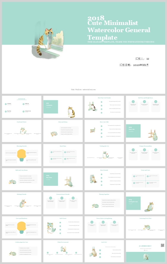
Why This Fits: The thumbnail uses a soft mint-green color palette, delicate watercolor illustrations, and generous white space. This signals a "content-first" design with a gentle touch. The design philosophy directly supports this by prioritizing structure, airy layouts, and emotionally warm, hand-crafted visuals.
How It Guides Decisions: Color stays restricted to mint green, white, and muted watercolor tones. The watercolor cats appear in every section to provide emotional continuity. The layout uses clean, shadowed white cards to organize the content into highly digestible, beautifully structured chunks.
2. Color System
Why This Color System: Mint green and white create a hygienic, fresh, and incredibly calming atmosphere. The muted watercolor tones of the cat illustrations add warmth and artistic authenticity without disrupting the minimalist focus.
Color Psychology & Emotional Meaning: Mint Green = tranquility, growth, health, clarity. Pure White = cleanliness, space, modernism, focus. Soft Grey = neutrality, support, grounding. Muted Watercolor (Brown, Orange, Grey) = warmth, nature, artistic charm.
Primary Palette: Soft Mint Green (#A5D6C5) for top/bottom framing banners, titles, and primary accents. It creates a refreshing, signature brand identity.
Secondary Palette: Pure White (#FFFFFF) for content cards, providing a pristine, maximum-contrast reading surface. Light Grey (#F5F5F5) for the page background, creating a subtle canvas so the white cards pop.
Accent Palette: Muted Watercolor Earth Tones (soft brown, grey, pale orange) exclusively for the cat illustrations. Warm Yellow (#F9A826) for high-priority callouts (like the lightbulb icon). Dark Charcoal (#333333) for optimal readability of body text.
Color Pairing Logic & Harmony: The mint green and white provide a clean, cool base. The warm, muted watercolor earth tones of the illustrations create a beautiful, organic contrast. Charcoal anchors the text to ensure absolute accessibility.
Color Proportion & Balance: 55% Off-White/Light Grey (Background), 25% Pure White (Cards), 15% Mint Green (Banners/Titles), 5% Watercolor Earth Tones and Charcoal (Illustrations/Text).
Background-to-Foreground Layering: Light grey is the base canvas. White cards are the primary reading surfaces. Mint green banners act as top and bottom framing devices. Watercolor illustrations and charcoal text are the foreground focal points.
Contrast, Readability & Accessibility: Charcoal on white and charcoal on light grey both exceed WCAG AA standards. The mint green is used for large headings and banners, ensuring it never compromises the readability of the body text.
Semantic Use of Color: Mint Green = structural framing, section headers, brand identity. White = content containers. Yellow = tips, insights, important data. Charcoal = reading text.
How the Palette Supports the Theme: It perfectly captures the "Cute Minimalist Watercolor" theme, creating an environment that feels fresh, academically gentle, and highly focused for general presentations.
3. Visual Elements
Why These Visual Elements: The thumbnail uses high-quality watercolor-style cat illustrations, soft rounded cards, and delicate geometric accents. These elements make the content feel friendly, crafted, and visually engaging.
Illustration Style & Mascot Direction: The visual anchors are several realistic, hand-painted watercolor cats. They are rendered with soft edges, organic textures, and muted earth tones. They appear in various poses (sitting, sleeping, playing with a yarn ball). They are never overly cartoonish; they feel like delicate artworks.
Iconography Style, Stroke Consistency & Corner Treatment: Minimalist solid icons (e.g., the yellow lightbulb, simple circular bullet points). All cards and image masks use a soft rounded corner radius (8–12 px) to maintain an approachable, modern, and friendly aesthetic.
Shape Language & Geometric Motifs: The dominant motifs are rounded rectangles (content cards, top/bottom banners) and perfect circles (bullet points, decorative accents). The organic, flowing shapes of the watercolor cats provide a beautiful contrast to the rigid, clean grid.
Texture, Materiality & Lighting Atmosphere: The white cards have very subtle, soft drop shadows to lift them off the grey background. The watercolor illustrations feature natural, organic pigment gradients. The overall atmosphere is airy, bright, and reminiscent of a quiet, sunlit art studio.
Decorative Elements & Framing Devices: The mint-green horizontal banners at the top and bottom are the primary framing devices, containing the title or section markers. Thin dotted lines and small geometric circles add subtle structure.
Repetition, Rhythm & Visual Consistency: The mint green banners, the watercolor cats, and the strict white/grey/charcoal layout appear on every slide. The numbered sections (01, 02, 03, 04) are consistently placed, providing predictable, cheerful wayfinding.
How Each Element Improves Comprehension & Engagement: The beautiful watercolor cats create an immediate emotional bond and a memory hook. The structured white cards organize the content into digestible, distinct zones. The high contrast and soft colors prevent visual fatigue, making the presentation feel effortless to read.
4. Layout & Typography
Why This Layout & Typography: The thumbnail uses a rigorous modular grid softened by the organic watercolor illustrations. This supports a calm, focused, and highly organized reading pace. The clean, bold sans-serif typography ensures absolute clarity and matches the modern, minimalist aesthetic.
Grid System & Alignment Logic: A strict 12-column grid with 24 px gutters. Content is organized into clean, distinct rectangular blocks or cards. There are no floating elements; everything is aligned to a strict margin. Side margins: 64 px. Top/Bottom margins: 48 px.
White Space Strategy & Visual Breathing Room: White space is a dominant active element. It surrounds every text block and illustration, ensuring the content never feels cluttered or overwhelming.
Visual Hierarchy & Focal Point Planning: The eye is drawn first to the large mint-green title, then to the delicate watercolor cats, then to the bold section headers and distinct white cards, and finally to the structured body text.
Reading Flow & Eye-Path Direction: Top-down, left-to-right. The numbered sections and bold mint-green headers provide clear wayfinding. Circular bullet points facilitate rapid scanning.
Font Pairing & Type Scale:
-
Headings: A bold, modern, clean sans-serif (e.g., Poppins, Montserrat, or Inter) for the main title and section headers.
-
Body: A clean, highly readable sans-serif (e.g., Inter, Roboto, or Open Sans).
-
Type Scale: Main Title (44 pt, Bold, White on Mint), Section Number (48 pt, Bold, Mint), Section Title (28 pt, Bold, Mint/Charcoal), Card Heading (18 pt, SemiBold, Charcoal), Body (12–14 pt, Regular, Dark Grey).
Weight, Spacing, Line Height & Readability Standards: Headings use 700 weight. Body uses 400. Line height: 1.6 for body, 1.2 for headings. Letter spacing is kept at 0 for body text and slightly increased for elegant headings.
Consistency Rules Across All Pages: Every slide must maintain the exact card radius, padding, and grid alignment. The watercolor cats must be present. No pure black text; only Dark Charcoal. Mint green is never used for long-form body text.
How the Layout Improves Clarity, Rhythm & Information Retention: The modular white card system breaks complex information into digestible, bite-sized pieces. The strict grid creates order amidst the organic watercolor visuals. The high contrast ensures the audience can easily absorb and retain the information.
5. Design Goal
Design Goals: To create a general presentation template that feels like a fresh, elegant, and highly organized art portfolio. To use delicate watercolor cat illustrations to build an immediate emotional bridge with the audience. To deliver information in a highly readable, structured, yet visually soothing manner.
Why These Goals Are Appropriate: General content often suffers from visual clutter or boring templates. This design strips away all distractions, allowing the message to take center stage while injecting a massive dose of personality through the watercolor cats and calming mint hues.
Intended Emotional Impact: Calm, trust, artistic appreciation, focus, and gentle delight.
Communication Objectives: Deliver content with absolute precision. Ensure the audience absorbs the information without visual fatigue.
Desired Audience Behavior or Response: Relax, focus, read thoroughly, and appreciate the clever minimalist aesthetic.
How the Design Balances Aesthetics, Readability & Message Delivery: The crisp white cards and charcoal text deliver the message clearly. The mint backgrounds and watercolor cats deliver the aesthetics and emotion. The generous white space ensures readability.
6. Design Principles and Consistency Checklist
Key Principles:
-
Watercolor Minimalism Discipline: Stick strictly to Mint Green, White, Light Grey, Charcoal, and Muted Watercolor Earth Tones.
-
Emotional Imagery: Every section must feature the watercolor cat illustrations to maintain the gentle narrative.
-
Strict Grid Fidelity: Align everything meticulously to the 12-column grid.
-
Soft Geometry: Use circles and rounded rectangles exclusively for structural elements.
-
High Contrast Readability: Never use mint green or yellow for body text; always use Charcoal on White.
Reusable Rules: -
Color: #F5F5F5 background, #FFFFFF cards, #A5D6C5 mint accents, #333333 text.
-
Typography: Bold Sans-serif for titles, regular Sans-serif for body. Line height 1.6.
-
Layout: 64 px side margins, 48 px top/bottom margins, 32 px card padding.
-
Imagery: Watercolor-style realistic cats, soft edges, muted earth tones.
-
Icons: Minimalist, solid geometric shapes, mint green or yellow fills.
-
Charts: Mint green and grey bars, white backgrounds, simple clean labels.
Conclusion
This design concept transforms a standard general template into a fresh, serene, and highly engaging visual experience. By combining a soft light grey canvas, a disciplined modular card layout, beautiful watercolor cat illustrations, and calming mint green accents, the deck achieves an extraordinary balance of modern editorial sophistication and artistic charm. The result is a presentation that feels less like a lecture and more like a calm, creative conversation—inviting, trustworthy, and incredibly easy to absorb.
Article + Bundle Download