







 Note Wisdom
Little Readers: Illustrated Picture Book Program — A Complete Picture Book Publishing Kit
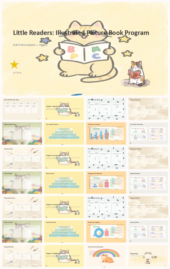
A complete picture book publishing kit for children's publishers and early literacy programs. Includes a 29-slide deck, speech script, customer Q&A, feedback survey, onsite checklist, and modification guide. Built to present books, creative process, and
- Download this PPT
- Commercial use (1 project)
- Present publicly
Little Readers Illustrated Picture Book Program — Complete Publishing Kit
A ready-to-use presentation kit for children's publishers and early literacy programs to share their books, creative process, and growth with parents, schools, and partners.
What's Inside This Pack
-
29-slide picture book program deck covering mission, creative process, learning, and roadmap
-
Full speech script for every slide, ready to deliver
-
8-answer customer Q&A on revenue, reach, retention, and channels
-
12-question feedback survey for post-meeting evaluation
-
Onsite checklist: storyboard summary, sample spreads, reading activity flyer, A/V, reading corner setup
-
PPT modification guide for first-time PowerPoint users
Problems It Solves
-
You need to present your picture book program but lack a structured deck.
-
Your catalogue feels scattered across story development, illustration, and distribution.
-
You struggle to explain early literacy value and creative process to parents and schools.
-
You want to show revenue and reader retention without sounding generic.
-
You need prepared answers for school, library, and partner questions.
-
You want a smooth onsite meeting with reading corner and materials ready.
Who It's For
Children's publishers, early literacy program directors, picture book authors, and school partnership managers.
Outcome
You walk into the room with a warm, professional presentation that shows your books, your creative process, and your learning outcomes. You explain your publishing journey and roadmap with confidence. You answer parent and partner questions without scrambling.
1. PPT Title
Little Readers: Illustrated Picture Book Program
PPT Title: Little Readers: Illustrated Picture Book Program — A Complete Picture Book Publishing Kit
2. Design Concept
1. Main Design Philosophy
The core idea is to make a picture book program feel warm, playful, and educational. The concept metaphor is a "hand-drawn reading journal" where a friendly cat reads a book surrounded by colorful letters and stars. The narrative moves from mission and values through creative process, learning, and publishing roadmap. The emotional tone is cheerful, gentle, and trustworthy.
Audience insight: children's publishers and early literacy programs present to parents, schools, and partners. They need to show educational value and creative craft without losing the joy of reading. The hand-drawn cat, colorful letters, and soft pastel palette create instant recognition and warmth.
Why this philosophy fits the thumbnail: the thumbnail uses a light yellow background, a hand-drawn cat reading a book, colorful letters (A, B, C), stars, and a small cat reading on the side. The design concept extends that language into a complete system. The philosophy guides color, elements, layout, and typography toward warmth and clarity.
2. Color System
Why this color system: the thumbnail uses light yellow, cream, pale blue, light green, and soft pink that feel organic and child-friendly. This is the palette of an early learning environment, not a corporate report.
Color psychology: light yellow suggests optimism and energy; cream brings softness and paper-like warmth; pale blue adds calm and trust; light green signals growth; soft pink adds care and playfulness.
Primary palette: light yellow #FDF3D0, cream #FFF8E7, pale blue #C9E4F0.
Secondary palette: light green #D4E8D4, soft pink #F8D7E0, warm white #FEFCF7.
Accent palette: black for outlines #1A1A1A, orange for highlights #F2A65A, red for small emphasis #E63946.
Color pairing logic: all colors share low saturation and warm undertones. Yellow and cream dominate, blue and green appear in small icons and chart elements. Black outlines keep everything grounded.
Proportion: 75% light yellow or cream background, 15% blue, green, and pink accents, 10% black outlines and dark text.
Background-to-foreground layering: backgrounds stay plain pastel with subtle hand-drawn textures. Foreground content sits on white or off-white rounded cards with 0.95 opacity for clear reading.
Contrast and accessibility: body text uses black or dark charcoal on white cards, meeting WCAG AA. Headings use black or dark orange.
Semantic use: titles in black; body text in dark grey; icons in blue, green, or pink; chart highlights in orange or red.
How the palette supports the theme: it keeps the deck visually warm so content and data stand out. The softness matches the early literacy audience without sacrificing professionalism.
3. Visual Elements
Why these elements: the thumbnail's hand-drawn cat reading, colorful letters, stars, and gentle organic shapes create instant warmth and recognizability. Extending them into a system makes the deck feel cohesive and branded.
Illustration style: bold black outline with soft flat fills, no gradients. Cats appear in different poses (reading, playing with blocks, head portrait) to add variety without breaking style.
Mascot direction: a friendly cat serves as the program guide. It appears on section dividers and key content slides, never overwhelming the text.
Iconography: hand-drawn, consistent 3px black stroke. Icons include open book, lightbulb, clock, blue arrow, letter A, letter B, number 1, yellow star, white cloud, rainbow, building block, water ripple, flower branch. Each icon uses one soft accent fill and sits inside a soft circular background.
Shape language: rounded rectangles for cards, circular badges for section numbers, hand-drawn dashed borders for emphasis boxes. No sharp corners.
Texture and materiality: subtle paper texture on background, hand-drawn lines on section pages. No glossy or 3D effects.
Decorative elements: small stars, dots, clouds, rainbows, letters, and hand-drawn lines. They frame content without competing.
Repetition and rhythm: every section starts with a large number, a warm wash, and a cat illustration. Content slides alternate between card layouts and chart layouts.
How elements improve comprehension: the cat humanizes data; letters and icons speed up scanning; consistent shapes reduce cognitive load.
4. Layout & Typography
Why this layout and typography: early literacy audiences need clarity and approachability. A single-column grid with generous margins keeps content airy.
Grid system: 12 columns, 24px gutters, 60px side margins. Content sits within 8 columns for text, 10 columns for charts.
White space strategy: at least 30% of each slide is empty. Cards have 24px internal padding.
Visual hierarchy: title at 36–44pt, subtitle at 20–24pt, body at 14–16pt, captions at 10–12pt. Section numbers at 72pt in pale yellow.
Reading flow: top-left to bottom-right. Key numbers placed on the left, supporting text on the right.
Font pairing: headings in Poppins SemiBold (rounded, friendly), body in Open Sans Regular (clean, readable). Fallback: Arial, sans-serif.
Type scale: H1 44pt / 1.2 line height; H2 32pt / 1.3; H3 24pt / 1.3; Body 16pt / 1.6; Caption 11pt / 1.4.
Weight and spacing: headings use 600 weight; body uses 400. Letter spacing normal. Line height generous for readability.
Consistency rules: all titles left-aligned; all cards same corner radius (16px); all icons same stroke weight.
How layout improves retention: consistent placement helps viewers predict where information lives, reducing effort and increasing focus on content.
5. Design Goal
Design goals: make a picture book program feel warm, clear, and trustworthy; show data without overwhelming non-technical audiences; create a reusable visual system for future catalogues.
Why these goals fit: children's publishers present to parents, schools, and partners. A gentle visual language builds emotional connection while structured layouts maintain authority.
Intended emotional impact: calm confidence, warmth, and a sense of shared reading.
Communication objectives: highlight $4.2M revenue, 18,000 customers, 82% retention, and the publishing roadmap.
Desired audience response: parents feel reassured; schools see a reliable partner; partners see growth potential; the team feels proud.
How design balances aesthetics and message: soft visuals reduce anxiety around numbers; clear hierarchy ensures key metrics are not lost.
6. Design Principles and Consistency Checklist
Key principles: keep backgrounds light and pastel; use white cards for all body text; limit primary colors to three; use cats and hand-drawn icons only as accents; maintain 16:9 aspect ratio; keep all text in English; use consistent corner radius, stroke weight, and icon style; never stretch images; use black or dark charcoal for all body text; section dividers always include a number, a warm wash, and a cat illustration.
Reusable rules: color — light yellow, cream, pale blue as primary; elements — hand-drawn cat, playful icons, dashed borders; typography — Poppins headings, Open Sans body; layout — 12-column grid, 8-column text width, 24px padding.
Conclusion: This design system turns a standard picture book presentation into a warm, memorable, and highly readable experience. It uses the thumbnail's cat-and-letters identity to build trust and keeps the focus on books, readers, and the future.
Article + Bundle Download