







 Note Wisdom
Line & Paw: Kids Comic Studio — A Complete Creative Studio Presentation
A complete comic studio presentation kit for kids comic studios. Includes a 29-slide deck, speech script, customer Q&A, feedback survey, onsite checklist, and modification guide. Built to show craft, characters, and growth through bold line art and comic
- Download this PPT
- Commercial use (1 project)
- Present publicly
Line & Paw Kids Comic Studio — Creative Studio Presentation
A complete presentation kit for kids comic studios to present their origin story, craft, characters, and growth with clarity and charm.
What's Inside This Pack
-
29-slide studio deck covering origins, craft, characters, readers, and roadmap
-
Full speech script for every slide, 300–400 words each
-
8-answer customer Q&A on revenue, readers, retention, and channels
-
12-question feedback survey for post-meeting evaluation
-
Onsite checklist: portfolio summary, comic samples, facilitator guide, drawing corner
-
PPT modification guide for first-time PowerPoint users
Problems It Solves
-
You need to present your studio’s work and growth but lack a structured deck.
-
Your portfolio feels scattered across web comics and print zines.
-
You struggle to explain your creative process and reader engagement.
-
You want to show revenue and retention without sounding generic.
-
You need prepared answers for partner or school questions.
-
You want a smooth onsite meeting with drawing materials and A/V ready.
Who It's For
Comic studio founders, creative directors, children’s publishers, and workshop facilitators.
Outcome
You walk into the room with a warm, professional presentation that shows your characters, craft, and community. You explain your studio’s journey and roadmap with confidence. You answer partner and school questions without scrambling.
1. PPT Title
Line & Paw: Kids Comic Studio
PPT Title: Line & Paw: Kids Comic Studio — A Complete Creative Studio Presentation
2. Design Concept
1. Main Design Philosophy
The core idea is to make a kids comic studio feel bold, playful, and authentic to its medium. The concept metaphor is a "living comic book" where the deck itself looks like pages from a comic. The narrative moves from studio origins through craft and characters to roadmap. The emotional tone is energetic, creative, and confident.
Audience insight: comic studio founders present to partners, schools, and young readers’ parents. They need to show craft and business sense without losing the playful spirit of comics. The bold black outlines, comic speech bubbles, and cat characters create instant recognition and warmth.
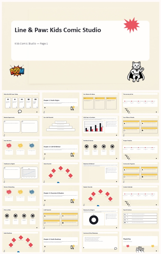
Why this philosophy fits the thumbnail: the thumbnail uses a warm paper background, bold black typography, a comic cat character, a BOOM burst, and simple panel frames. The design concept extends that language into a complete system. The philosophy guides color, elements, layout, and typography toward comic authenticity.
2. Color System
Why this color system: the thumbnail uses warm paper with bold black line art and a single red accent. This is the classic palette of indie comics and zines. It signals craft, print culture, and playful energy.
Color psychology: warm paper suggests print and handmade craft; black signals boldness and clarity; red brings energy and action; yellow adds optimism and kid-friendliness.
Primary palette: warm paper #F8F2E0, black #111111, white #FFFFFF.
Secondary palette: light grey #E8E4DC, mid-grey #8A8A8A.
Accent palette: red #E63946, yellow #F4C542.
Color pairing logic: high contrast between black and paper white, with red and yellow used sparingly for bursts, CTAs, and key icons.
Proportion: 75% warm paper and black, 15% grey, 10% red and yellow.
Background-to-foreground layering: backgrounds stay flat warm paper. Content sits on white or off-white rounded cards with thick black outlines. Red and yellow appear on comic bursts, speech bubbles, and emphasis dots.
Contrast and accessibility: black on warm paper meets WCAG AA. Body text uses dark grey on white cards.
Semantic use: titles in black; body text in dark grey; red for action and emphasis; yellow for highlights and stars.
How the palette supports the theme: it keeps the deck visually bold so characters and data stand out. The red accent creates a memorable signature.
3. Visual Elements
Why these elements: the thumbnail uses bold black line art cats, comic speech bubbles, burst lines, onomatopoeia, and panel frames. These are the visual language of comics.
Illustration style: bold black line art with white fill, thick outlines, no gradients. Cats appear in different poses (sitting, lying, standing, stretching, licking, hero, kid) to add variety without breaking style.
Mascot direction: a comic cat serves as the studio’s recurring character. It appears on section dividers and key slides, sometimes in a cape, sometimes as a kid.
Iconography: consistent 4px black stroke. Icons include paw print, paw trail, diamond block, circle avatar frame, star, heart, cat head, speech bubble, thought bubble, burst lines, action lines, star burst, panel frame, page corner, onomatopoeia BOOM, onomatopoeia POW, arrow.
Shape language: comic panel frames, circles, diamonds, bursts. Rounded corners only on content cards.
Texture and materiality: flat, clean, print-like. No gradients, no shadows, no 3D.
Decorative elements: red and yellow bursts, speech bubbles, action lines, paw prints.
Repetition and rhythm: every slide uses the same panel logic, the same type scale, the same black outline weight. Section dividers use large numbers and a single comic burst.
How elements improve comprehension: comic frames organize information; speech bubbles humanize data; the cat mascot creates memory; the monochrome-plus-red palette reduces noise.
4. Layout & Typography
Why this layout and typography: comic readers expect bold headers, clear panels, and playful rhythm. A single-column layout with occasional panel splits keeps content readable.
Grid system: 12 columns, 24px gutters, 60px side margins. Content sits within 8 columns for text, 10 columns for charts.
White space strategy: at least 30% of each slide is empty. Cards have generous internal padding.
Visual hierarchy: headline at 44pt, subhead at 28pt, body at 16pt, caption at 11pt. Page numbers at 10pt in grey.
Reading flow: top-left to bottom-right, like a comic page. Key numbers and comic bursts placed on the left or center.
Font pairing: headings in a bold comic-style sans (Bangers, Comic Neue, or Poppins Bold). Body in a regular grotesque sans.
Type scale: H1 44pt / 1.1 line height; H2 32pt / 1.2; H3 24pt / 1.3; Body 16pt / 1.6; Caption 11pt / 1.4.
Weight and spacing: headings 700 weight; body 400. Letter spacing tight for headlines, normal for body.
Consistency rules: all titles left-aligned. All cards same corner radius (8px). All lines same weight.
How layout improves retention: the panel grid creates a predictable rhythm. The bold typography ensures the viewer always knows what matters most.
5. Design Goal
Design goals: present the studio as bold, playful, and business-savvy. Show characters, craft, and growth without losing comic authenticity.
Why these goals fit: comic studio partners and schools want proof of craft and reach. A comic-styled deck demonstrates that the studio lives its medium.
Intended emotional impact: energy, creativity, trust.
Communication objectives: highlight $4.9M revenue, 84,000 readers, 82% retention, and the studio’s channels.
Desired audience response: partners see a reliable creative force; schools see an engaging workshop provider; readers see their favorite characters.
How design balances aesthetics and message: the comic style is fun but not childish. The red accent prevents monotony. The grid keeps data readable.
6. Design Principles and Consistency Checklist
Key principles: warm paper base, bold black outlines, one red accent, one yellow accent, comic panel logic, typographic hierarchy, no decoration without purpose, consistent margins, same corner radius, same line weight.
Reusable rules: color — warm paper, black, white, red, yellow. Elements — line art cats, speech bubbles, bursts, onomatopoeia, panel frames. Typography — bold comic headlines, regular grotesque body. Layout — 12-column grid, left-aligned, generous white space.
Conclusion: This design system turns a studio presentation into a living comic book. It uses bold line art, warm paper, and a single red accent to create clarity, energy, and memorability. The comic is not just the product; it is the presentation.
Article + Bundle Download