







 Note Wisdom
Zoo Pals: A Kindergarten Animal Adventure
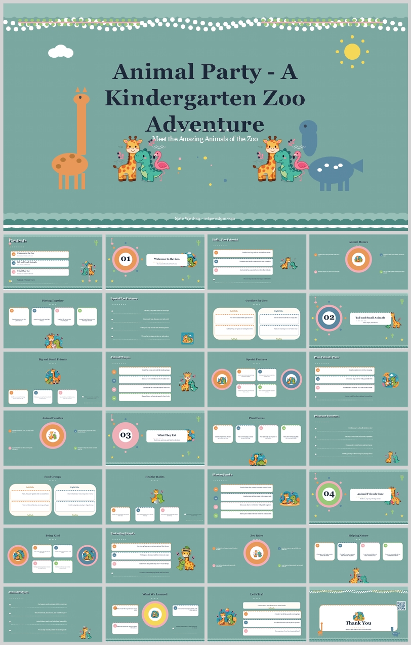
This design concept shows how a soft mint-green zoo-themed template can turn kindergarten learning into a friendly four-part adventure. It details color psychology, animal mascot use, rounded card layouts, and readable typography to help educators create
- Download this PPT
- Commercial use (1 project)
- Present publicly
Core Design Philosophy
Learning is framed as a joyful, guided zoo expedition where friendly animal mascots turn early childhood concepts into a shared adventure. The deck should feel like a sunny, safe classroom field trip: structured enough for teachers to deliver clear lessons, playful enough to hold kindergarten attention, and emotionally warm enough for parents. A repeatable card-based layout, cute animal guides, and soft mint-green tones reduce anxiety and make literacy, numeracy, animal facts, and social skills feel like discovery rather than instruction.
Emotional Tone and Narrative Direction
The tone is cheerful, curious, gentle, and inclusive. The narrative moves from welcome and introduction through four clear learning parts, then into reflection, practice, and gratitude. Section badges 01–04 act as trail markers; the giraffe, crocodile, flamingo, and elephant act as friendly guides; paw prints, leaves, suns, clouds, and scalloped borders create a recognizable visual signature.
1. Main Design Philosophy
-
Core idea: “Every lesson is a walk through the zoo with friends.” The animal mascots transform abstract kindergarten content into a companionable journey.
-
Creative approach: Use a soft mint-green background, white modular cards, rounded geometry, and friendly flat-vector animal illustrations to make early education feel like a bright, organized playground.
-
Conceptual metaphor: The deck is a kindergarten zoo map. Section badges are exhibit markers; content cards are activity stations; animal mascots are tour guides; paw prints and leaves are trail clues.
-
Narrative direction: Cover → Contents → Part 01 → Part 02 → Part 03 → Part 04 → What We Learned → Let’s Try! → Thank You.
-
Emotional tone: Joyful, curious, safe, encouraging, and slightly whimsical.
-
Audience insight and intended perception: Designed for kindergarten learners, early-childhood teachers, parents, and educational facilitators. The audience should perceive the content as friendly, easy to follow, and emotionally inviting. The deck must never feel like a corporate report or a high-stakes test.
-
Why this philosophy fits the thumbnail style, topic, and audience: The thumbnail uses a muted mint-green background, white rounded cards, cute zoo animals, scalloped top border, sun, clouds, and paw prints. These choices signal a non-threatening, child-centered learning environment. The philosophy therefore guides color toward fresh, calm tones; elements toward animal mascots and nature icons; layout toward card-based clarity; and typography toward readable, friendly pairings.
-
How the design idea guides color, elements, layout, and typography: Color stays in a fresh mint-and-white range with coral, aqua, mustard, and lavender accents. Elements include animal mascots, paw prints, leaves, sun, and clouds. Layout uses a 12-column grid with white cards. Typography pairs a classic serif display face with a clean rounded sans-serif for readability.
2. Color System
-
Why this color system was chosen: Mint green lowers anxiety and evokes nature, growth, and freshness. White cards provide clean, paper-like surfaces for content. Warm accents add joy and help distinguish the four learning parts.
-
Color psychology and emotional meaning: Mint green represents calm, growth, and nature. White represents clarity and simplicity. Dark navy represents safety and readability. Coral and mustard add playful energy. Aqua and lavender add variety and quiet focus.
-
Primary palette:
-
Mint Green
#A8C6B8— full-slide background; creates a soft, natural, calm base. -
Pure White
#FFFFFF— cards, title containers, and content surfaces. -
Dark Navy
#2C3E50— primary text, mascot outlines, and grounding elements. -
Coral
#F28C6B— section 01 badge, title accents, and key highlights.
-
-
Secondary palette:
-
Aqua
#5BB8B0— section 02 badge, tags, icons, and calm informational accents. -
Blush Pink
#F4A6B8— section 03 badge, soft attention cues, and hearts. -
Leaf Green
#7FB069— section 04 badge, nature cues, and positive indicators. -
Mustard Yellow
#F4C95D— suns, stars, and highlight marks.
-
-
Accent palette:
-
Lavender
#9B8AC4— secondary badges and quiet accents. -
Warm Grey
#7A7A7A— captions and secondary body text. -
Soft Blue
#7FB3D5— sky, water, and secondary icon fills.
-
-
Color pairing logic and harmony: Analogous mint and white form the base; coral, aqua, pink, and green provide split-complementary relief. Mustard and lavender create focal energy without overwhelming.
-
Color proportion and balance: 55% mint green backgrounds, 30% white cards, 15% accents (coral, aqua, pink, green, mustard, lavender).
-
Background-to-foreground layering strategy: Mint green background → white rounded cards → dark navy outlines and text → colored badges and mascot accents. Soft shadows
rgba(44,62,80,0.12)lift cards without harshness. -
Contrast, readability, and accessibility: Dark Navy on White meets AA contrast. Never use mint, pink, yellow, or lavender for long body text; reserve them for headings, badges, icons, and highlights.
-
Semantic use of color across titles, body text, icons, and highlights: Coral = section 01 and primary headings. Aqua = section 02 and category tags. Pink = section 03 and hearts. Green = section 04 and nature reinforcement. Navy = body copy and mascot outlines. Mustard = highlights and celebration.
-
How the palette supports the theme, audience, and visual hierarchy: The fresh mint palette keeps young learners calm and curious. The four badge colors help teachers and students instantly know which part they are in. White cards isolate content so information never feels crowded.
3. Visual Elements
-
Why these visual elements were chosen: They reinforce the “zoo adventure with animal friends” narrative and keep the deck emotionally consistent across every page.
-
Illustration style and mascot direction: Flat vector zoo animals with simple dot eyes, friendly smiles, and soft rounded bodies. Use a giraffe, crocodile, flamingo, and elephant as recurring guides. Poses include sitting, peeking, walking, holding balloons, pointing, and celebrating. The cover uses a balanced arrangement of animal mascots flanking the title to create warmth and symmetry.
-
Iconography style, stroke consistency, and corner treatment: 2px rounded strokes, filled with pastel colors, no sharp corners. Icons should feel hand-drawn but clean, matching the animal mascots’ friendly geometry. Corner treatment is always rounded, never square.
-
Shape language and geometric motifs: Circles for badges, avatars, and icon containers; rounded rectangles with 20–24px radius for cards; pill shapes for tags and labels; scalloped edges for top borders; organic curves for leaves and clouds.
-
Texture, materiality, and lighting atmosphere: Flat vector with a subtle paper-grain texture on the mint background. Drop shadows are soft and diffuse, simulating layered paper. Lighting is even and gentle, never dramatic.
-
Decorative elements and framing devices: Scalloped top border, sun, clouds, paw prints, leaves, dots, and small stars. These create rhythm without clutter.
-
Repetition, rhythm, and visual consistency rules: Mascots appear on every content slide, usually bottom-right or beside section badges. Section badges 01–04 use colored circles with white numerals. Cards repeat the same padding, radius, and shadow. Paw prints and leaves appear at corners on the cover and section dividers.
-
How each element improves comprehension, engagement, and brand recognition: The animal mascots build emotional recognition. Rounded cards chunk information. Paw prints and leaves create a playful visual signature that improves recall. Color-coded badges help learners track progress through the four parts.
4. Layout & Typography
-
Why this layout and typography system was chosen: It supports modular kindergarten teaching content, easy scanning, and a clear four-part structure. The title card and section badges create predictable wayfinding.
-
Grid system and alignment logic: 12-column grid, 48px outer margins, 24px gutters. Cards align to columns and never crowd edges. Section badges sit top-left; mascots sit bottom-right.
-
White space strategy and visual breathing room: Target 30–40% empty space per slide. Breathing room around title cards, section badges, and card interiors keeps the deck from feeling busy.
-
Visual hierarchy and focal point planning: Section badge > slide title > card title > body text > caption. The mascots are a secondary focal point; accent colors guide the eye.
-
Reading flow and eye-path direction: Top-left to bottom-right for content slides. Cover uses a centered title card with symmetrical animal mascots. Section dividers use a large left-aligned badge with a right-side mascot.
-
Font pairing and type scale:
-
Titles: Playfair Display or Merriweather — classic serif that matches the “Animal Party” title card and adds a storybook feel.
-
Body/UI: Nunito or Quicksand — rounded sans-serif that matches the friendly animal style and maximizes readability.
-
H1: 44–48pt, bold, Dark Navy.
-
H2: 28–32pt, medium, Coral or Aqua.
-
H3: 20–24pt, semibold, Dark Navy.
-
Body: 16–18pt, regular, Dark Navy.
-
Caption/Label: 12–14pt, medium, Leaf Green or Blush Pink.
-
-
Title, subtitle, body, caption, and label hierarchy: Title uses the largest serif display font. Subtitle uses a softer coral or aqua. Body uses dark navy on white. Captions use green or pink for secondary information.
-
Weight, spacing, line height, and readability standards: Headings 1.2 line height; body 1.5 line height with 0.3px letter spacing. Use bold sparingly for emphasis. Never set body text below 16pt.
-
Consistency rules across all pages: Same card radius, same shadow, same badge position, same mascot placement logic, same color roles across all slides. Section badge colors follow 01 coral, 02 aqua, 03 pink, 04 green.
-
How the layout improves clarity, rhythm, and information retention: The modular card system chunks information into digestible pieces. The four-part structure gives learners a clear mental map. The consistent mascots and color-coded badges reduce cognitive load and increase retention.
5. Design Goal
-
State the design goals clearly: Create a joyful, structured, four-part kindergarten zoo adventure that feels like a guided play session with animal friends.
-
Why these goals are appropriate for the audience and context: Kindergarten learners and early educators respond to predictable layouts, friendly characters, and soft colors. The design reduces intimidation while maintaining instructional clarity.
-
Intended emotional impact: Calm, curious, welcomed, and encouraged.
-
Communication objectives: Deliver early learning content in clear modular chunks; make each part visually distinct; end with reflection and gratitude.
-
Desired audience behavior or response: Learners stay engaged, follow the animal guides, and retain section content because the visual system is consistent and low-stress.
-
How the design balances aesthetics, readability, and message delivery: Aesthetics come from fresh mint colors, mascot charm, and rounded shapes. Readability comes from high-contrast navy text, generous spacing, and strict hierarchy. Message delivery comes from the repeatable card system and four-part structure.
6. Design Principles and Consistency Checklist
-
Key principles to keep the deck visually coherent:
-
Fresh consistency: every slide uses the mint green, white, navy, and accent core.
-
Mascot continuity: the animal guides appear on all content slides.
-
Rounded geometry: no sharp corners except intentional scallops and leaves.
-
Readability first: body text always high contrast.
-
Modular card system: content is always chunked into white rounded cards.
-
-
Reusable rules for color: Use mint green for backgrounds. Use white for cards. Use coral, aqua, pink, and green only for their respective sections and tags. Never introduce new saturated colors.
-
Reusable rules for elements: Same 2px icon stroke. Same 20–24px card radius. Same soft shadow. Same paw print, leaf, sun, cloud, and scalloped motifs. Same mascot pose logic: cover uses multiple animals; content slides use one or two in the bottom-right or beside the section badge.
-
Reusable rules for typography: Playfair Display or Merriweather for titles only. Nunito or Quicksand for everything else. Never more than two font families. Body line height 1.5.
-
Reusable rules for layout: 48px margins. 24px gutters. Section badges top-left. Mascots bottom-right or beside badge. Cards align to grid. Section divider slides use a large left-aligned badge with a right-side mascot.
Conclusion
This design concept turns a kindergarten learning presentation into a cheerful, animal-guided zoo adventure. Soft mint-green tones, rounded modular cards, a repeatable mascot cast, and clear typography create a deck that is playful yet highly readable. It supports teachers and parents who need structure, while giving young learners a safe and engaging visual environment. The four-part badge system and consistent card layout make the content easy to follow, remember, and enjoy.
Article + Bundle Download