







 Note Wisdom
Fresh & Cute White Cat: A Professional Learning & Teaching Template
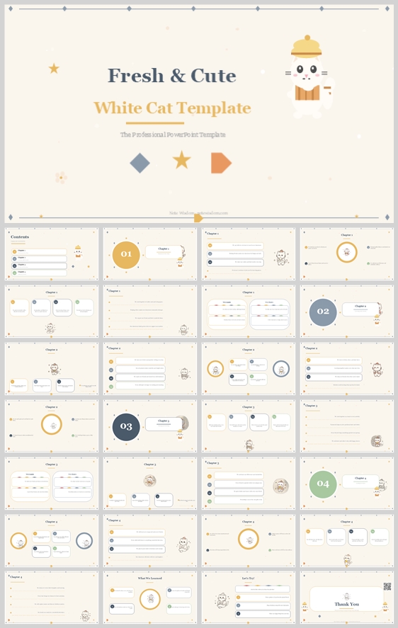
A fresh, structured design concept for educational and training presentations. It uses a warm beige and white palette, a cute white cat mascot, and rounded white cards to create an organized, engaging, and highly professional learning experience for educa
- Download this PPT
- Commercial use (1 project)
- Present publicly
Design Concept (Expanded, Fine-Grained, and Rationale-Driven)
1. Main Design Philosophy
-
Core Idea & Creative Approach: "Curated Whimsy." The design merges a clean, professional presentation structure with a soft, child-friendly visual identity. It uses a "scholarly companion" approach, where a cute white cat mascot acts as a knowledgeable but gentle guide through the curriculum, reducing anxiety for both presenters and audiences.
-
Main Concept & Conceptual Metaphor: The overarching metaphor is "A Guided Reading Journey." The white cat holding a book represents the educator or the learner as a curious reader. The thin dotted lines with small nodes represent a structured learning path, milestones, or a timeline. The warm beige canvas represents a blank notebook or a calm classroom wall.
-
Narrative Direction & Emotional Tone: The narrative flows from a friendly, welcoming cover into a highly organized, chapter-based structure. The emotional tone is fresh, optimistic, calm, organized, and professionally nurturing. It avoids the chaos of overly playful designs and the sterility of corporate templates.
-
Audience Insight & Intended Perception: The target audience includes educators, teacher trainers, parents, and workshop facilitators. They need to perceive the content as trustworthy, easy to navigate, and visually appealing to young learners without sacrificing professional credibility. They should feel that this template saves time and elevates their teaching materials.
-
Why this philosophy fits: The thumbnail features a soft beige background, a white cat with a beret, simple geometric shapes, and rigid card layouts. This philosophy directly translates those visual cues into a strategic communication approach: it reassures adults with its structured grid while appealing to children with its cute, friendly mascot.
-
How it guides design: This idea dictates the use of warm, low-saturation background colors to reduce eye strain, generous white space within content cards to prevent cognitive overload, and a consistent mascot presence to build emotional connection and brand recognition. The thin connecting lines reinforce the idea of a step-by-step educational journey.
2. Color System
-
Why this color system: Early childhood and professional training environments require a palette that is both calming and readable. This system balances warm neutrals with high-contrast text and energetic accents to maintain focus without overwhelming the senses.
-
Color Psychology:
-
Warm Beige (#F7F2E8): Comfort, calmness, and a paper-like quality. It provides a sophisticated, non-distracting backdrop that is easier on the eyes than stark white.
-
Pure White (#FFFFFF): Clarity, cleanliness, and focus. Used for content cards to make text highly legible and create a clear visual separation from the background.
-
Dark Slate (#2D3A4B): Authority, readability, and structure. Used for primary text to provide strong contrast against white backgrounds.
-
Warm Gold (#F4B942): Optimism, creativity, and attention. Used for the cat's beret, key headers, and numbered section badges to draw the eye.
-
Muted Blue-Grey (#8FA3B0) and Soft Orange (#E67E22): Balance, trust, and playful energy. Used as secondary accents for geometric shapes, icons, and decorative dots.
-
-
Primary Palette: Warm Beige (Backgrounds), Pure White (Content Cards).
-
Secondary Palette: Dark Slate (Primary Text), Warm Gold (Main Accents, Mascot, Headings).
-
Accent Palette: Muted Blue-Grey and Soft Orange for decorative geometric shapes (diamonds, stars, triangles) and secondary icons.
-
Color Pairing Logic: The high-contrast pairing of Dark Slate on White, and White on Beige ensures excellent readability. The warm gold and soft orange provide complementary pops of color that guide the eye and segment information without distracting from the core message.
-
Color Proportion & Balance: 60% Warm Beige (base), 30% Pure White (focal points and breathing room), 10% Gold/Blue-Grey/Orange/Slate (text, accents, icons).
-
Background-to-Foreground Layering: The warm beige background sits at the back. White rounded cards with subtle drop shadows sit on top, creating a clear visual hierarchy. The white cat mascot, thin dotted lines, and geometric shapes sit on the topmost layer to add whimsy and guide navigation.
-
Contrast & Accessibility: The Dark Slate text on White backgrounds exceeds WCAG AA standards for contrast. The gold and orange accents are used sparingly for emphasis, ensuring the design remains accessible and easy to read for all audiences.
-
Semantic Use: Beige = overarching theme; White = actionable content; Dark Slate = reading text; Gold = key headings, numbers, and mascot; Blue-Grey/Orange = secondary decorative elements and icons.
-
Why it supports the theme: The palette directly mirrors the fresh, organized aesthetic of a modern, well-prepared classroom, instantly signaling "professional" and "child-friendly" to the audience.
3. Visual Elements
-
Why these elements: To create a cohesive, recognizable brand identity that feels approachable, creative, and highly professional.
-
Illustration Style & Mascot: The mascot is a cute, flat-vector white cat wearing a yellow beret and holding a book. The style is clean with soft, rounded edges and no harsh outlines. The cat appears in various poses (reading, pointing, sitting) to act as a friendly guide throughout the deck, reinforcing the "learning companion" metaphor.
-
Iconography Style: Icons use a consistent, thin-line, rounded-corner flat design. They are universally recognizable educational symbols (e.g., lightbulb for ideas, star for achievements, book for reading) and maintain a consistent stroke weight.
-
Shape Language: Rounded rectangles are the dominant shape for content cards. Perfect circles are used for the numbered section badges (01, 02, 03, 04). Small geometric shapes (diamonds, stars, triangles) are used as decorative accents. Sharp corners are strictly avoided to maintain a soft, safe, and playful aesthetic.
-
Texture, Materiality, & Lighting: The design is flat and matte. There are no harsh gradients. Very soft, subtle drop shadows on the white cards give a slight sense of depth, making them float gently above the beige background like pages in a notebook.
-
Decorative Elements: Thin dotted lines connecting small nodes (like a timeline or learning path), and simple geometric shapes in gold, blue-grey, and orange. These frame the content and add a whimsical, "blueprint" touch without cluttering the informational space.
-
Repetition & Consistency: The white cat mascot appears on every slide. The thin connecting lines and geometric shapes maintain a playful rhythm. The numbered circles provide a consistent visual anchor for the four main sections.
-
How they improve comprehension: Visual repetition reduces cognitive load. The mascot provides a consistent, relatable anchor point, while the simple icons and ample white space allow for quick scanning of slide content. The dotted lines visually guide the eye from one concept to the next.
4. Layout & Typography
-
Why this layout and typography: To provide a highly structured, predictable, and easily navigable experience for educators who need to present information clearly and professionally.
-
Grid System: A strict 12-column grid is used. Content is centered or left-aligned within white rounded cards. Margins are generous (approx. 5-8% of slide width) to ensure the presentation feels airy and uncluttered.
-
White Space Strategy: High. The warm beige background and the internal padding within the white cards act as essential breathing room, preventing visual fatigue during long presentations and allowing the eye to rest.
-
Visual Hierarchy & Focal Points: Every slide has one primary focal point (usually a large white card or a prominent circular number) surrounded by supporting details. The eye path moves from the top-left title, down to the central visual, and then to the supporting text.
-
Font Pairing:
-
Headings: A classic serif font (e.g., Merriweather or Playfair Display) in Dark Slate. This adds a sense of educational authority and tradition.
-
Body Text: A clean, geometric sans-serif font (e.g., Nunito or Quicksand) in Dark Slate. This ensures maximum readability and a friendly feel, especially for longer text blocks.
-
-
Type Scale:
-
Main Title: 40pt Bold
-
Section Headers: 24pt Medium
-
Body Text: 14-16pt Regular
-
Captions/Labels: 12pt Regular
-
-
Weight, Spacing, & Line Height: Body text uses a 1.5 line height with slightly increased letter spacing to improve legibility for projected presentations. Headings use tighter letter spacing to appear more solid and authoritative.
-
Consistency Rules: Titles are always top-aligned. Mascots are always integrated into the card layout or placed bottom-right. Accent colors are only used for icons, numbers, and highlights, never for large text blocks.
-
How it improves clarity: The rigid grid and consistent typography create a rhythmic flow, making the information feel organized and easy to absorb, which is critical for educational and training content.
5. Design Goal
-
Design Goals: To create a visually fresh, highly organized, and engaging presentation template that makes lesson planning, teacher training, and curriculum delivery feel accessible, joyful, and professionally credible.
-
Why appropriate: Educators and trainers are often overwhelmed by dense administrative literature and dull templates. This design breaks complex ideas into visual, bite-sized, friendly chunks using a clean, notebook-like aesthetic that feels both professional and approachable.
-
Intended Emotional Impact: The audience should feel confident, inspired, and reassured. The playful, cute white cat and structured layout should evoke a sense of calm control and creativity.
-
Communication Objectives: To clearly convey educational milestones, curriculum structures, and developmental goals without overwhelming the reader or the presenter.
-
Desired Behavior: The audience (educators/parents/trainers) should feel motivated to implement the strategies, reuse the template, and share the presentation with colleagues.
-
Balancing Aesthetics & Delivery: The design uses a clean, neutral background and structured grids to ensure the focus remains on the educational content, while the white cat mascot and geometric accents keep it from feeling too corporate or sterile.
6. Design Principles and Consistency Checklist
-
Color Principle: Stick to the defined 5-color palette. Avoid harsh blacks, neon colors, or high-contrast gradients. Use Warm Beige as the foundational anchor.
-
Element Rule: The white cat mascot must appear on every slide to maintain brand continuity. Decorative elements (lines/dots/shapes) should not overlap with critical text.
-
Typography Rule: Keep body text under 50 words per card. Use the serif font exclusively for headers to maintain visual hierarchy.
-
Layout Rule: Maintain a minimum 1-inch margin on all sides of the slide. All content must be contained within rounded white cards with consistent corner radii.
-
Consistency Check: Before finalizing, verify that all icons use the same stroke width, all corners are rounded, and the subtle drop shadow effect on the cards is identical across all slides.
Conclusion
This design concept transforms the fresh, structured aesthetic of the provided thumbnail into a robust, systematic presentation framework. By balancing a calming warm beige background with crisp white cards and warm gold accents, and utilizing a structured grid alongside a friendly white cat mascot, the design effectively communicates complex educational and training concepts. It ensures that the presentation is not only visually engaging and appealing to children but also
Article + Bundle Download