







 Note Wisdom
Floral Feline Journey: A Gentle Cat Master Presentation Template
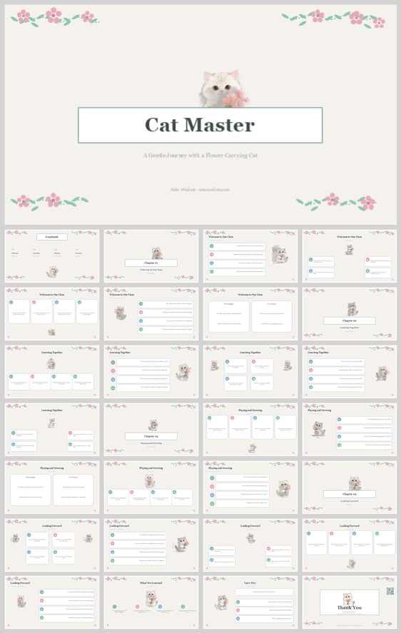
This floral cat master presentation template uses a cream background, pastel floral accents, and a watercolor-style white cat mascot to create a gentle, nurturing educational experience. It balances elegant serif typography with soft modular cards, making
- Download this PPT
- Commercial use (1 project)
- Present publicly
1. Main Design Philosophy
Core Idea: "Nurturing Guidance Through Floral Softness."
Conceptual Metaphor: The presentation is a gentle garden path. The white flower-carrying cat is a serene guide, leading the learner through chapters of knowledge. Floral borders act as garden gates, marking transitions between learning stages.
Narrative Direction & Emotional Tone: Calm, affectionate, elegant, and encouraging. The tone is soft and feminine without being childish. It feels like a peaceful stroll through a blooming garden rather than a formal lecture.
Audience Insight: This design targets educators, wellness coaches, creative workshop facilitators, and anyone teaching in a gentle, supportive context (e.g., art classes, mindfulness training, early childhood education, or pet care). The audience values warmth, beauty, and a non-threatening learning atmosphere.
Why This Fits: The thumbnail uses pastel florals, a watercolor-style white cat, and a light cream background. This signals a nurturing, aesthetic-first educational experience. The design philosophy directly supports that by prioritizing soft colors, floral motifs, and a calm, airy layout.
How It Guides Decisions: Color stays pastel and botanical. The cat mascot appears on every section to provide emotional continuity. The layout uses generous white space and soft, rounded cards to make learning feel like a gentle journey, not a race.
2. Color System
Why This Color System: Pastels and cream reduce visual stress and evoke spring, gentleness, and positivity. Floral pinks and greens connect the design to nature, making the content feel organic and alive.
Color Psychology & Emotional Meaning: Cream = warmth, paper, softness. Pink = affection, care, blossoming. Mint Green = growth, balance, freshness. Baby Blue = trust, calm, clarity. Charcoal = gentle authority, readability.
Primary Palette: Soft Cream (#F5F2EA) for full backgrounds. It is warm, paper-like, and easy on the eyes.
Secondary Palette: Pure White (#FFFFFF) for content cards and the central title box. It lifts information and creates a clean reading surface.
Accent Palette: Blush Pink (#F7C6C7) for floral decorations and active highlights. Mint Green (#B5D8C8) for progress indicators and calm accents. Baby Blue (#A8D0E6) for secondary accents and chart bars. Soft Charcoal (#3A3A3A) for all typography and primary icons.
Color Pairing Logic & Harmony: The pastel trio (pink, green, blue) sits harmoniously on the warm cream base. White cards create separation. Charcoal anchors the text. The palette feels like a spring bouquet: delicate, balanced, and cheerful.
Color Proportion & Balance: 60% Cream background, 20% White cards and title box, 10% Charcoal text, 10% Pastel accents (pink, green, blue) distributed evenly.
Background-to-Foreground Layering: Cream is the canvas. Floral borders and grey geometric shapes are the mid-ground. White cards are the reading surfaces. Charcoal text and pastel accents are the foreground.
Contrast, Readability & Accessibility: Charcoal on cream and charcoal on white exceed WCAG AA. Pastel colors are never used for body text, only for highlights, icons, and decorative elements.
Semantic Use of Color: Pink = floral decorations, active states, cat's flowers. Green = progress, positive indicators, growth. Blue = neutral data, secondary bullet points. Charcoal = titles, body text, primary navigation. White = content containers.
How the Palette Supports the Theme: It creates a soft, nurturing, and elegant atmosphere that perfectly matches a "gentle journey" with a flower-carrying cat. It feels feminine, sophisticated, and calming.
3. Visual Elements
Why These Visual Elements: The thumbnail uses a watercolor-style cat, delicate floral borders, and soft rounded cards. These elements make the educational content feel like a precious, hand-crafted guide.
Illustration Style & Mascot Direction: A fluffy white cat rendered in a soft, watercolor or pastel illustration style. The cat holds a small bouquet of pink flowers. It appears in various poses: peeking, sitting, presenting, and sleeping. The style is gentle, detailed but not realistic, with soft edges and warm highlights.
Iconography Style, Stroke Consistency & Corner Treatment: Thin-line icons with rounded caps and joins. Circular bullet nodes with pastel fills (pink, green, blue). Icons are simple, recognizable, and always paired with text. Corners of cards and boxes are softly rounded (8–12 px radius).
Shape Language & Geometric Motifs: Rounded rectangles for cards and the central title box. Circles for bullet points and progress indicators. Floral motifs are organic and curved, contrasting with the clean geometric cards.
Texture, Materiality & Lighting Atmosphere: Flat matte surfaces with very subtle drop shadows on cards. The floral elements have a slight watercolor texture. The overall atmosphere is airy, light, and reminiscent of a spring morning.
Decorative Elements & Framing Devices: Floral borders at the top and bottom of every slide (pink flowers with green leaves). A central white rectangular box for chapter titles. Thin horizontal rules and dotted lines for structure.
Repetition, Rhythm & Visual Consistency: Every slide features the floral borders. Every chapter slide has the central white box. Every content slide includes the cat mascot. This creates a strong, predictable rhythm that feels safe and nurturing.
How Each Element Improves Comprehension & Engagement: The cat provides an emotional anchor and memory hook. The floral borders frame the content beautifully. The pastel bullet points make lists feel friendly. The consistent layout reduces cognitive load, allowing the learner to focus on the gentle message.
4. Layout & Typography
Why This Layout & Typography: The thumbnail uses a balanced, card-based layout with generous margins. This supports a calm, unhurried reading pace. The serif title adds elegance, while the sans-serif body keeps the content modern and readable.
Grid System & Alignment Logic: A 12-column grid with 24 px gutters. Content is organized into 2 or 3 card columns. All cards align to the grid. Side margins are generous: 64 px. Top and bottom margins: 48 px. The floral borders sit outside the main content area.
White Space Strategy & Visual Breathing Room: Minimum 32 px padding inside cards. Empty space is treated as an active design element, not wasted area. This prevents the deck from feeling dense or overwhelming.
Visual Hierarchy & Focal Point Planning: Each slide has one primary focal point: the chapter title box, the cat mascot, or a key chart. Secondary content sits in white cards below or beside. The cat is always the most eye-catching element after the title.
Reading Flow & Eye-Path Direction: Top-left to bottom-right. The floral borders and central title box act as wayfinding anchors. Pastel bullet points guide the eye through lists. Charts are placed near the top or center of content slides.
Font Pairing & Type Scale: Playfair Display (or similar elegant serif) for the main cover title and chapter titles. Lato, Open Sans, or Montserrat (sans-serif) for body text, labels, and captions.
-
Main cover title: 44–52 pt, serif, bold.
-
Chapter title: 28–32 pt, serif, bold.
-
Card heading: 18–20 pt, sans-serif, semibold.
-
Body: 12–14 pt, sans-serif, regular.
-
Captions and metadata: 10–11 pt, sans-serif, regular.
Weight, Spacing, Line Height & Readability Standards: Headings use 600–700 weight. Body uses 400. Line height: 1.6 for body, 1.2 for headings. Letter spacing: 0 for body, -1% for large serif titles. All text left-aligned except cover title.
Consistency Rules Across All Pages: Every slide uses the same floral borders, card radius, padding, and color roles. The cat mascot appears at least once per slide. Chapter titles always use the same serif font and are centered within the white box.
How the Layout Improves Clarity, Rhythm & Information Retention: The card system chunks information into digestible units. The floral borders create a consistent frame. The mascot creates emotional breaks. The serif/sans pairing balances elegance with readability. Together they make the learning journey feel calm, beautiful, and memorable.
5. Design Goal
Design Goals: To create an educational presentation that feels like a gentle, beautiful journey. To use the flower-carrying cat as a comforting guide. To make learning content scannable, elegant, and emotionally warm.
Why These Goals Are Appropriate: Learners in gentle educational contexts need materials that reduce anxiety and increase engagement. The pastel palette and floral motifs lower defenses. The clean layout and readable typography maintain professionalism.
Intended Emotional Impact: Calm, cared for, inspired, and gently delighted.
Communication Objectives: Clearly communicate chapter-based learning content. Make each section visually distinct yet unified. Ensure the audience remembers the cat and the gentle journey.
Desired Audience Behavior or Response: Read carefully, feel nurtured, smile at the cat, and retain key takeaways.
How the Design Balances Aesthetics, Readability & Message Delivery: The cream background and white cards carry the message. The floral borders and cat mascot carry the emotion. The charcoal text carries the authority. No single element overwhelms the others.
6. Design Principles and Consistency Checklist
Key Principles:
-
Pastel discipline: cream, white, charcoal, blush pink, mint green, baby blue only.
-
Floral framing: top and bottom floral borders on every slide.
-
Cat as anchor: every slide must include at least one cat illustration.
-
Rounded softness: all cards, icons, and buttons use rounded corners.
-
Calm contrast: never use pure black on pure white; use charcoal on cream or white.
Reusable Rules: -
Color: #F5F2EA background, #FFFFFF cards, #3A3A3A text, #F7C6C7 pink accent, #B5D8C8 green accent, #A8D0E6 blue accent.
-
Typography: Playfair Display for titles, Lato/Open Sans for body. Never more than two weights per slide.
-
Layout: 64 px side margins, 48 px top margin, 32 px card padding.
-
Illustration: watercolor-style white cat with pink flowers, consistent proportions.
-
Icons: rounded caps, 1.5–2 px stroke, circular nodes, pastel fills.
-
Charts: pastel bars only, white backgrounds, simple labels.
Conclusion
This design concept transforms a standard educational template into a gentle, floral journey guided by a flower-carrying cat. By combining a soft cream palette, delicate pastel accents, watercolor-style illustrations, and a disciplined modular card layout, the deck achieves a rare balance of elegance, warmth, and readability. The result feels like a beautifully illustrated storybook: calm, nurturing, sophisticated, and highly memorable—perfect for any lesson that deserves a gentle touch.
Article + Bundle Download