







 Note Wisdom
Cinematic Feline: A Mysterious Cat Journey Presentation Template
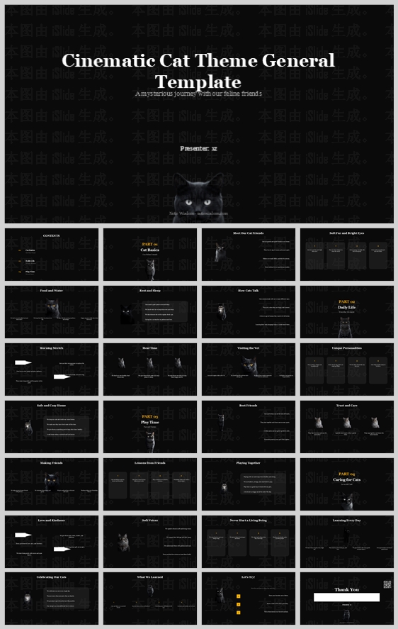
This cinematic cat presentation template uses a deep black background, dramatic spotlight photography, and elegant gold accents to create a mysterious, premium experience. It balances high-contrast visuals with structured modular cards, making pet care an
- Download this PPT
- Commercial use (1 project)
- Present publicly
1. Main Design Philosophy
Core Idea: "Cinematic Noir & Feline Mystery."
Conceptual Metaphor: The presentation is a dramatic, dark stage. The cats are the stars, illuminated by a single spotlight. The dark background represents the mystery of the night, while the glowing images invite the audience to lean in and discover the secrets of feline life.
Narrative Direction & Emotional Tone: Mysterious, elegant, dramatic, and premium. The tone avoids bright, playful cartoon aesthetics, opting instead for a sophisticated, "documentary" or "film noir" atmosphere that feels both intellectual and emotionally gripping.
Audience Insight: This design targets mature pet owners, feline behaviorists, or creative professionals who want to deliver a high-impact, serious, and cinematic narrative. It appeals to audiences who appreciate dark mode aesthetics and high-end visual presentation.
Why This Fits: The thumbnail uses a deep black background, high-contrast spotlight photography, and subtle gold accents. This signals a premium, story-driven educational experience. The design philosophy directly supports that by prioritizing dramatic lighting, strict high contrast, and a focused modular layout.
How It Guides Decisions: Color stays strictly monochrome with a single warm accent. The realistic, shadowy cat imagery acts as the emotional anchor. The layout uses dark, structured cards to make the dramatic content feel organized and easily digestible.
2. Color System
Why This Color System: Dark mode is inherently cinematic. It reduces eye strain in low-light environments and makes the illuminated subjects (the cats) pop with incredible intensity. The addition of a warm gold accent adds a touch of luxury and guidance.
Color Psychology & Emotional Meaning: Deep Black = mystery, power, elegance, the unknown. Charcoal = depth, grounding, subtlety. Pure White = clarity, focus, truth. Warm Gold/Amber = warmth, attention, premium quality.
Primary Palette: Deep Midnight Black (#0A0A0A) for full-bleed backgrounds. It creates the ultimate canvas for cinematic lighting.
Secondary Palette: Rich Charcoal (#1A1A1A) for content cards and structural elements. It provides slight separation from the pure black background.
Accent Palette: Pure White (#FFFFFF) for primary headlines and body text. Warm Amber/Gold (#F5B041) for section numbers, active states, and key highlights.
Color Pairing Logic & Harmony: The stark contrast of white and gold against the deep black creates a dynamic, high-end visual hierarchy. It feels like a spotlight cutting through the darkness.
Color Proportion & Balance: 70% Deep Black (Background), 20% Charcoal (Cards), 7% White (Text), 3% Gold/Amber (Accents).
Background-to-Foreground Layering: Black is the canvas. Charcoal cards are the reading surfaces. White text and gold accents are the foreground focal points. The cat photos are the illuminated subjects.
Contrast, Readability & Accessibility: White on black and white on charcoal exceed WCAG AAA standards. The gold accent is used exclusively for large headings, numbering, and icons, ensuring maximum readability.
Semantic Use of Color: Gold = action, section headers, primary emphasis, spotlight effects. White = reading text, body content. Charcoal = content containers.
How the Palette Supports the Theme: It perfectly mirrors the "Cinematic" and "Mysterious" subtitle. It feels like a high-end documentary, inviting the audience into a secret, nighttime world.
3. Visual Elements
Why These Visual Elements: The thumbnail uses realistic, dramatically lit photography paired with clean geometric lines. This grounds the design in reality while maintaining a highly stylized, cinematic feel.
Illustration Style & Mascot Direction: The visual anchor is a series of high-quality, moody photographs of cats. They are often placed in shadows, with only their eyes or parts of their face illuminated by a soft spotlight. This creates an aura of mystery and intrigue.
Iconography Style, Stroke Consistency & Corner Treatment: Minimalist solid icons and thin-line icons. Circular bullet nodes with gold or white fills. All corners of cards use a sharp or very minimal radius (0–4 px) to maintain the dramatic, cinematic aesthetic.
Shape Language & Geometric Motifs: The dominant motifs are rectangular cards and sharp lines. The spotlight effect (a soft radial gradient or circular glow) is a key recurring shape that frames the cat imagery.
Texture, Materiality & Lighting Atmosphere: The design relies heavily on the lighting within the photographs. The backgrounds are flat matte black. The spotlight effects create a soft, glowing atmosphere.
Decorative Elements & Framing Devices: Subtle horizontal lines. A faint, repeating watermark pattern in the background adds a layer of texture. The gold section numbers (01, 02, 03, 04) act as strong visual anchors.
Repetition, Rhythm & Visual Consistency: The spotlight motif and the dark, moody cat photography appear on every slide. The gold section numbers are consistently placed, creating predictable, dramatic wayfinding.
How Each Element Improves Comprehension & Engagement: The dramatic lighting creates an immediate emotional bond and a strong memory hook. The structured dark cards chunk information beautifully. The high contrast prevents visual fatigue, making the presentation feel like a captivating film.
4. Layout & Typography
Why This Layout & Typography: The thumbnail uses a rigorous modular grid with strong alignment. The elegant serif title paired with a clean sans-serif body creates a sophisticated, editorial feel that matches the cinematic theme.
Grid System & Alignment Logic: A strict 12-column grid with 24 px gutters. Content is organized into structured columns (2, 3, or 4 columns) using charcoal cards. Consistent side margins (64 px) and top/bottom margins (48 px) create a balanced, framed appearance.
White Space Strategy & Visual Breathing Room: Generous padding (minimum 32 px) inside charcoal cards. The deep black background provides significant negative space, allowing the spotlit imagery to breathe, creating a calm, suspenseful pacing.
Visual Hierarchy & Focal Point Planning: The eye is drawn first to the large white title, then to the illuminated cat imagery, then to the gold section numbers and headers. Secondary content sits in charcoal cards below.
Reading Flow & Eye-Path Direction: Top-down, left-to-right. The numbered sections and gold headers provide clear wayfinding. Circular bullet points facilitate rapid scanning.
Font Pairing & Type Scale:
-
Headings: A classic, elegant serif (e.g., Playfair Display or Cinzel) for the main title and section headers, adding a touch of cinematic grandeur.
-
Body: A clean, geometric sans-serif (e.g., Inter, Montserrat, or Roboto) for body text and labels.
-
Type Scale: Main Title (48 pt, Bold, Serif), Section Number (48 pt, Bold, Serif, Gold), Section Title (28 pt, Bold, Sans-serif), Card Heading (18 pt, SemiBold, Sans-serif), Body (12–14 pt, Regular, Sans-serif).
Weight, Spacing, Line Height & Readability Standards: Headings use 700 weight. Body uses 400. Line height: 1.6 for body, 1.2 for headings. Letter spacing is slightly increased for headings to add elegance.
Consistency Rules Across All Pages: Every slide must maintain the exact card radius, padding, and grid alignment. The spotlight imagery must be present. No pure black text; only White or Charcoal. Gold is never used for body text.
How the Layout Improves Clarity, Rhythm & Information Retention: The modular charcoal card system breaks complex pet-care or cinematic information into digestible pieces. The strict grid creates order amidst the dramatic visuals. The high contrast ensures the audience can easily absorb and retain the information.
5. Design Goal
Design Goals: To create a pet education or thematic presentation that feels like a high-end documentary film. To use dramatic, high-quality imagery to build an immediate emotional bridge with the audience. To deliver information in a highly readable, structured, yet visually mysterious manner.
Why These Goals Are Appropriate: Pet care and education topics can often feel mundane. This design injects drama, suspense, and premium quality, making the information feel like an exclusive discovery.
Intended Emotional Impact: Intrigue, respect, awe, curiosity, and a sense of premium quality.
Communication Objectives: Clearly communicate feline habits, care routines, and behavioral traits. Ensure the audience absorbs the information while feeling emotionally connected to the mysterious subject matter.
Desired Audience Behavior or Response: Lean in, focus intently, read thoroughly, and feel captivated by the cinematic journey.
How the Design Balances Aesthetics, Readability & Message Delivery: The dark background and white text deliver the message clearly. The dramatic photography and gold accents deliver the emotion and premium feel. The disciplined grid keeps the presentation professional and structured.
6. Design Principles and Consistency Checklist
Key Principles:
-
Cinematic Discipline: Stick strictly to Deep Black, Charcoal, White, and Warm Gold.
-
Dramatic Imagery: Every section must feature the spotlit cat photography to maintain the "mysterious journey" narrative.
-
Strict Grid Fidelity: Align everything meticulously to the 12-column grid.
-
Sharp Geometry: Use rectangular cards and sharp corners for structural elements.
-
High Contrast Readability: Never use gold for body text; always use White on Dark backgrounds.
Reusable Rules: -
Color: #0A0A0A background, #1A1A1A cards, #FFFFFF text, #F5B041 accents.
-
Typography: Elegant Serif for titles, clean Sans-serif for body. Line height 1.6.
-
Layout: 64 px side margins, 48 px top/bottom margins, 32 px card padding.
-
Imagery: High-quality, moody cat photography with spotlight effects, deep shadows.
-
Icons: Rounded caps, thin stroke weight, simple circular nodes, gold or white fills.
-
Charts: Gold and white bars, dark backgrounds, simple clean labels.
Conclusion
This design concept transforms a standard educational template into a dramatic, cinematic journey through the mysterious world of cats. By combining a deep black canvas, moody spotlight photography, elegant gold accents, and a disciplined modular card layout, the deck achieves an extraordinary balance of high-end aesthetics and professional clarity. The result is a presentation that feels less like a lecture and more like a captivating documentary film—inviting, intriguing, and incredibly easy to absorb.
Article + Bundle Download