







 Note Wisdom
Children's Education: Cute White Bear Template
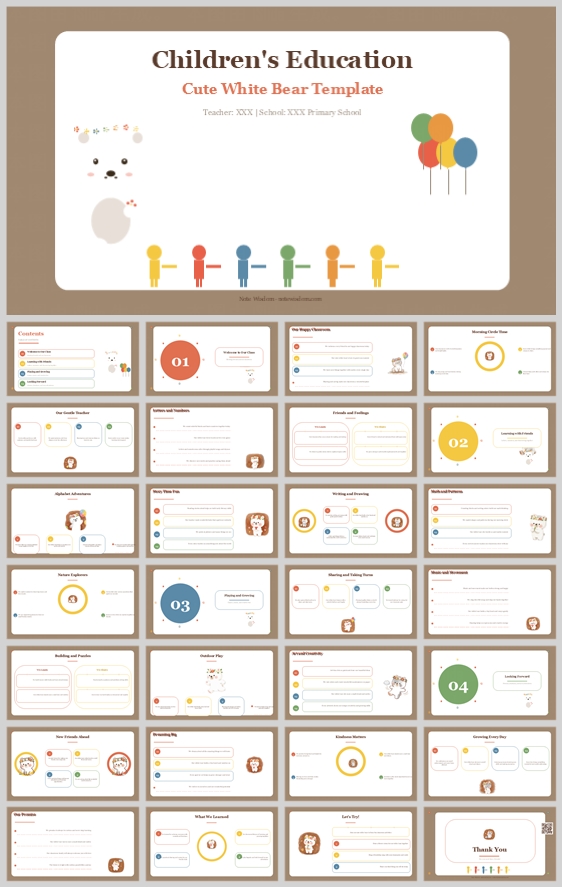
This warm, storybook-themed children's education presentation uses a cute white bear mascot, white rounded cards, and muted brown backgrounds to make early learning feel playful, focused, and organized. It offers a precise visual system for teachers to c
- Download this PPT
- Commercial use (1 project)
- Present publicly
A Warm, Playful Learning Adventure for Young Minds
This deck is designed as a gentle, organized introduction to early education for young children and their families. A cute white bear mascot, soft earthy tones, and clean white content cards transform the learning experience into a safe, joyful, and highly structured adventure.
Core design philosophy: Create a warm, focused, and highly readable early-learning environment where a friendly bear mascot and colorful visual cues guide young learners through essential topics without overwhelming them.
Emotional tone and narrative direction: Cheerful, calm, curious, and gently structured. The visual story moves from welcome and daily routines to exploration, discovery, and celebration. The muted brown background provides a soothing, grounded canvas, while bright accent colors and the white bear inject joy and clarity.
1. Main Design Philosophy
The core idea is to use a soft, neutral backdrop to make the learning content pop. Unlike high-energy primary colors, the muted brown and warm grey background creates a calm, cozy atmosphere similar to a storybook or a quiet classroom corner. The white bear mascot serves as a friendly, non-threatening guide. The design removes visual noise and replaces it with clear, rounded cards and simple, recognizable icons.
The main conceptual metaphor is "Learning as a Cozy Storytime." The white bear is the storyteller. The large white content areas are the pages. The colorful number badges (01, 02, 03, 04) mark chapters. The floating balloons and abstract children icons represent the joy and community of learning. This metaphor makes abstract educational concepts feel concrete, warm, and approachable.
The narrative direction is simple and reassuring: welcome, learn, play, and grow. This tone supports young learners who need emotional safety and predictability, while giving teachers and parents a highly organized, distraction-free structure to follow.
This philosophy fits the thumbnail because the white bear, muted earthy tones, and simple card layouts directly signal "early childhood education" and "gentle guidance." The topic "Children's Education" requires a balance of fun and structure. This approach keeps the deck from becoming chaotic while preserving its playful soul.
Every design decision follows this idea: muted backgrounds instead of harsh white, rounded corners instead of sharp edges, a single mascot instead of many competing characters, and clear, high-contrast typography instead of decorative fonts.
2. Color System
The color system is chosen to create a grounded, warm, and highly focused visual experience. The muted brown background reduces eye strain and creates a cozy, storybook feel. White cards provide immediate, high-contrast zones for reading. Bright accent colors (red, yellow, green, blue) are used sparingly for icons, badges, and key highlights, ensuring the child's eye is always guided to the most important information.
Color psychology and emotional meaning:
Muted Brown suggests stability, warmth, earthiness, and comfort. Pure White offers clarity, cleanliness, and focus. Bright Red represents energy, excitement, and importance. Sunny Yellow adds happiness, optimism, and warmth. Fresh Green suggests growth, nature, and new beginnings. Sky Blue brings calm, trust, and safety.
Primary palette:
Muted Brown #A68A6B for the main background, creating a warm, grounded canvas. Pure White #FFFFFF for central content cards and focal areas. Soft Grey #F5F5F5 for secondary text and supportive elements.
Secondary palette:
Bright Red #E74C3C for the main title and key emphasis. Sunny Yellow #F1C40F for the bear mascot and accent badges. Fresh Green #27AE60 for growth-related icons and section markers. Sky Blue #3498DB for calm, trust, and supporting highlights.
Accent palette:
Soft Orange #F39C12 for the balloons and small decorative dots. Warm Beige #D9C7B8 for secondary background elements. These are used sparingly to maintain the clean, focused look of the slides.
Color pairing logic and harmony:
The palette is a warm, earthy base with a classic bright accent palette. The muted brown background unifies everything; white cards create readable content zones; red, yellow, green, and blue are used as distinct, recognizable markers for different sections and concepts. This creates a harmonious balance between calm and energy.
Color proportion and balance:
Use 50% muted brown background, 30% white cards, 10% bright accent colors for icons and badges, 5% soft orange and warm beige for tiny accents, and 5% dark grey for text. This prevents visual overload and keeps the focus on the learning content.
Background-to-foreground layering strategy:
Layer 1 is the muted brown background. Layer 2 is the white rounded cards and large focal areas. Layer 3 is the dark grey typography and colorful letter badges. Layer 4 is the white bear mascot and colorful icons. Layer 5 is the tiny decorative dots and balloons. This creates depth while keeping text readable.
Contrast, readability, and accessibility:
Body text is dark charcoal #333333 on white cards, not on the brown background. This ensures high contrast. Titles are large and bold. Accent colors are reserved for icons, badges, and labels. No long text appears on the brown background.
Semantic use of color:
Muted brown represents the warm, safe learning environment. White represents content clarity and structure. Red marks the main title and important actions. Yellow marks the mascot and positive reinforcement. Green marks growth and sections. Blue marks calm and supporting details.
This palette supports the theme by making "Children's Education" feel joyful but organized. It keeps children engaged through bright accents and a cute mascot, while adults can easily read the clean white cards and dark text.
3. Visual Elements
The cute white bear mascot creates an immediate emotional connection and serves as a familiar, friendly guide. The abstract colorful children icons represent community and play. The balloons add a sense of celebration and lightness. White rounded cards organize information clearly. Tiny dots and simple icons add playfulness without clutter.
The illustration style is flat vector cartoon with soft, simple, and highly rounded shapes. The white bear has a gentle expression, a small red nose, and soft ears. The bear should appear consistently, often in corners or beside section badges, to guide the viewer's eye. The abstract children icons are simple stick figures with round heads and bright colored bodies.
Icons are filled with rounded caps and rounded corners. No sharp edges. Icons sit inside circular white or colored badges. This matches the friendly, child-safe aesthetic and ensures legibility against the brown background.
The shape language is dominated by circles and rounded rectangles. Large circles are used for the main title and number badges. Rounded rectangles are used for cards and text panels. The balloons and abstract children are organic, playful accents. These shapes feel safe, organized, and playful.
Texture is matte, flat, and paper-like. There are no glossy gradients or harsh shadows. Very soft shadows may be used under the white cards to create gentle depth against the brown background. The atmosphere is warm, calm, and cheerful.
Decorative elements include the colorful balloons at the top, the abstract children icons at the bottom, and tiny scattered dots. These fill negative space and reinforce the joyful, community-oriented theme without distracting from the core content.
Repetition and rhythm are essential. Repeat the white bear, the white circular focal areas, the colored number badges, and the simple icons. This repetition creates a predictable rhythm that improves retention and makes the deck feel professionally designed.
Each element improves comprehension, engagement, and brand recognition. The mascot makes the deck memorable and friendly. Number badges clarify the sequence quickly. White cards chunk information. Repetition builds a recognizable visual identity for the classroom or teacher.
4. Layout & Typography
The layout separates information into soft, digestible white cards and large circular focal areas. This reduces overwhelm for young viewers and helps teachers present clearly. Typography balances playful titles with readable body text.
The grid system uses 12 columns. Content cards align to columns with consistent gutters. Titles and section badges are centered within their designated areas. Card content is left-aligned for natural reading. This creates order without rigidity.
White space is a key design tool. Keep at least 20–30% of each page as empty space. White space directs attention to the cards and focal areas, reducing cognitive load. The muted brown background acts as a calm, warm canvas between the white elements.
Visual hierarchy is planned carefully. The first focal point is the title panel or the large white circle. The second is the white content cards. The third is the white bear mascot and colored number badges. The fourth is the decorative balloons, children icons, and dots. This ensures the viewer always knows where to look.
Reading flow follows a Z-pattern or F-pattern. The eye moves from top-left to top-right, then down to the next row. Number badges anchor each new topic. The white bear can guide the eye toward important content.
Font pairing uses a classic serif for main titles, such as Playfair Display, Lora, or Merriweather. Body text uses a rounded sans-serif, such as Quicksand, Nunito, or Varela Round. Titles are 32–40 pt. Number badges are 28–32 pt. Card headers are 16–18 pt. Body text is 14–16 pt. Captions are 11–12 pt.
The hierarchy is clear: the main title is large, red or dark brown, and serif. Card headers are bold, dark gray, and sans-serif. Body text is regular, dark gray, and sans-serif. Captions and labels are small, muted gray or soft brown.
Readability standards include body line height of 1.5. Letter spacing is slightly increased for titles. Avoid all-caps for long text. Use bold sparingly for emphasis. Keep line lengths under 60 characters.
Consistency rules across all pages include the same card corner radius of 16–24 px, the same padding inside cards, the same mascot placement logic, the same accent color roles, the same title position, and the same icon style. This consistency makes the deck feel cohesive and professional.
The layout improves clarity, rhythm, and information retention because the card system chunks information. The repeated rhythm helps viewers predict where content will appear. The typography hierarchy ensures key points are seen first.
5. Design Goal
The design goals are to create a warm, organized, and playful presentation template for early childhood education, communicate fun, friendship, growth, and classroom structure, and make it easy for teachers to customize and for parents to understand.
These goals are appropriate because early childhood audiences need emotional safety and visual clarity. Teachers need professional-looking materials that save time. Parents need clear communication about learning and growth.
The intended emotional impact is joy, curiosity, comfort, trust, and pride. The communication objectives are to present learning as a cozy adventure, highlight routines, skills, social-emotional growth, and celebration, and keep information scannable and memorable.
The desired audience response is that children feel engaged and safe, parents feel informed and reassured, and teachers feel supported and confident using the template.
The design balances aesthetics, readability, and message delivery by keeping playful elements in the background, borders, and mascots, while readable content lives in white cards with strong contrast. This separation keeps the deck both charming and functional.
6. Design Principles and Reusable Rules
Key principles:
-
If it can be rounded, round it.
-
Use the white bear as a friendly guide, not a distraction.
-
Keep content on white cards for readability.
-
Use muted brown for backgrounds to create contrast and calm.
-
Maintain generous white space.
-
Repeat the balloons, children icons, and colored number badges.
Reusable rules:
Background is always muted brown. Cards are always white. Titles are always bright red or dark brown serif. Body text is always dark gray rounded sans. Section badges are always colored circles. Icons are always filled with rounded corners. Cards are always aligned to the grid. The mascot is always placed in corners or beside badges.
Conclusion
This design concept transforms "Children's Education: Cute White Bear Template" into a warm, structured, and emotionally intelligent presentation system. By using muted brown backgrounds, white rounded cards, a friendly white bear mascot, colorful accents, and clear typography, it makes early learning feel safe, joyful, and highly focused. Every choice is justified by audience needs, readability, and the goal of celebrating fun and growth.
Article + Bundle Download