







 Note Wisdom
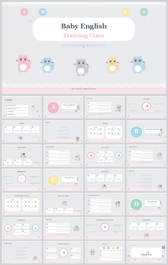
Baby English Training Class: A Fun ABC Learning Adventure for Kids
This soft, pastel-themed English learning presentation uses cute animal mascots, white rounded cards, and clear letter badges to make early language education feel playful and organized. It offers a precise visual system for teachers to communicate fun, f
- Download this PPT
- Commercial use (1 project)
- Present publicly
A Warm, Playful Early Literacy Adventure
This deck is designed as a gentle, encouraging introduction to English for the youngest learners. Rounded animal mascots, soft pastel colors, and clean white cards transform the potentially intimidating experience of learning a new language into a safe, playful adventure.
Core design philosophy: Create a joyful, safe, and highly readable early-learning environment where friendly animal guides make English acquisition feel like a game rather than a formal lesson.
Emotional tone and narrative direction: Cheerful, calm, curious, and gently structured. The visual story moves from welcome and alphabet basics to vocabulary, songs, and celebration. Pastel pink and baby blue signal softness and safety, while bright accent letters create clear focal points for early literacy.
1. Main Design Philosophy
The core idea is to lower the "affective filter" — the emotional barrier that can block language learning in young children. By using smiling, rounded animal mascots (a pink cat, blue bear, gray elephant, yellow lion, and blue owl) alongside soft, pastel backgrounds, the deck removes any sense of academic pressure. The design feels like a playdate, not a classroom.
The main conceptual metaphor is "The Alphabet as a Friendly Adventure." Each letter (A, B, C, D) is a stop on a journey, marked by a colorful circular badge. The animal mascots act as companions, guiding the child through each new letter, sound, and word.
The narrative direction is simple and encouraging: welcome, learn, play, sing, and celebrate. This tone supports toddlers and preschoolers who are just beginning to recognize letters, as well as parents who need clear, reassuring communication about their child's progress.
This philosophy fits the thumbnail because the soft scalloped borders, pastel pink and blue palette, and cute animal characters directly signal "baby" and "early learning." The topic "Fun ABC Learning Adventure" requires a balance of joy and structure. This approach keeps the deck from becoming chaotic while preserving playfulness.
Every design decision follows this idea: rounded corners instead of sharp edges, low-contrast pastels instead of loud primary colors, animal mascots instead of abstract icons, and highly legible typography instead of decorative fonts.
2. Color System
The color system is chosen to balance child-friendly energy with adult-readable clarity. Pastel pink and baby blue create a calming, nurturing atmosphere. White cards provide high-contrast reading zones for text. Bright yellow and mint green accents add excitement and highlight learning points without overwhelming the senses.
Color psychology and emotional meaning:
Pastel pink suggests warmth, care, and affection. Baby blue brings calm, trust, and safety. White offers clarity, cleanliness, and focus. Soft yellow adds happiness and optimism. Mint green represents freshness, growth, and new beginnings.
Primary palette:
Pastel Pink #F8BBD0 for the main background and female mascots. Baby Blue #B3E5FC for secondary backgrounds and the owl mascot. Crisp White #FFFFFF for content cards and text panels. Light Gray #F5F5F5 for the main slide canvas.
Secondary palette:
Soft Yellow #FFF176 for the lion mascot and accent badges. Mint Green #C8E6C9 for growth-related icons. Warm Gray #757575 for the elephant mascot and supporting text.
Accent palette:
Vibrant pastel circles for letters A, B, C, D: Pink #F48FB1, Blue #81D4FA, Yellow #FFF59D, Green #A5D6A7. These are used for navigation and section markers.
Color pairing logic and harmony:
The palette is analogic with a soft split-complementary twist. The gray background unifies everything; white cards create readable content zones; pink and blue frame the content; yellow and green accents draw the eye to key learning moments.
Color proportion and balance:
Use 50% light gray and white background, 30% pastel pink and baby blue, 15% white cards, 5% bright accent colors. This prevents visual overload and keeps the focus on the learning content.
Background-to-foreground layering strategy:
Layer 1 is the light gray background. Layer 2 is the scalloped pastel border. Layer 3 is the white rounded cards. Layer 4 is dark gray typography and colorful letter badges. Layer 5 is the animal mascots and tiny star decorations. This creates depth while keeping text readable.
Contrast, readability, and accessibility:
Body text is dark gray #333333 on white cards, not on pastel backgrounds. This ensures high contrast. Titles are large and bold. Accent colors are reserved for icons, badges, and labels. No long text appears on pastel backgrounds.
Semantic use of color:
Pink and blue represent the "baby" and "safe" theme. White represents content clarity. Yellow and green highlight letters, numbers, and positive reinforcement. Dark gray carries trustworthy text.
This palette supports the theme by making "Baby English" feel joyful but organized. It keeps children engaged through soft pastels and cute animals, while adults can easily scan white cards and dark text.
3. Visual Elements
The animal mascots create emotional connection and brand recognition. Scalloped borders reinforce the "baby" and "soft" theme. White rounded cards organize information. Tiny stars and dots add playfulness without clutter.
The illustration style is flat vector cartoon with soft, simple shapes. The pink cat, blue bear, gray elephant, yellow lion, and blue owl all have large eyes, rounded bodies, and gentle expressions. They should appear consistently, often in corners or beside section badges, to guide the eye.
Icons are filled with rounded caps and rounded corners. No sharp edges. Icons sit inside circular or rounded-square badges. This matches the friendly, child-safe aesthetic.
The shape language is dominated by circles and rounded rectangles. Circles are used for letter badges (A, B, C, D) and icon backgrounds. Rounded rectangles are used for cards and title panels. Scalloped waves and stars act as organic accents. These shapes feel safe, organized, and playful.
Texture is matte, flat, and paper-like. There are no glossy gradients or harsh shadows. Very soft shadows may be used under cards to create gentle depth. The atmosphere is bright, clean, and cheerful.
Decorative elements include scalloped pink borders at the top and bottom, tiny star icons, and soft pastel dots. These fill negative space and reinforce the baby and early learning theme without distracting from content.
Repetition and rhythm are essential. Repeat the animal mascots, scalloped borders, pastel letter badges, white cards, and rounded corners. This repetition creates a predictable rhythm that improves retention and makes the deck feel professionally designed.
Each element improves comprehension, engagement, and brand recognition. Mascots make the deck memorable and friendly. Letter badges clarify the alphabet sequence quickly. Cards chunk information. Repetition builds a recognizable visual identity for the classroom or teacher.
4. Layout & Typography
The layout separates information into soft, digestible cards. This reduces overwhelm for young viewers and helps teachers present clearly. Typography balances playful titles with readable body text.
The grid system uses 12 columns. Content cards align to columns with consistent gutters. Titles and section badges are centered. Card content is left-aligned for natural reading. This creates order without rigidity.
White space is a key design tool. Keep at least 20–30% of each page as empty space. White space directs attention to cards and reduces cognitive load. The light gray background acts as a calm, cheerful canvas between white cards.
Visual hierarchy is planned carefully. The first focal point is the title panel or letter badge. The second is the white content cards. The third is the animal mascots. The fourth is decorative stars and dots. This ensures the viewer always knows where to look.
Reading flow follows a Z-pattern or F-pattern. The eye moves from top-left to top-right, then down to the next row. Letter badges anchor each new topic. Mascots can guide the eye toward important content.
Font pairing uses a classic serif for main titles, such as Playfair Display, Lora, or Merriweather. Body text uses a rounded sans-serif, such as Quicksand, Nunito, or Varela Round. Titles are 32–40 pt. Letter badges are 28–32 pt. Card headers are 16–18 pt. Body text is 14–16 pt. Captions are 11–12 pt.
The hierarchy is clear: main title is large, dark gray, and serif. The subtitle "Training Class" is medium, pink, and sans-serif. Card headers are bold, dark gray, and sans-serif. Body text is regular, dark gray, and sans-serif. Captions and labels are small, muted gray or light pink.
Readability standards include body line height of 1.5. Letter spacing is slightly increased for titles. Avoid all-caps for long text. Use bold sparingly for emphasis. Keep line lengths under 60 characters.
Consistency rules across all pages include the same card corner radius of 16–24 px, the same padding inside cards, the same mascot placement logic, the same accent color roles, the same title position, and the same icon style. This consistency makes the deck feel cohesive and professional.
The layout improves clarity, rhythm, and information retention because the card system chunks information. Repeated rhythm helps viewers predict where content will appear. Typography hierarchy ensures key points are seen first.
5. Design Goal
The design goals are to create a warm, organized, and playful presentation template for early English learning, communicate fun, friendship, growth, and classroom structure, and make it easy for teachers to customize and for parents to understand.
These goals are appropriate because early childhood audiences need emotional safety and visual clarity. Teachers need professional-looking materials that save time. Parents need clear communication about learning and growth.
The intended emotional impact is joy, curiosity, comfort, trust, and pride. The communication objectives are to present learning as an adventure, highlight routines, skills, social-emotional growth, and celebration, and keep information scannable and memorable.
The desired audience response is that children feel engaged and safe, parents feel informed and reassured, and teachers feel supported and confident using the template.
The design balances aesthetics, readability, and message delivery by keeping playful elements in the background, borders, and mascots, while readable content lives in white cards with strong contrast. This separation keeps the deck both charming and functional.
6. Design Principles and Reusable Rules
Key principles:
-
If it can be rounded, round it.
-
Use the animal mascots as learning buddies, not distractions.
-
Keep content on white cards for readability.
-
Use pastel pink and blue for backgrounds and borders.
-
Maintain generous white space.
-
Repeat the scalloped borders, stars, and mascots.
Reusable rules:
Background is always light gray or pastel. Cards are always white. Titles are always dark gray serif. Body text is always dark gray rounded sans. Letter badges are always pastel circles. Icons are always filled with rounded corners. Cards are always aligned to the grid. Mascots are always placed in corners or beside badges.
Conclusion
This design concept transforms "Baby English Training Class: A Fun ABC Learning Adventure for Kids" into a warm, structured, and emotionally intelligent presentation system. By using soft pastels, white rounded cards, cute animal mascots, and clear typography, it makes early language learning feel safe, joyful, and organized. Every choice is justified by audience needs, readability, and the goal of celebrating fun and growth.
Article + Bundle Download