







 Note Wisdom
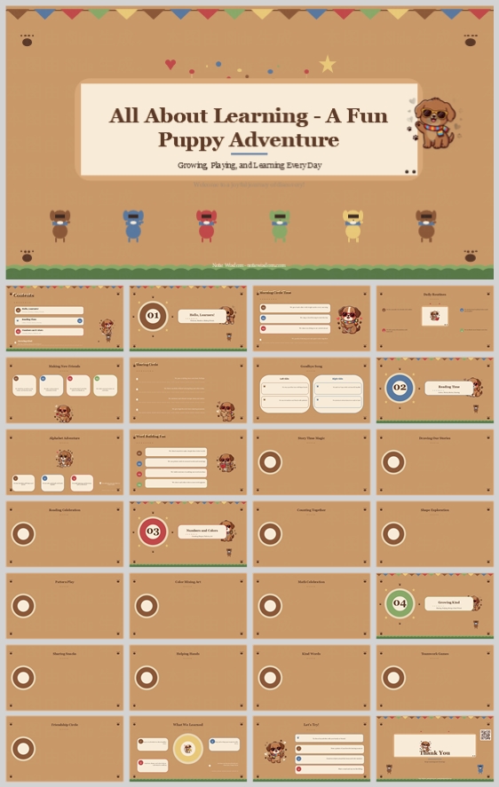
All About Learning – A Fun Puppy Adventure: Growing, Playing, and Learning Every Day
This warm, earth-toned learning presentation uses a friendly puppy mascot and soft rounded cards to make early education feel safe and playful. It offers a precise visual system for teachers to communicate fun, growth, and classroom structure clearly.
- Download this PPT
- Commercial use (1 project)
- Present publicly
1. PPT Title
All About Learning – A Fun Puppy Adventure: Growing, Playing, and Learning Every Day
2. Design Concept (Expanded, Fine-Grained, and Rationale-Driven)
Core design philosophy:
Create a warm, playful, and emotionally safe learning environment where the puppy mascot acts as a friendly guide, not a distraction. The deck should feel like a storybook classroom: structured enough for teachers and parents, soft enough for young children.
Emotional tone and narrative direction:
Joyful, calm, encouraging, and gently adventurous. The visual story moves from welcome and routine to learning, social growth, and celebration. The puppy, bone, paw prints, bunting, and grass border create a continuous “learning adventure” narrative.
1. Main Design Philosophy
-
Core idea, thought, and creative approach:
Use warmth and softness as functional tools. Rounded corners, earthy tones, and cartoon illustrations reduce anxiety, improve attention, and make educational content feel approachable. Every sharp or cold element is removed because the audience includes early learners and their families. -
Main design concept and conceptual metaphor:
“The Classroom as a Cozy Puppy Adventure.” Each content block is a soft card, like a flashcard or storybook page. The puppy mascot appears as a companion, guiding the viewer through sections. The bone motif and paw prints reinforce loyalty, play, and friendship. -
Narrative direction and emotional tone:
Welcome → daily routines → learning and exploration → social-emotional growth → celebration. The tone is nurturing, positive, and never intimidating. The design avoids visual noise so children can follow along and parents can quickly understand key messages. -
Audience insight and intended perception:
Primary audience: kindergarten and early elementary teachers, parents, and young students. They should perceive the deck as organized, friendly, and easy to understand. Teachers need professional credibility; children need emotional comfort. -
Why this philosophy fits the thumbnail style, topic, and audience:
The beige background, cream title panel, brown puppy mascot, colorful bunting, and grass border all signal “early childhood education.” The topic “Fun & Growth” requires a balance of play and structure. This philosophy directly supports that balance without becoming childish or chaotic. -
How the design idea guides color, elements, layout, and typography:
It dictates warm neutrals instead of bright primary colors, rounded cards instead of sharp tables, a mascot instead of abstract icons only, and readable serif-plus-rounded-sans typography instead of dense corporate fonts. Each decision reinforces safety, clarity, and playful growth.
2. Color System
-
Why this color system was chosen:
Warm tan, cream, and brown tones evoke paper, wood, and natural classroom materials. They feel calm, organic, and non-digital. This reduces visual fatigue and makes the deck suitable for young children and parent presentations. -
Color psychology and emotional meaning:
Warm tan = safety, warmth, simplicity. Cream = clarity, focus, softness. Brown = reliability, friendliness, earthiness. Terracotta/coral = energy, encouragement. Mustard yellow = optimism, attention. Sage green = growth, balance. Muted blue = trust, calm. -
Primary palette:
Warm Tan#D9B382for the main background. Cream#FFF6E5for title panels and content cards. Puppy Brown#8B5E3Cfor the mascot and key headings. -
Secondary palette:
Terracotta#C96F4Afor section number badges and important highlights. Mustard#E6B84Cfor stars, icons, and small attention cues. Sage#A8B89Afor growth-related icons. Muted Blue#7FA8A3for balance and variety. -
Accent palette:
Soft pink, muted blue, pale yellow, and light green from the bunting flags. These are used sparingly to avoid visual chaos. -
Color pairing logic and harmony:
The palette is analogous with warm neutrals, plus small split-complementary accents. The tan background unifies everything; cream cards create readable content zones; brown text provides strong contrast. -
Color proportion and balance:
60% warm tan background, 25% cream cards, 10% brown text and mascot, 5% accent colors. This prevents the deck from becoming too busy and keeps focus on content. -
Background-to-foreground layering strategy:
Layer 1: tan background. Layer 2: cream rounded cards. Layer 3: brown typography and mascot. Layer 4: small accent icons, paw prints, and bunting. This creates depth without clutter. -
Contrast, readability, and accessibility:
Body text is dark brown or charcoal on cream cards, not on tan. This ensures high readability. Accent colors are used only for icons and labels, never for long text. Headings are large enough for projection. -
Semantic use of color across titles, body text, icons, and highlights:
Brown = authority and warmth. Terracotta = section markers and key actions. Mustard = positive reinforcement. Sage = growth and learning. Blue = reflection and balance. Pink = celebration and friendship. -
How the palette supports the theme, audience, and visual hierarchy:
It reinforces “Fun & Growth” by mixing playful accents with grounded neutrals. It keeps the deck child-friendly but still credible for educators and parents. Color is used to guide attention, not to decorate randomly.
3. Visual Elements
-
Why these visual elements were chosen:
Cartoon animals, bones, paw prints, and bunting create instant emotional recognition. They make the topic of learning feel like a friendly adventure rather than a formal lecture. The grass border and tiny stars add a playful outdoor atmosphere. -
Illustration style and mascot direction:
Flat vector cartoon style with soft shading. The puppy mascot has simple shapes, large eyes, and a gentle expression. It should appear consistently, preferably bottom-right or bottom-left, to guide the eye without blocking text. The mascot’s scarf or collar can include accent colors. -
Iconography style, stroke consistency, and corner treatment:
Filled icons with rounded caps and rounded corners. No sharp edges. Icons sit inside circular or rounded-square badges. This matches the overall “no sharp corners” rule and keeps the visual language friendly. -
Shape language and geometric motifs:
Circles and rounded rectangles dominate. Circles are used for section numbers, icon backgrounds, and mascot framing. Rounded rectangles are used for content cards and title panels. These shapes feel safe, friendly, and organized. -
Texture, materiality, and lighting atmosphere:
Matte, paper-like surfaces. No glossy gradients or harsh shadows. Subtle dotted lines and tiny stars create a handcrafted storybook feel. The background may include very faint paw prints or dots to add depth without distraction. -
Decorative elements and framing devices:
Bunting flags at the top, scattered paw prints, bones, stars, and dots. The grass border at the bottom creates a ground line. These fill negative space and reinforce the playful theme without distracting from content. -
Repetition, rhythm, and visual consistency rules:
Repeat the puppy mascot, bone motif, paw prints, and bunting across pages. Repeat the same card radius, icon style, and accent color usage. This creates a predictable rhythm that improves retention and brand recognition. -
How each element improves comprehension, engagement, and brand recognition:
The mascot creates emotional attachment. The icons make abstract ideas concrete. The bunting and stars signal celebration and progress. The repetition builds a recognizable visual brand for the classroom or teacher.
4. Layout & Typography
-
Why this layout and typography system was chosen:
The layout separates information into soft, digestible cards. This reduces overwhelm and helps young viewers follow the presentation. The typography is friendly but readable, balancing playfulness with professionalism. -
Grid system and alignment logic:
Use a 12-column grid. Content cards align to columns with consistent gutters. Titles and section badges are centered. Card content is left-aligned for natural reading. This creates order without rigidity. -
White space strategy and visual breathing room:
Keep at least 20–30% of each page as empty space. White space is not wasted; it directs attention to the cards and reduces cognitive load. The tan background provides a calm canvas between cream cards. -
Visual hierarchy and focal point planning:
First focal point: large title panel or section badge. Second: cream content cards. Third: mascot and accent icons. Fourth: decorative elements. This order ensures the viewer always knows where to look. -
Reading flow and eye-path direction:
Use a Z-pattern or F-pattern depending on card arrangement. Top-left to top-right, then down to the next row. Section badges act as anchors before each new topic. Dotted lines can guide the eye between cards. -
Font pairing and type scale:
Serif font for main titles: Playfair Display, Lora, or Merriweather. Rounded sans-serif for body: Nunito, Quicksand, or Varela Round. Titles: 32–40 pt. Section numbers: 24–28 pt. Card headers: 16–18 pt. Body: 12–14 pt. Captions: 10–11 pt. -
Title, subtitle, body, caption, and label hierarchy:
Main title: large, brown, serif. Subtitle: medium, terracotta, sans-serif. Card headers: bold, brown, sans-serif. Body: regular, dark brown, sans-serif. Captions and labels: small, muted brown or gray. -
Weight, spacing, line height, and readability standards:
Body line height: 1.4–1.5. Letter spacing: slightly increased for titles. Avoid all-caps for long text. Use bold sparingly for emphasis. Keep line lengths under 70 characters for readability. -
Consistency rules across all pages:
Same card corner radius (16–24 px). Same padding inside cards. Same mascot placement logic. Same accent color roles. Same title position. Same icon style. This consistency makes the deck feel professionally designed. -
How the layout improves clarity, rhythm, and information retention:
The card system chunks information. The repeated rhythm helps viewers predict where content will appear. The typography hierarchy ensures key points are seen first. This improves comprehension and memory.
5. Design Goal
-
State the design goals clearly:
Create a warm, organized, and playful presentation template for early learning. Communicate growth, fun, and structure. Make it easy for teachers to customize and for families to understand. -
Explain why these goals are appropriate for the audience and context:
Early childhood audiences need emotional safety and visual clarity. Teachers need professional-looking materials that save time. Parents need clear communication about learning and growth. -
Intended emotional impact:
Comfort, curiosity, joy, trust, and pride. -
Communication objectives:
Show learning as a journey. Highlight routines, skills, social-emotional growth, and celebration. Keep information scannable and memorable. -
Desired audience behavior or response:
Children feel engaged and safe. Parents feel informed and reassured. Teachers feel supported and confident using the template. -
How the design balances aesthetics, readability, and message delivery:
Playful elements live in the background, borders, and mascot. Readable content lives in cream cards with strong contrast. This separation keeps the deck both charming and functional.
6. Design Principles and Consistency Checklist
-
Key principles to keep the deck visually coherent:
-
If it can be rounded, round it.
-
Use the mascot as a guide, not a distraction.
-
Keep content on cream cards for readability.
-
Use accent colors only for icons, badges, and highlights.
-
Maintain generous white space.
-
Repeat motifs: bones, paws, bunting, stars, grass.
-
-
Reusable rules for color, elements, typography, and layout:
Background always warm tan. Cards always cream. Titles always brown serif. Body always dark brown rounded sans. Section badges always terracotta circles. Icons always filled with rounded corners. Cards always aligned to the grid. Mascot always placed in a corner or edge.
Conclusion
This design concept transforms “All About Learning – A Fun Puppy Adventure” into a warm, structured, and emotionally intelligent presentation system. By using earthy colors, a friendly puppy mascot, rounded cards, bunting, and clear typography, it makes early learning feel safe, joyful, and organized. Every choice is justified by audience needs, readability, and the goal of celebrating growth.
Article + Bundle Download